Integration of Micro Interactions, reinforcing UX
A use case added in Ibexa's eZ Platform v2 - Switchers

Company: Ibexa - eZ Systems
Year: 2015-2020
Background
Ibexa's eZ Platform v1 introduced the Landing Page Manager, allowing to build Landing pages.
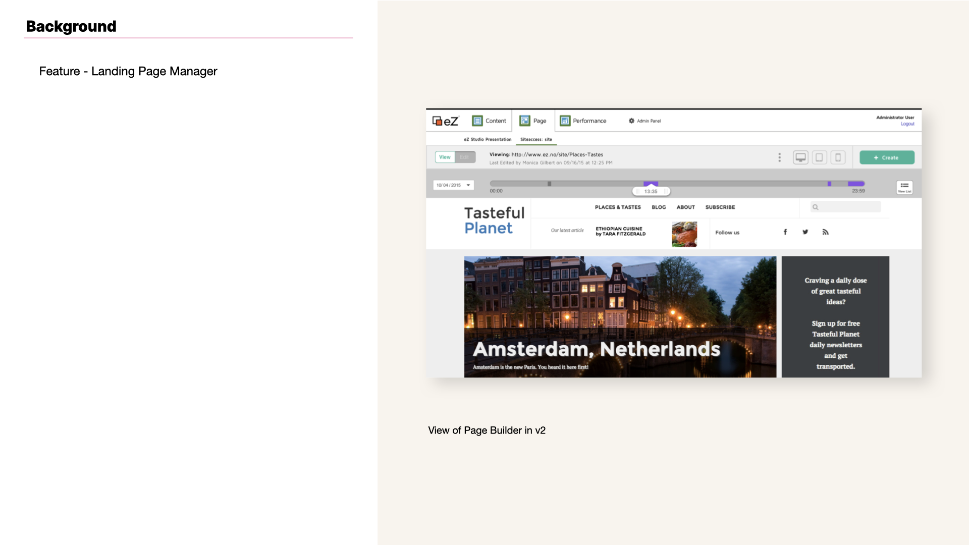
View of Landing Page manager in Ibexa's eZ Platform v1.
Challenge
- As part of my role as UX/UI Designer at Ibexa, I designed eZ Platform v2 UI;
- The re-design concept had to take into account new improvements to be included in the product from the UI perspective, and automatic translation of the UI was one of them among others;
- Improve affordability for both states: active and disabled.
Issue
Ibexa's eZ Platform users had issues with one specific, but important switcher. Feedback gathered showed that active state wasn't afforded sufficiently. For a sensitive percentage of users it was hard to differentiate active from disabled.
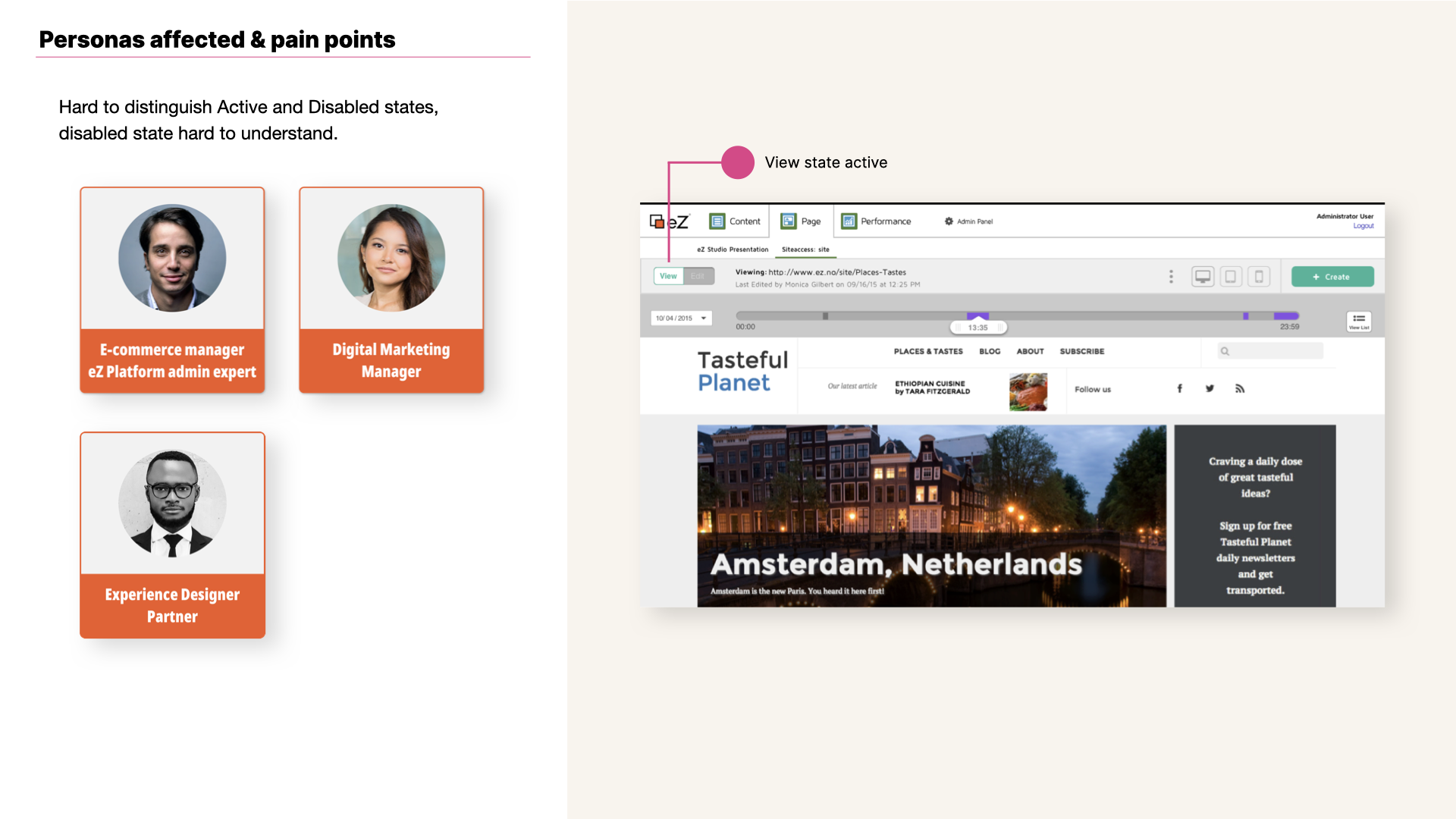
View of Landing Page manager in Ibexa's eZ Platform v1 as well as pain point and personas.
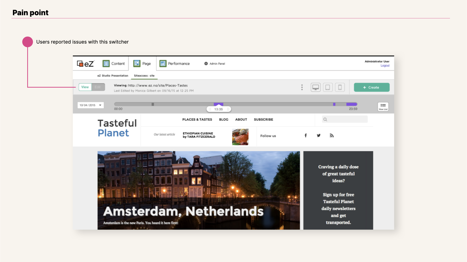
View of Landing Page manager in Ibexa's eZ Platform v1 and pain point in Content view.
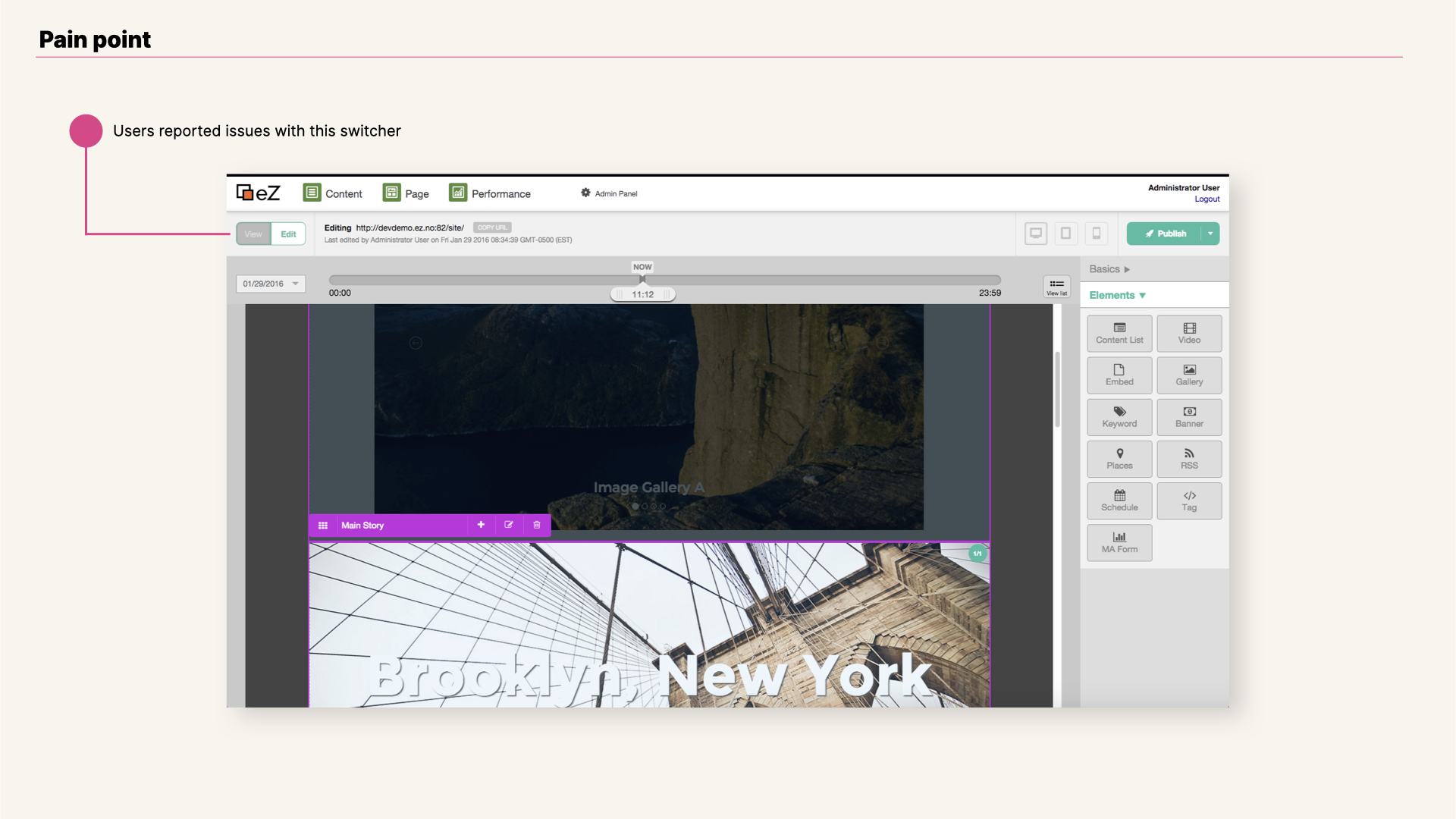
View of Landing Page manager in Ibexa's eZ Platform v1 and pain point in Edit view.
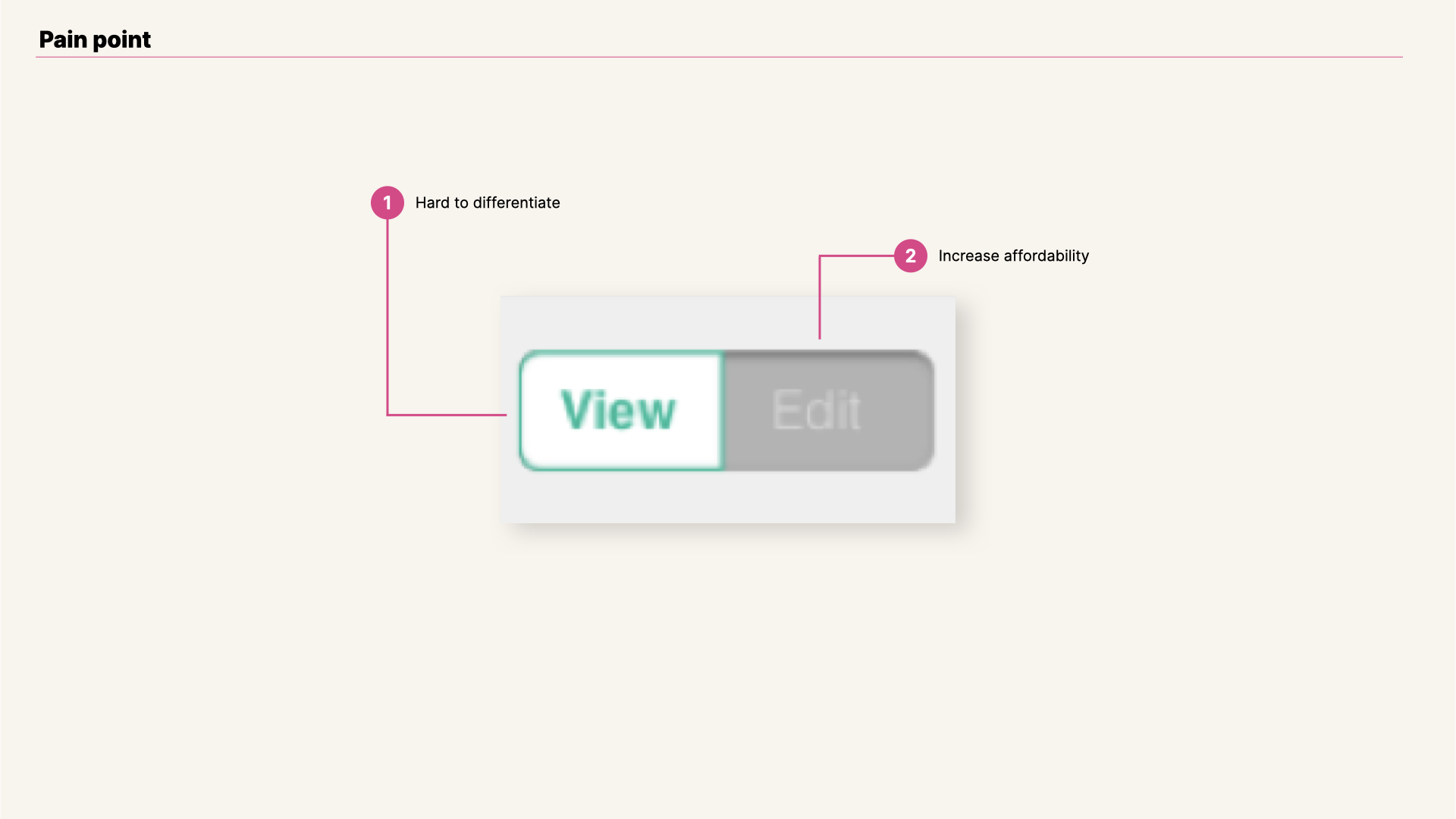
Enlarged view of View Edit switcher.
My Role

- Introduced a whole new set of icons (currently more than 200 icons) and streamlined its creation process.
- Applied standards for forms and tables across the different interfaces.
- Work based on predefined UI Guidelines as well as Library of components (Sketch, InVision).
- User tested new features and micro interactions added to v2 of the product.
- Simplified content creation process and emphasize the important of patterns for a working tool as a CMS is.
- Contribute directly to the corresponding repositories with styling changes, as well as bug fixing contributions.
Constraints

Gif of real interaction when hovering disabled state in v1 switcher.
- Ibexa's eZ Platform v2 integrates translations for its UI, and that includes buttons;
- From the technical perspective, find the simplest solution;
- Final solution chosen would be applied to the rest of cases throughout the UI that needed a switcher as a solution.
Testing
Switchers are a well known solution for radio buttons, specially in mobile screen sizes. Given the feedback gathered from our users, we decided to test out if what it works for mobile sizes it answers to Ibexa's users too.
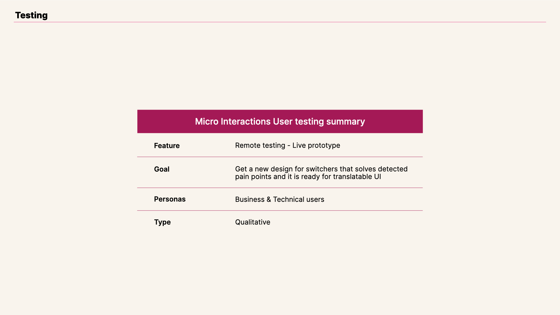
View of View Edit switcher testing summary.
Our first attempt improved text color contrasts, without the addition of hover state. But test results indicated that this approach it was still confusing for a group of test users. They still would not be able to differentiate active state from disabled.
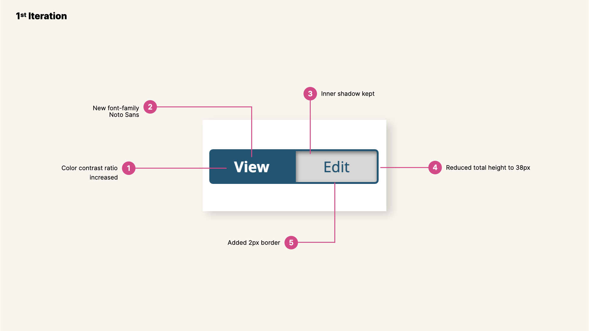
View of View Edit switcher, first iteration.
Based on feedback gathered from the first iteration, it was clear that we needed to increase affordability for the active state. We added rounded corners, increased text color contrast and highlighted more active state from disabled. We also added a slight padding within the switcher, giving with it more affordability to the active state by splitting up switcher boundaries from active state.
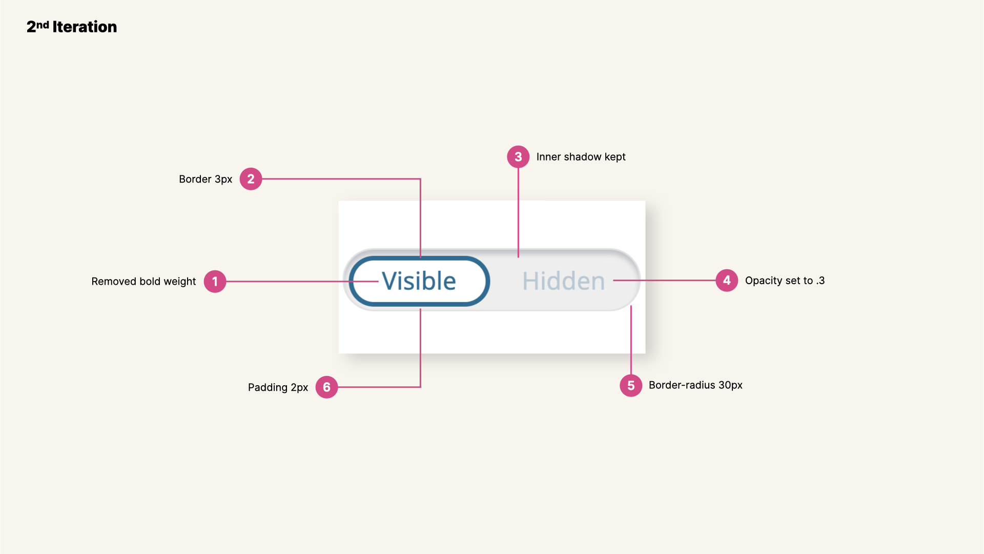
View of View Edit switcher, second iteration.
Results from second iteration were promising. Adding that extra padding was a move in the right direction. Now it was clear which is the active state. But there were a couple of areas that needed some attention: test users wanted to be able to read the disabled state with ease and we also needed to work on the animation.
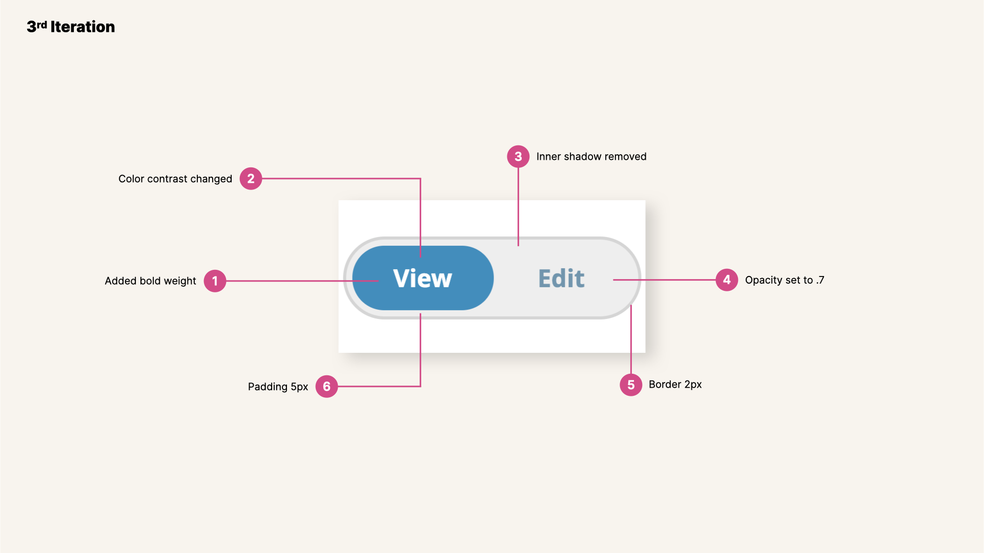
View of View Edit switcher, third iteration.
We were closer after each testing session. Results from third iteration showed a clear path now, based on feedback gathered: we needed to work a bit more on color contrast, for both text and switcher, as well as animation easing. Summing up, simplify design as much as possible.
View of View Edit switcher in a live prototype, fourth iteration.
Result
Final iteration and result: Change state switcher
Last step involved addition of icons, instead of text, and final fine-tunning of animation easing.
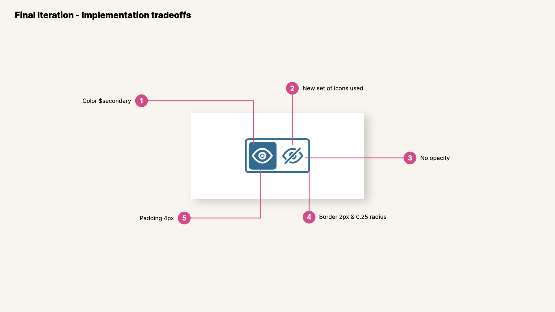
View of View Edit switcher, final iteration.
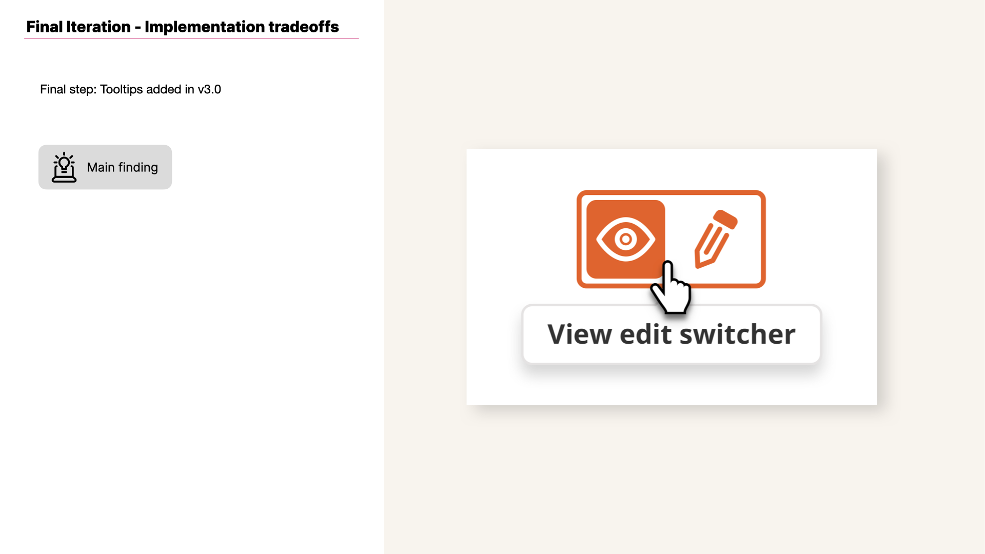
View of View Edit switcher, final iteration with tooltips added.
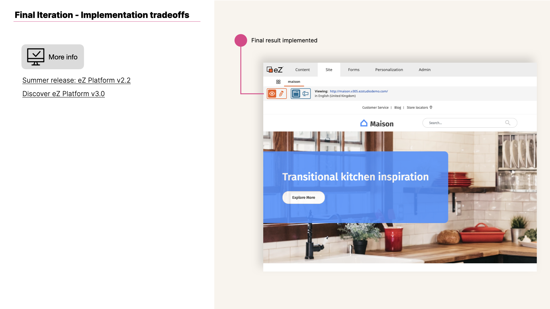
View of View Edit switcher, final iteration and implemented.

Gif of View edit and Page fields switchers with tooltips implemented in eZ Platform v2 that enable Editors to edit content items in a dynamic format (tooltips added in v3.0).
More information about this feature on
Ibexa's blog posts Summer release eZ Platform v2.2 and Discover eZ Platform v3.0
Related content
