Improving UX for Editorial Teams
This feature improvement placed content at the center of the editorial experience
Company: Ibexa - eZ Systems
Year: 2015-2020
Background
This is a case of a customer request asking for a specific improvement that we ended up adding it to the product.
Customer is in News industry, with a large editorial team and spending extensive time working on content in the platform.
Challenge
Led the adoption of user-testing tools and user-testing and increase Product Management’s team capabilities in this area.
What is Ibexa's eZ Platform?
eZ Platform is a Digital Experience Platform (DXP) created by Ibexa that helps B2B companies to stay relevant and succeed by transforming traditional sales strategies into frictionless buying experiences. This DXP is ideal for large enterprises working on complex projects requiring several languages, with numerous sites, and multiple content types.
Ibexa's eZ Platform offers the ability to build interactive sites, pages and views and deliver multisite, multichannel and multilingual websites and apps. It gives organizations the control to create, and structure their content, reuse it and present it differently from a single location. It also provides a granular configurable system for user permissions, which allows organizations to set specific access rights for users and roles across all features.
Constraints
- Ibexa's eZ Platform gives developers a highly extensible platform for building content-rich websites, upgradeable and easy to integrate. This great value added from the technical side implies that all features and design improvements have to include both customization and extensibility approaches;
- All implementations of enterprise instances are done by the partner network or in-house by customer’s own team, but when a fixup or a feature improvement is raised by them, Product Support and Product Management teams can work together along with stakeholders involved.
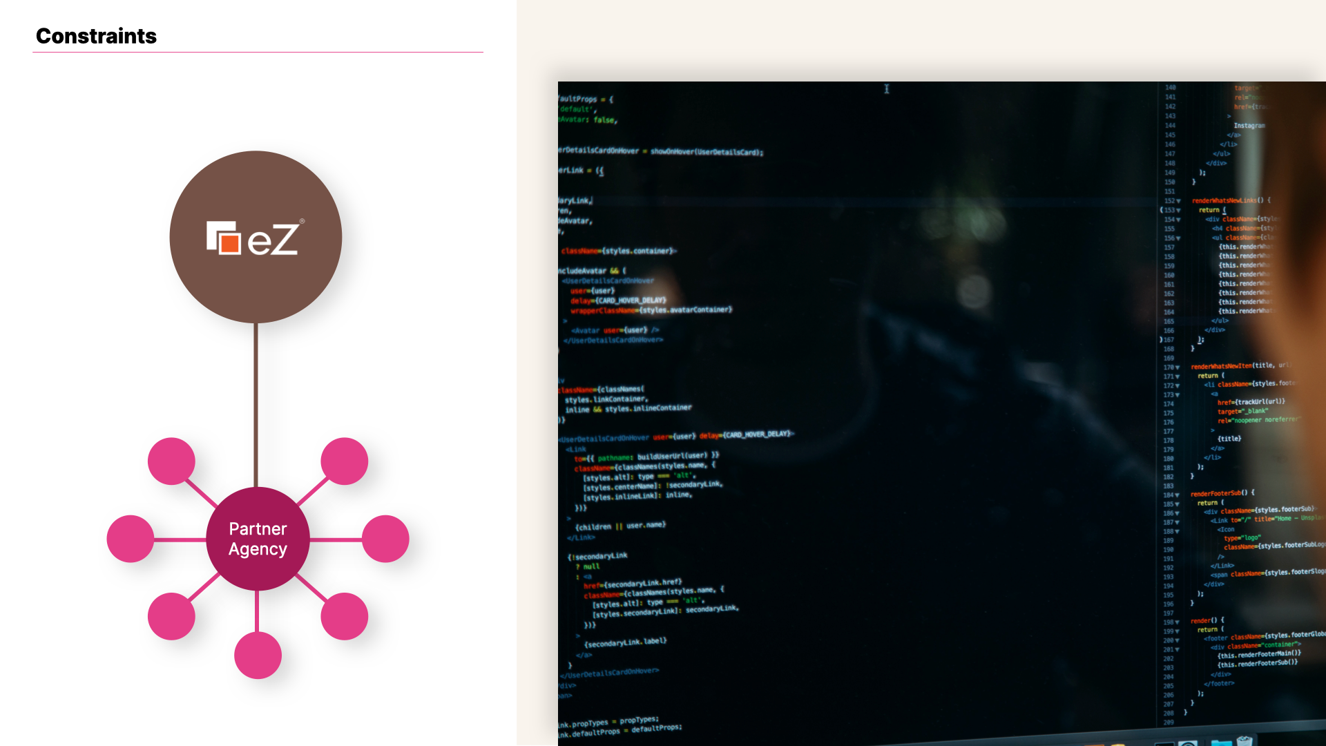
View of online editor constraints and problem framing.
My Role

- As part of my role as UX/UI Designer at Ibexa, I led the implementation of user-testing actions adapted to Ibexa's eZ Platform needs and constraints;
Issue
Some background on the customer
This case exemplifies the work with Enterprise customers and the contribution of my role to this process.
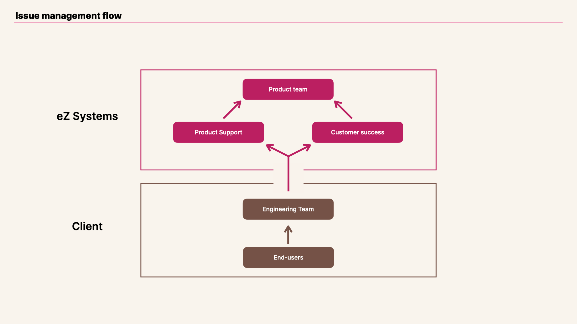
View of issue flow when a customer request involved Ibexa's Product Management team.
Editors were the main personas affected by this pain point.
Their feedback was quite simple but sharp: When creating or editing content the contextual Paragraph toolbar is inhibiting basic editorial tasks and hence was annoying the team. They also asked if the toolbar could behave more like a standard Alloy.
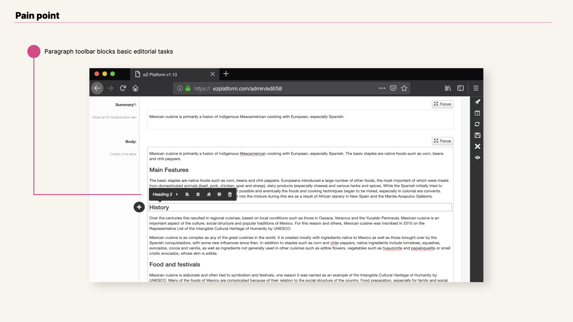
View of online editor v1 pain point.
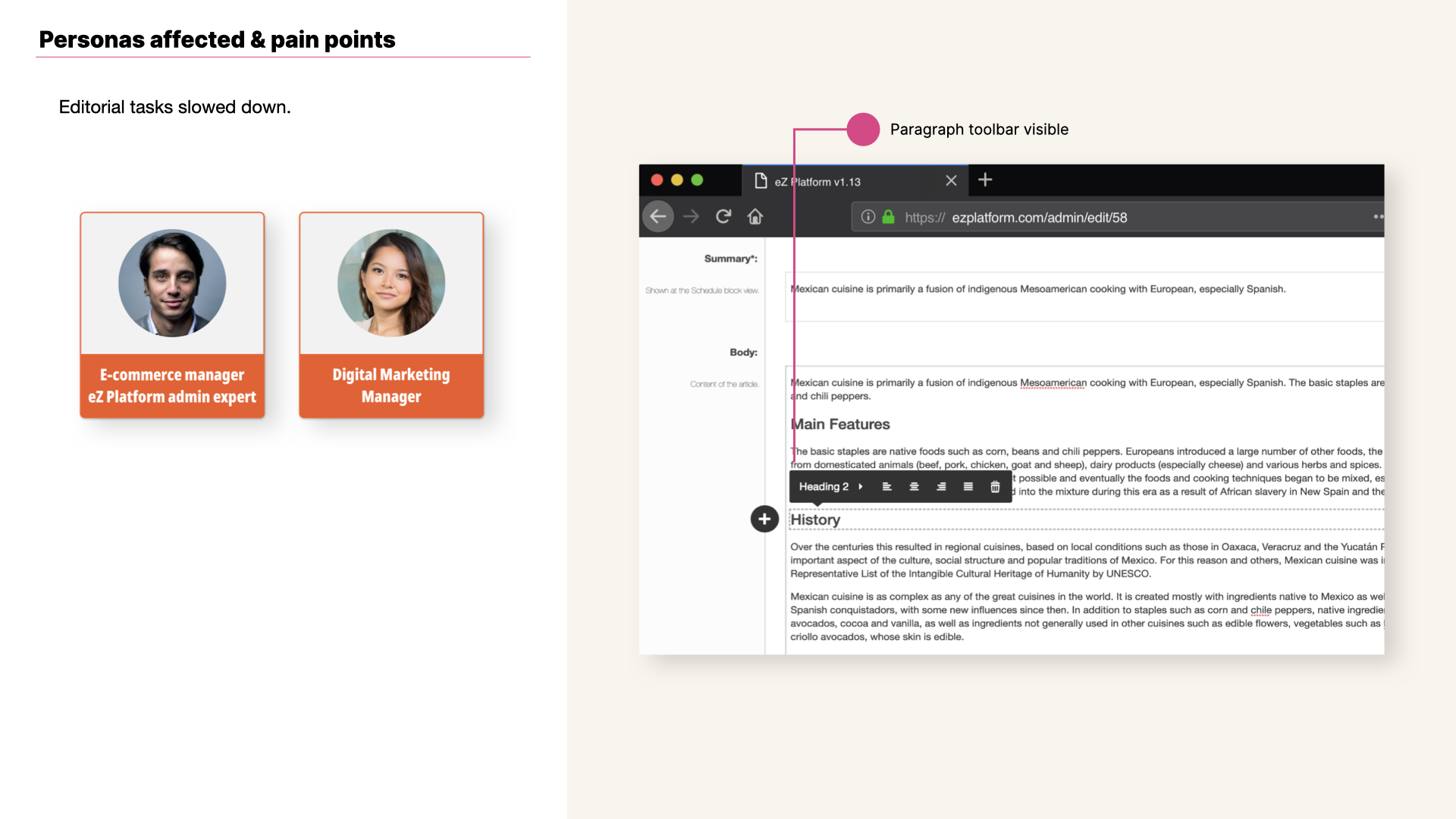
View of online editor v1 pain point and persona.
Some background on the Online Editor, and it’s usage of Alloy
Just in case you are not 100% familiar with this editorial tool, I believe it is worth focusing briefly on providing some background about the Online Editor, Ibexa's eZ Platform RichText Editor. This editorial feature it is based on Alloy Editor, which in turn is based on CKEditor. When Ibexa decided to adopt Alloy, it was clear that it would need to include advanced capabilities for editorial tasks common to eZ Platform’s editor personas.
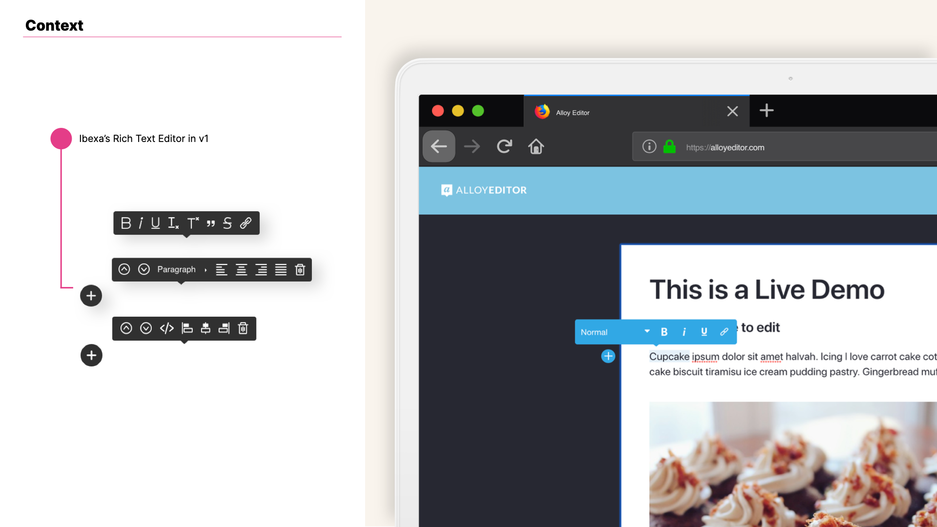
View of Ibexa's online editor v1 and demo view of Liferay's Alloy Editor.
Testing
User testing is something you ideally never stop doing
Almost in parallel to the issue that customer reported in regards to the toolbar I had already been running a series of user testing sessions and this issue was also turning up. The major pain point detected showed users clicking above the paragraph they were working on to move the toolbar up to be able to read the content just written (a very usual task when editing or creating content).
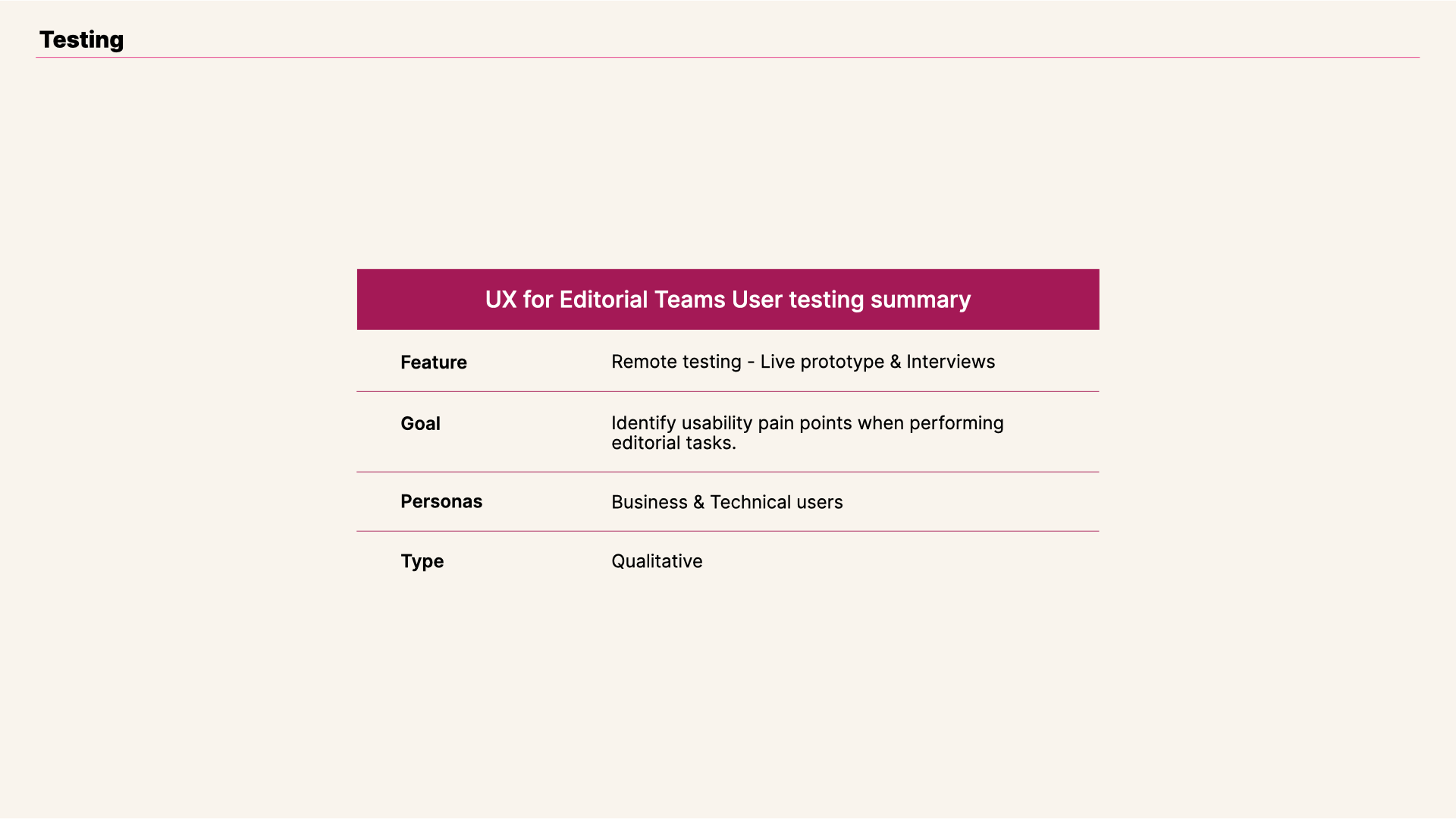
View of online editor testing summary.
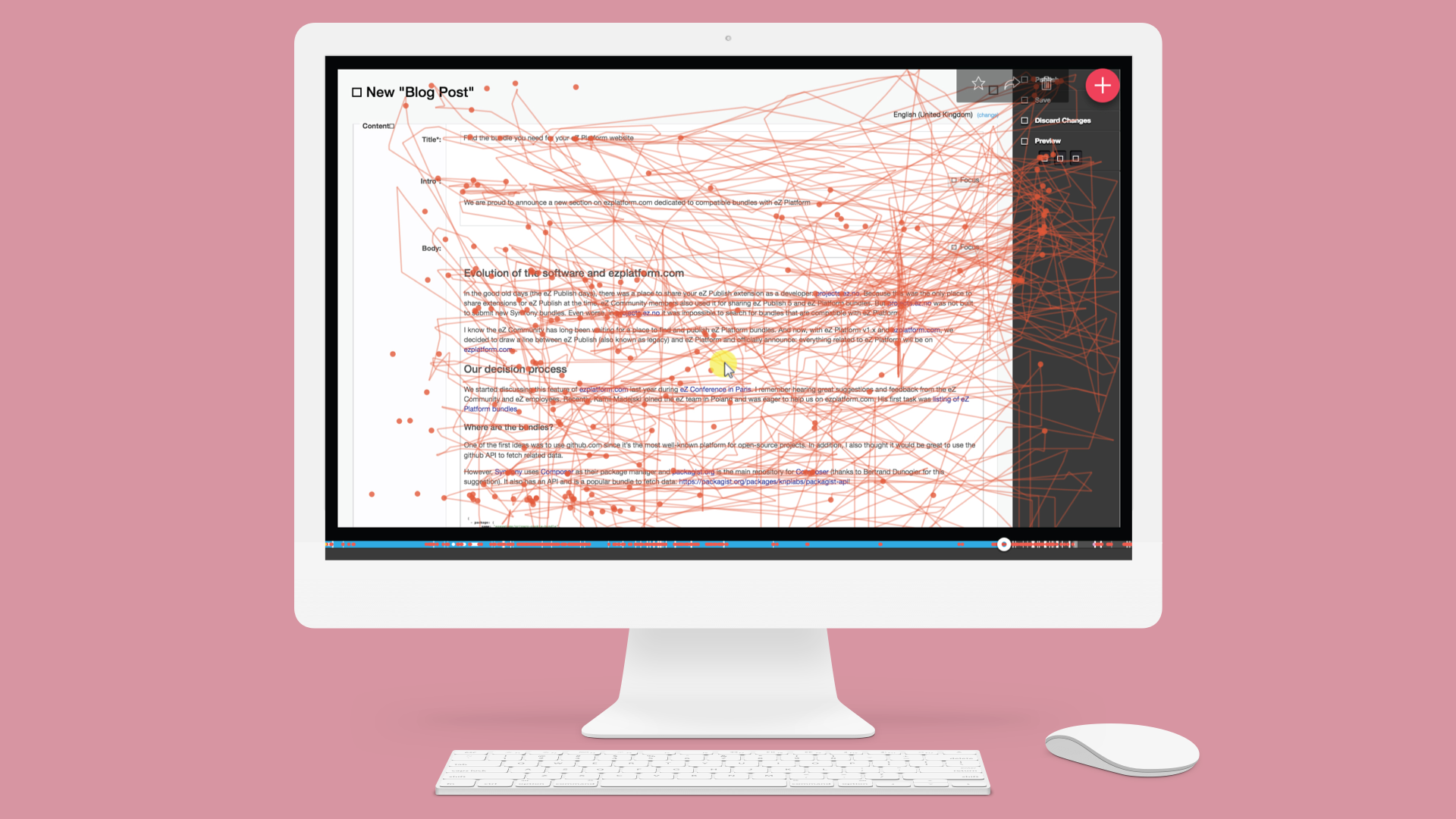
A common use case showed a user clicking an average of 25 times for a long editing workflow, about 45 minutes. Users' tricks to avoid the Online Editor toolbar? Clicking on two paragraphs above; clicking one paragraph below; or clicking outside of the Input Rich Text box, as seen on the clicks on the right toolbar.
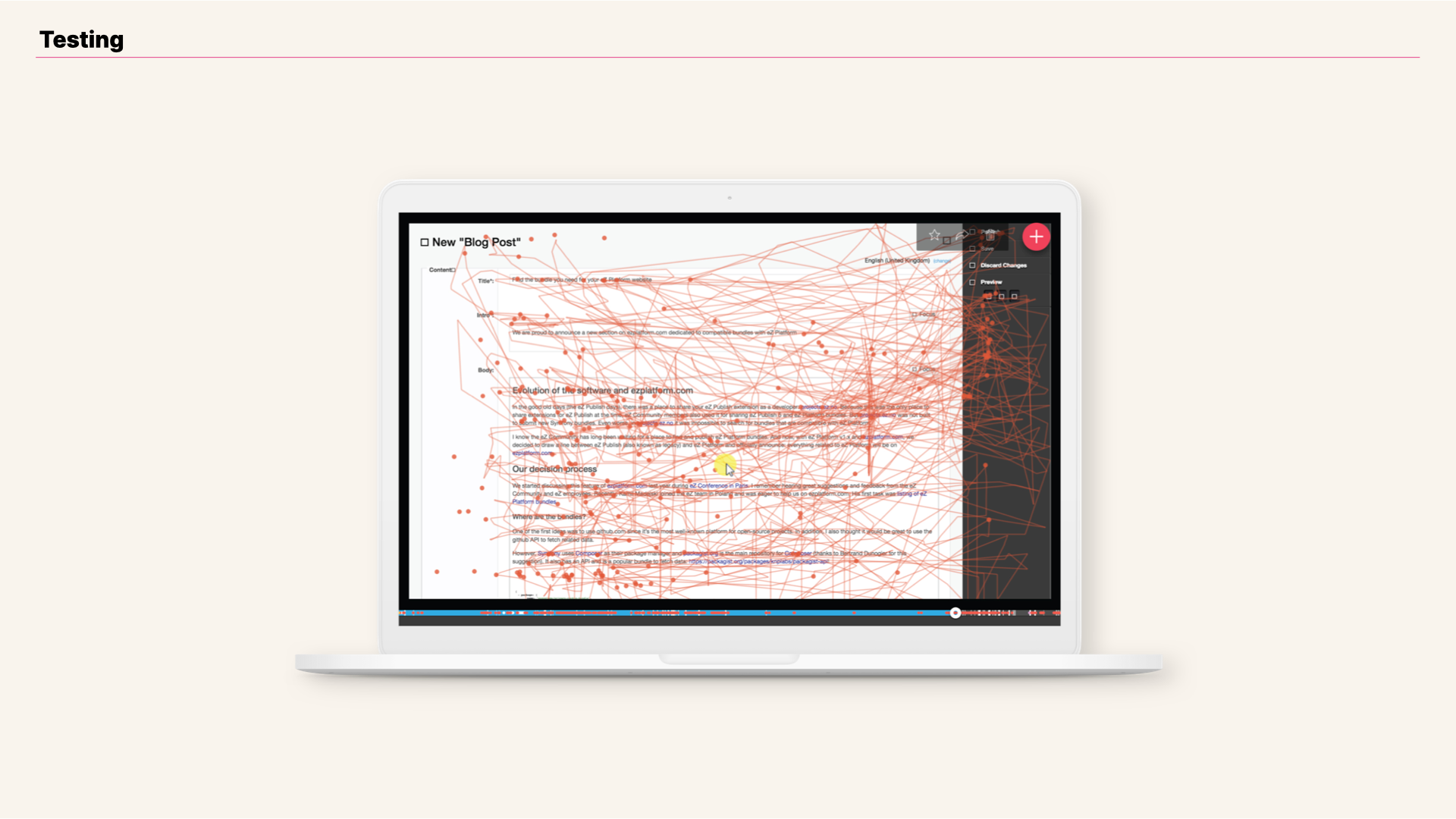
View of user testing flow for a long editorial workflow (~45 minutes), showing all interactions performed so far.
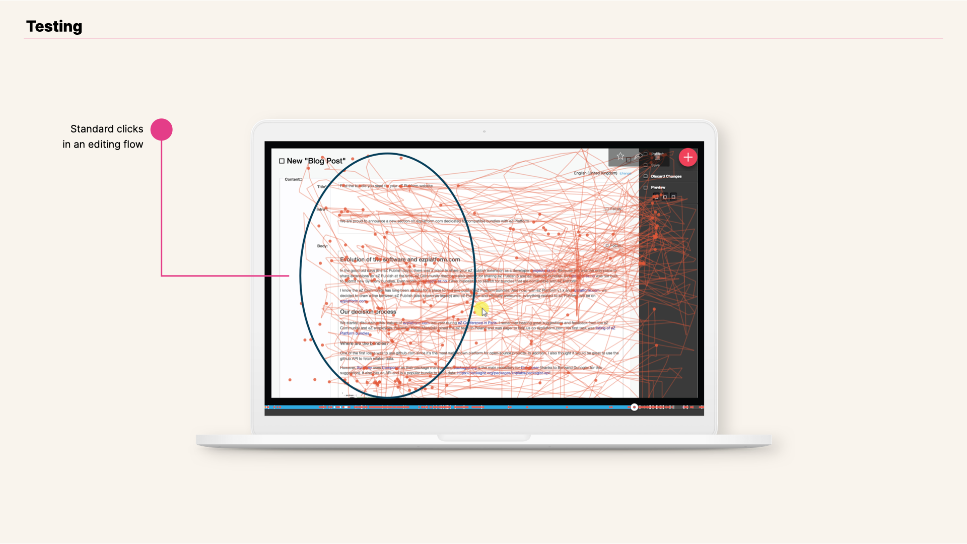
View of online editor testing session, regular clicks highlighted.
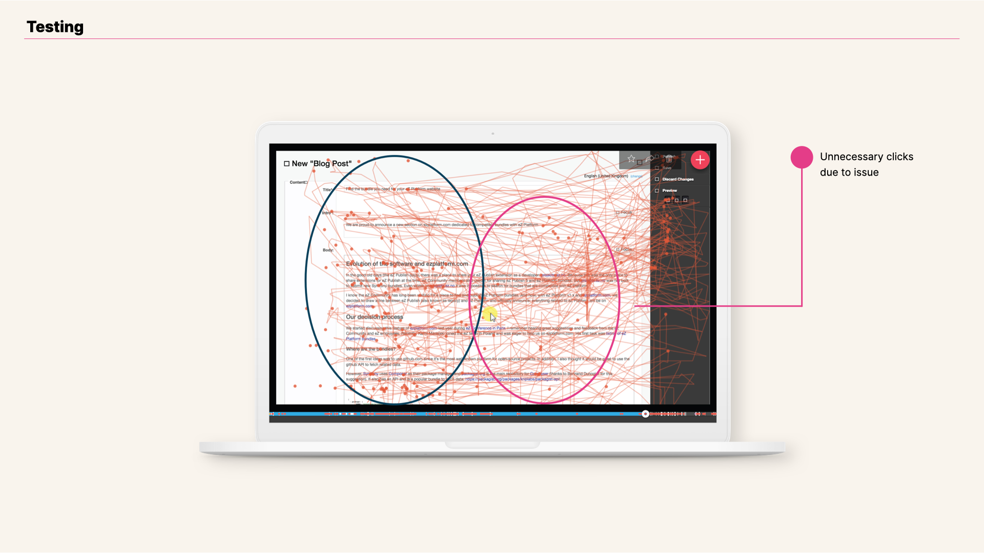
View of online editor testing session, extra clicks highlighted.
So when the customer request came through, Customer Success and Product Support Departments, along with Product Team members —me included— were ready to work together with them. We already had the background knowledge of what was the customer’s real issue.
Results
Streamlined User Experience with Ibexa's eZ Platform v2
Short-term satisfaction, mid-term solution
To address our customer’s feedback we decided to split the efforts into two scopes—one short-term for v1.13 that customers could pull, and one mid-term for v2.
For v1.13, we sought out a few different approaches:
- Introduce larger margins between blocks and slim down the toolbar to fit within those margins;
- Hide the toolbar while typing.
However, after iterating with our customer’s team and testing them, both of these approaches proved to be clunky or janky. So in the end, we looked into attaching the toolbar to the top of the editor, which proved we needed to handle cases where the top of the editor is not visible within current browser view.
The final resolution, which the customer was satisfied with, is the following:
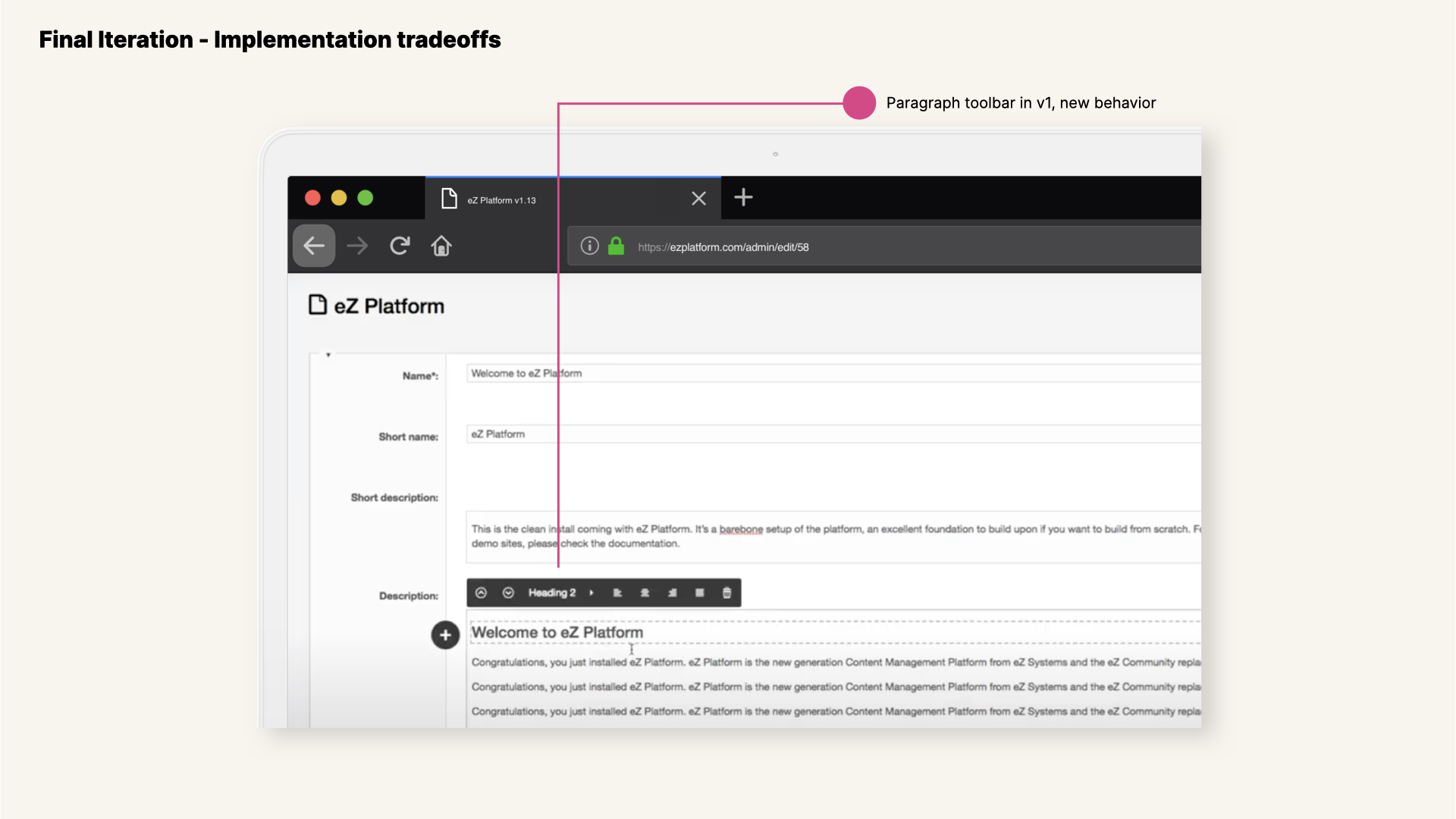
View of final solution in Online Editor v1.13.2 - Paragraph toolbar now positioned on top of the editor view.
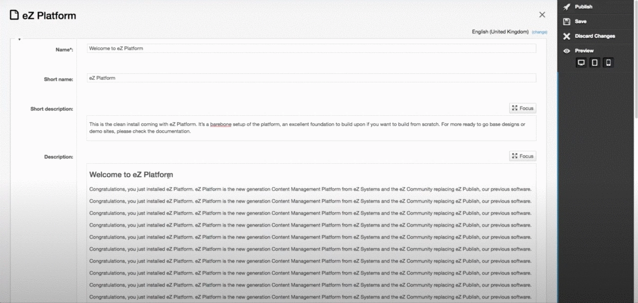
Gif showing behavior of Online Editor v1.13.2 after fixup - Paragraph toolbar now positioned on top of the editor view.
Knowledge management on editorial needs and how to plan for upcoming versions
Editorial UX is a key driver in the choice of a CMS. That’s why ease-of-use and speed, including for the Online Editor, was the main focus for the next improvements added to that Fast Track release and the following ones.
The feature improvements targeted in the Fast Track releases relied on placing content at the center of the editorial experience. This is one of the most important aspects I have learned from the exchange with this specific customer in the News industry but also with customers in other domains—and it’s something I truly agree on.
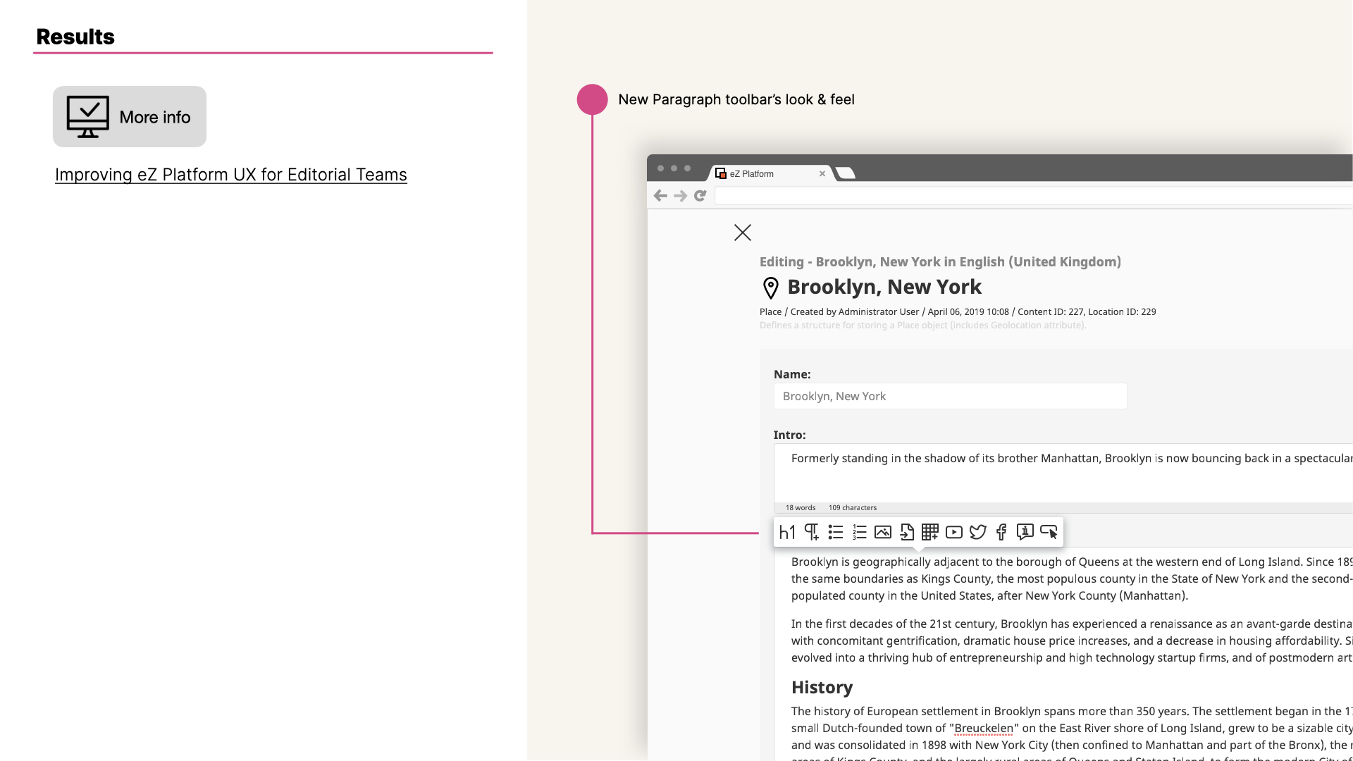
View of online editor final solution implemented.
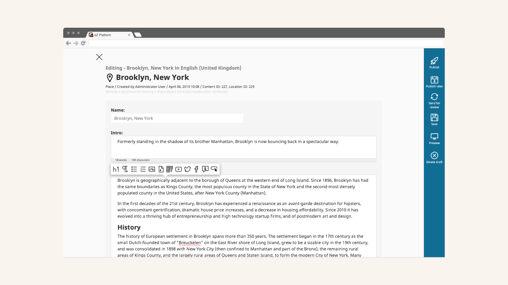
View of Rich Text styling toolbar in version 2.
