Design revamp of browsing feature
Improved UX when navigating and selecting content in Ibexa's eZ Platform
Company: Ibexa - eZ Systems
Year: 2015-2020
Background
Universal Discovery Widget was the dedicated feature for Editors since Ibexa's eZ Platform v1 for navigating the content repository and finding and selecting content items.
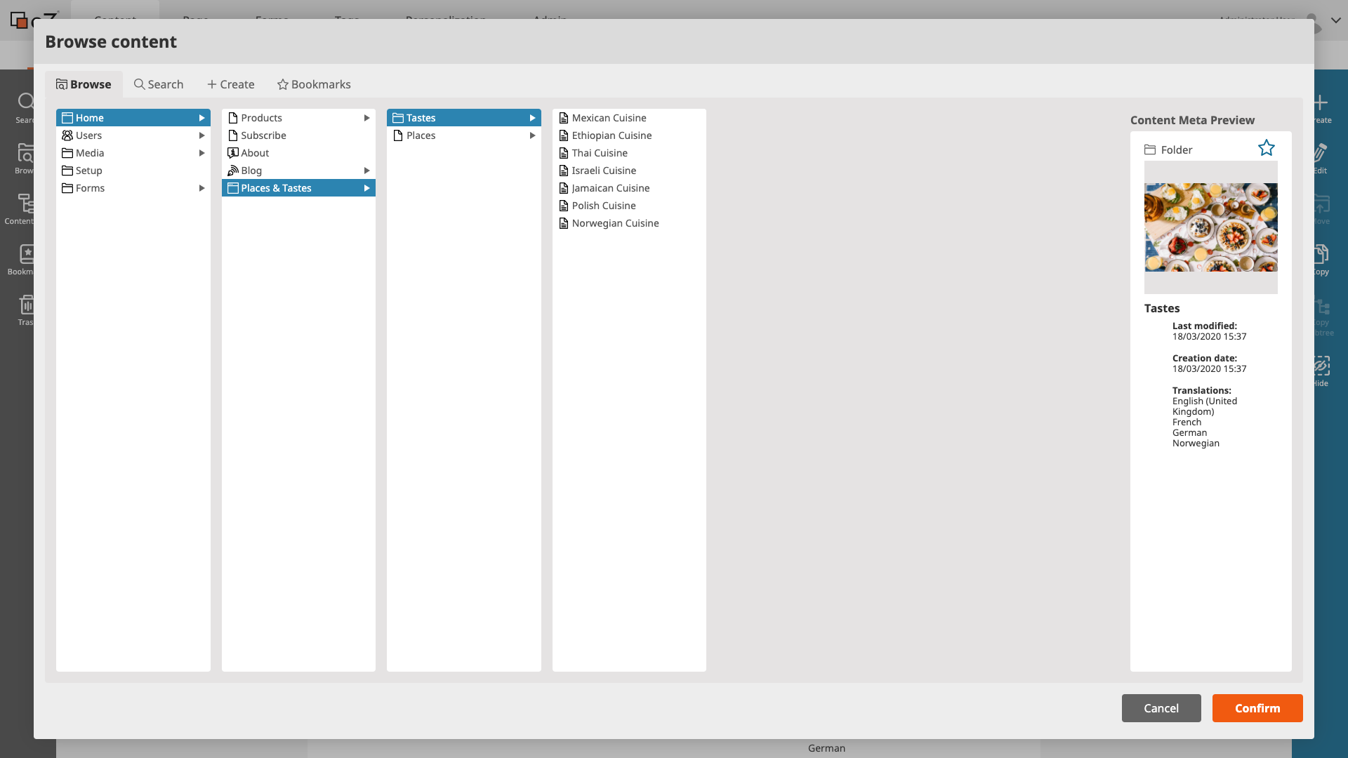
View of Universal Discovery Widget in Ibexa's eZ Platform v1.
What is Ibexa's eZ Platform?
eZ Platform is a Digital Experience Platform (DXP) created by Ibexa that helps B2B companies to stay relevant and succeed by transforming traditional sales strategies into frictionless buying experiences. This DXP is ideal for large enterprises working on complex projects requiring several languages, with numerous sites, and multiple content types.
Ibexa's eZ Platform offers the ability to build interactive sites, pages and views and deliver multisite, multichannel and multilingual websites and apps. It gives organizations the control to create, and structure their content, reuse it and present it differently from a single location. It also provides a granular configurable system for user permissions, which allows organizations to set specific access rights for users and roles across all features.
Issue
We received very interesting feedback from users that highlighted sensitive pain points and also feedback that wanted to take this key feature further.
One of the recurring feedback comments we got was "too many clicks": Every user of eZ Platform wants to create, edit and navigate as fast as possible.
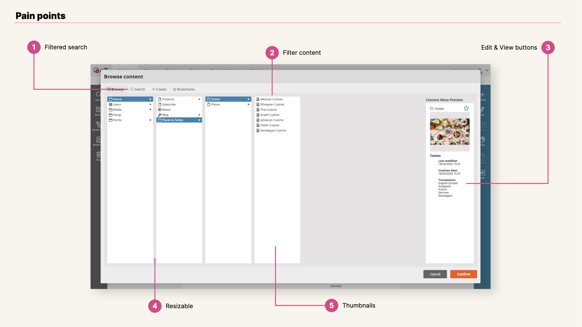
View of Universal Discovery Widget v1 pain points.
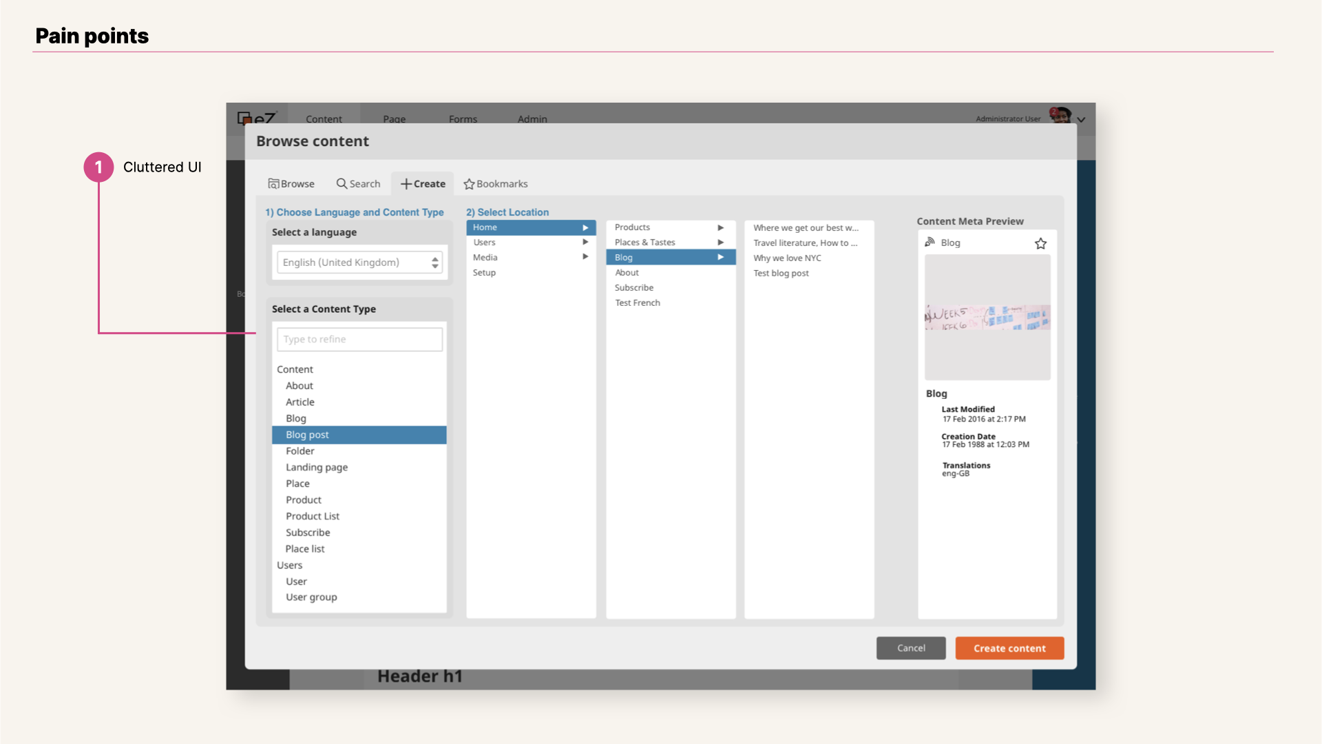
View of Universal Discovery Widget v1 pain points.
Constraints & Personas
- Ibexa's eZ Platform v2 gives developers a highly extensible platform for building content-rich websites, upgradeable and easy to integrate. This great value added from the technical side implies that all features and design improvements have to include both customization and extensibility approaches;
- Universal Discovery Widget in eZ Platform v2 was designed based on two main personas: Technical user, who adapts, customizes and manages the content platform setting workflows, permissions and roles for platform’s users; and Business user, who can have an advanced knowledge of the application and has a prominent role within the application setup; Here we include Editors, who create, modify and distribute content throughout the application’s channels based on role and permission defined for her tasks.
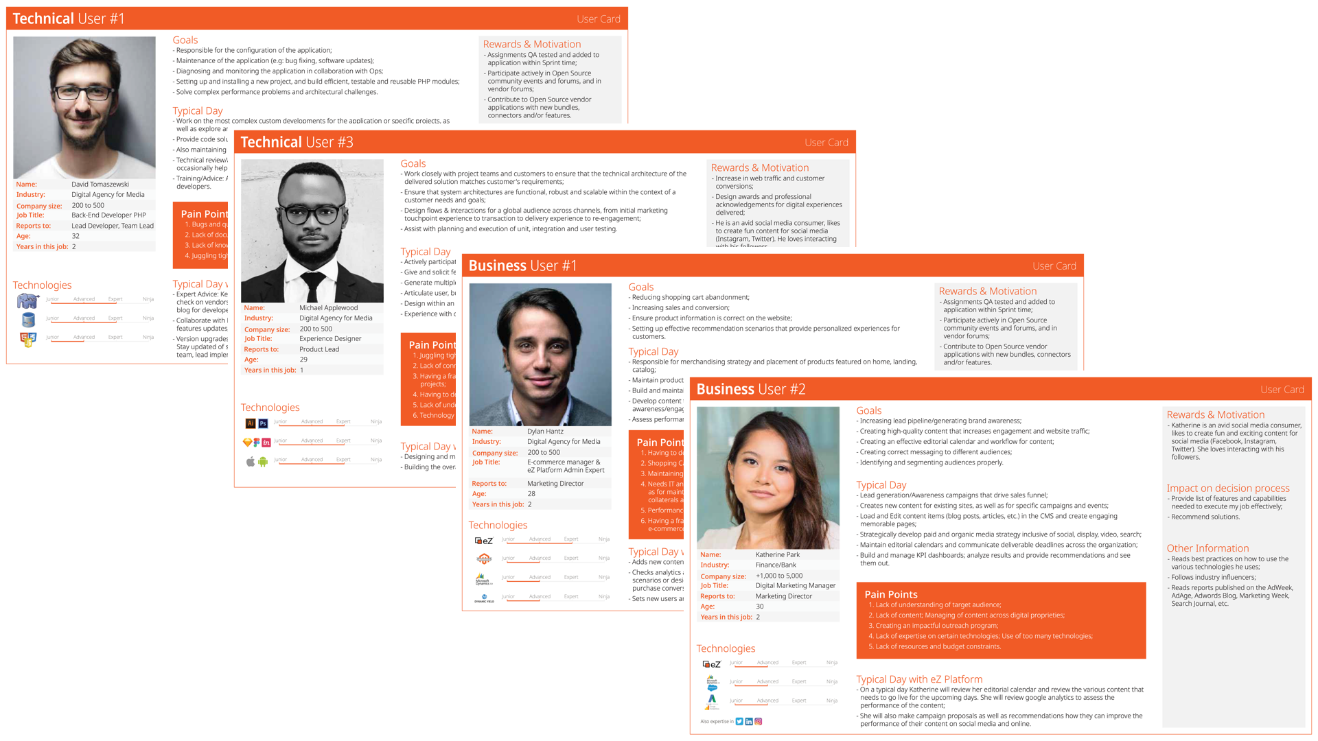
View of Universal Discovery Widget Personas.
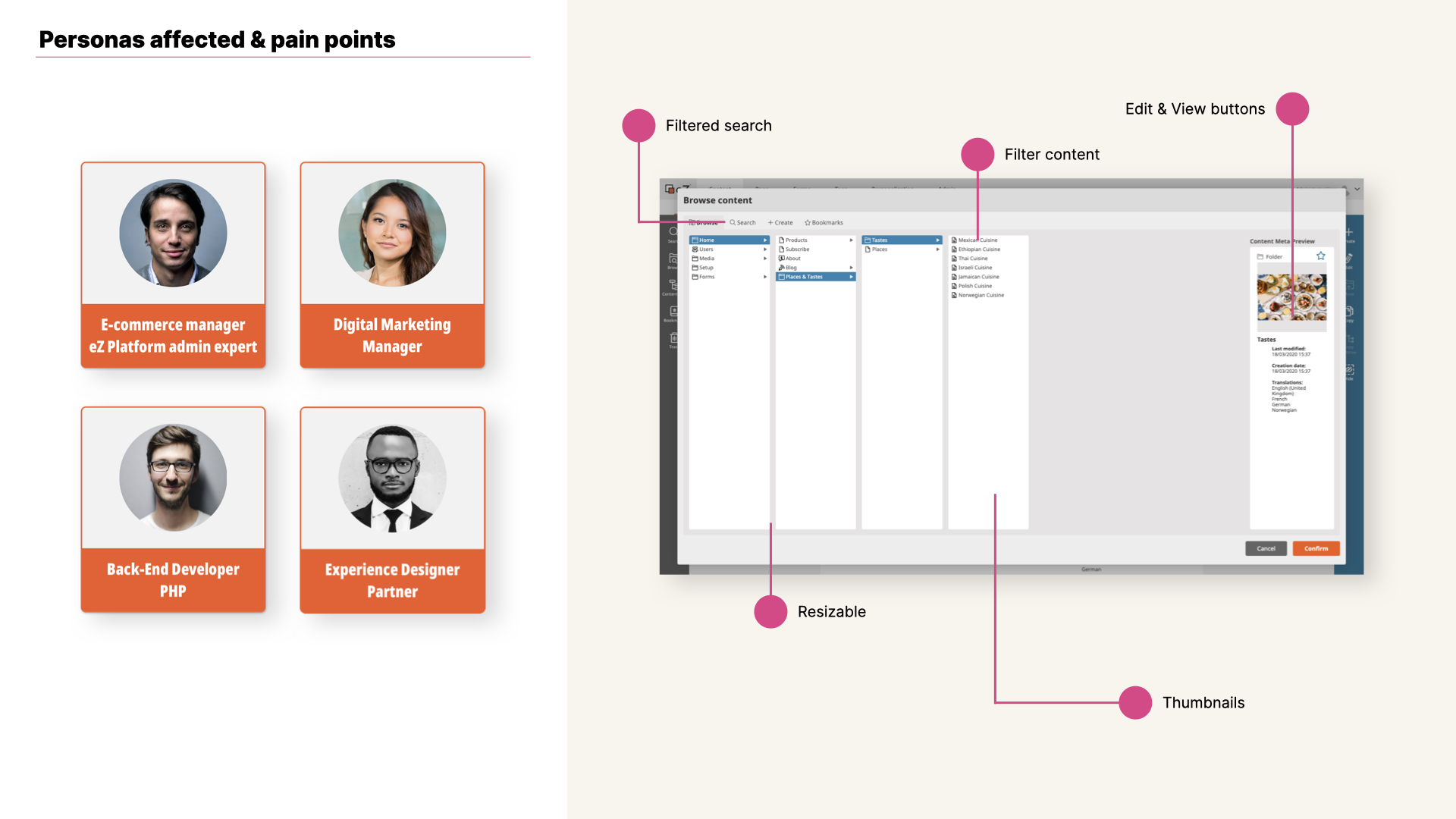
View of Universal Discovery Widget v1 along with Personas and pain points.
My Role

- Applied standards for navigation across the different interfaces.
- Work based on predefined UI Guidelines as well as Library of components (Sketch, InVision).
- User tested new features and designs, as well as micro interactions added to the browsing widget.
- Simplified browsing and content creation process and emphasize the important of patterns for a key feature in a CMS.
- Contribute directly to the corresponding repositories with styling changes, as well as bug fixing contributions.
Iterations
We knew that the revamp of this feature it was going to have a substantive impact on Ibexa's Platform users. We kicked off the design work with enough time ahead. There were interesting discussions about reusing existing components in the UI, as well as the potential addition of sub-features.
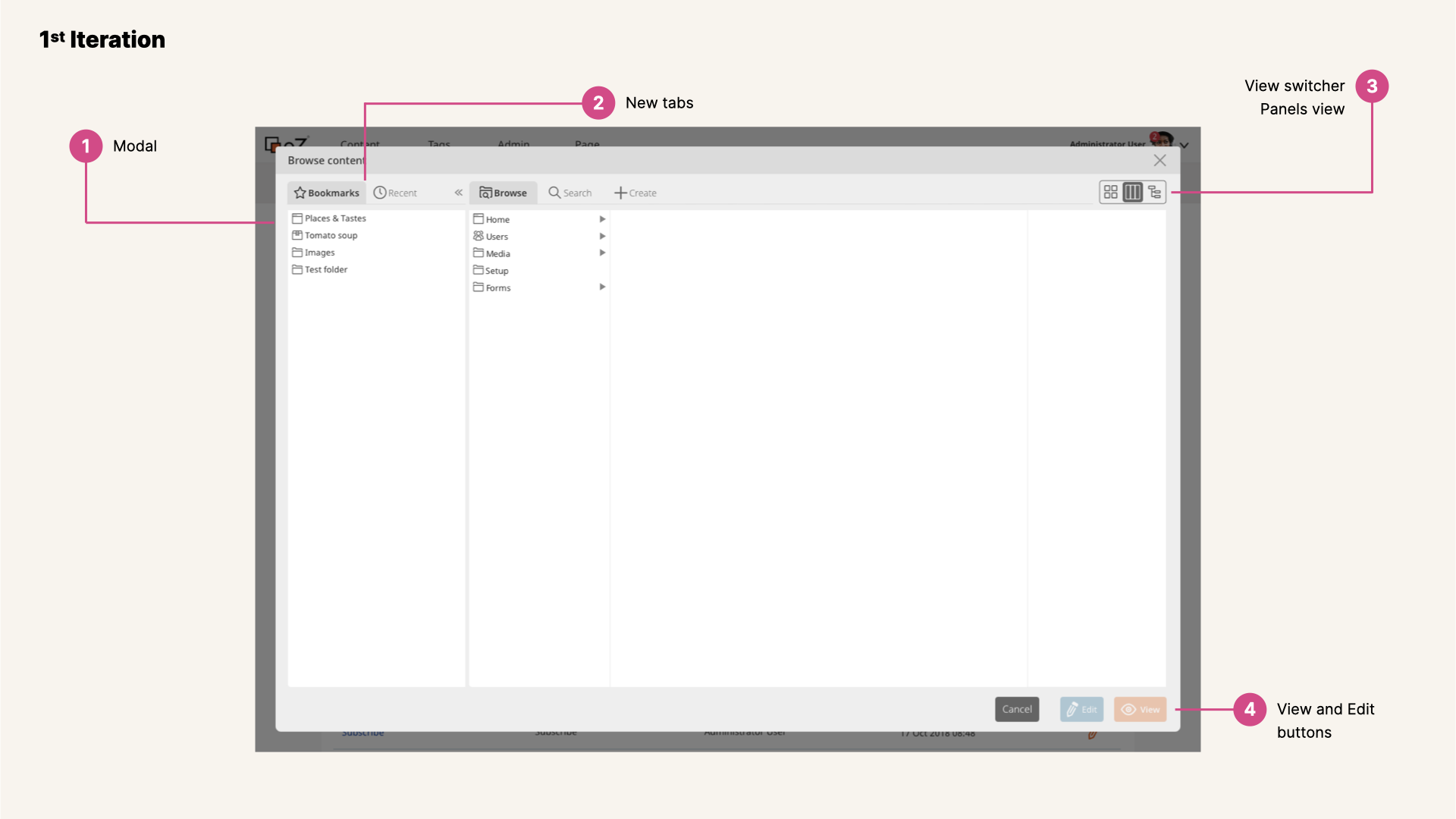
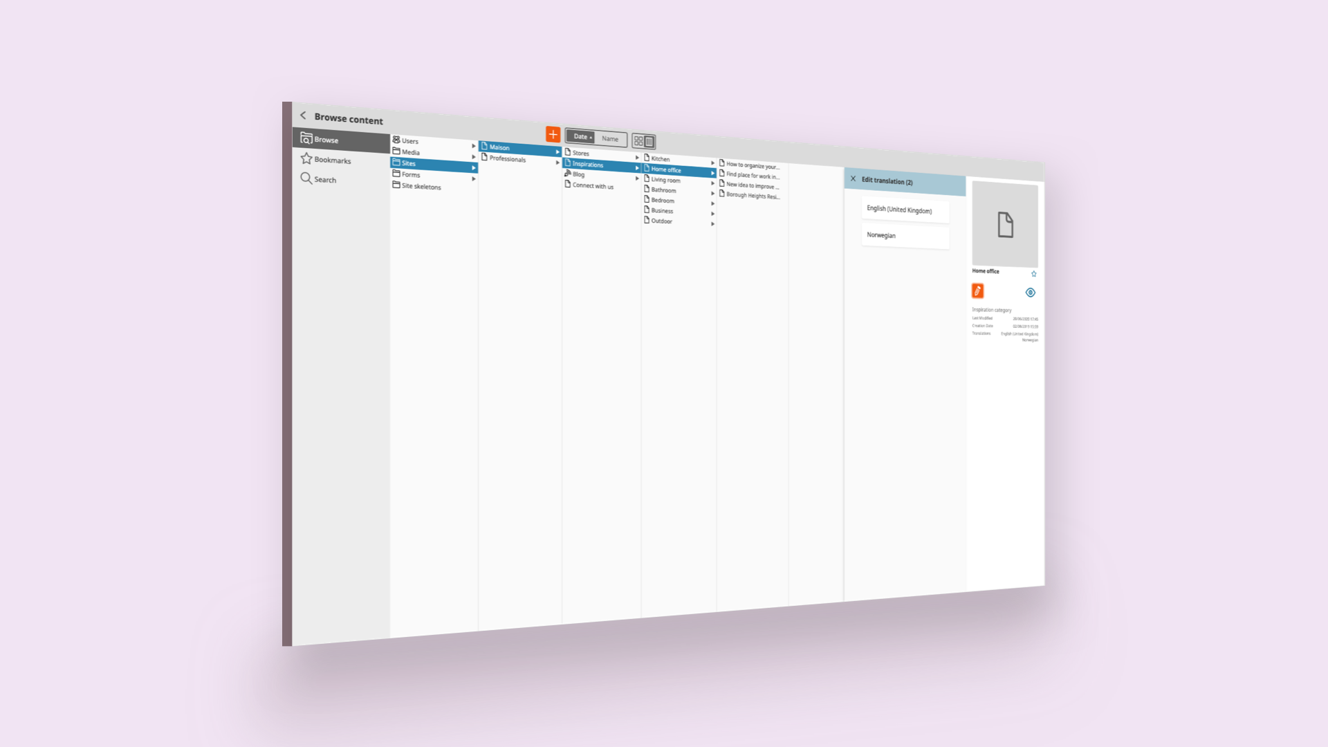
View of Universal Discovery Widget first iteration, browse view.
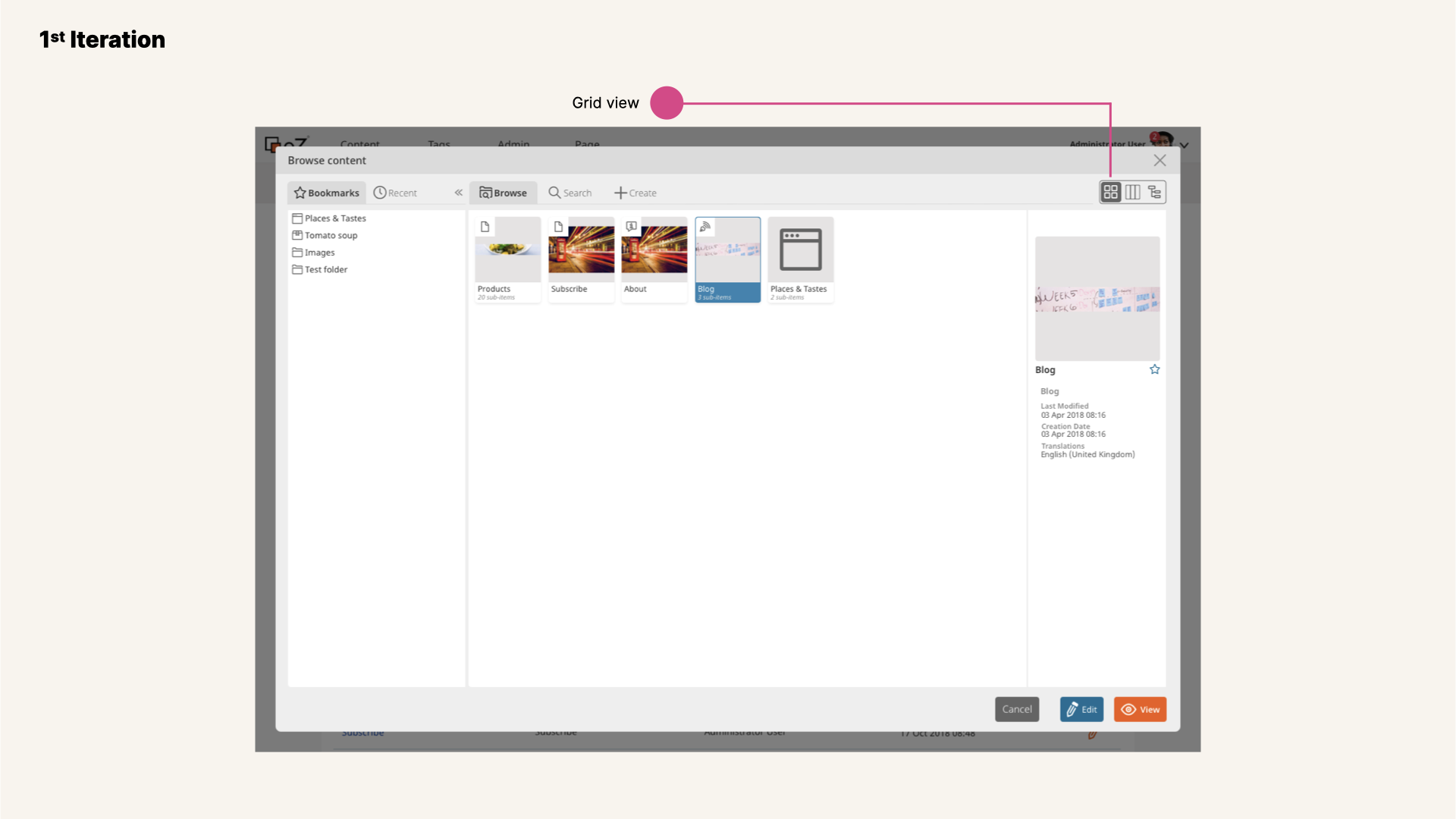
View of Universal Discovery Widget first iteration, browse view with grid view selected.
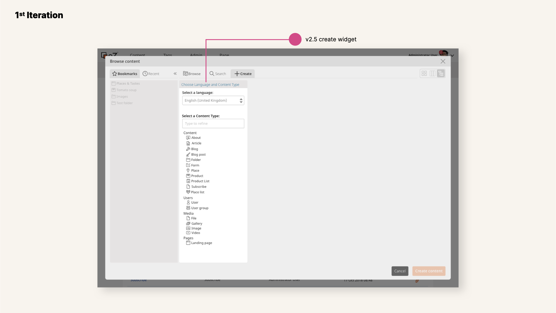
View of Universal Discovery Widget first iteration, create view.
A different redesign project was going to have an impact for this case. The redesign of widgets opened up a window of opportunity and improvement.
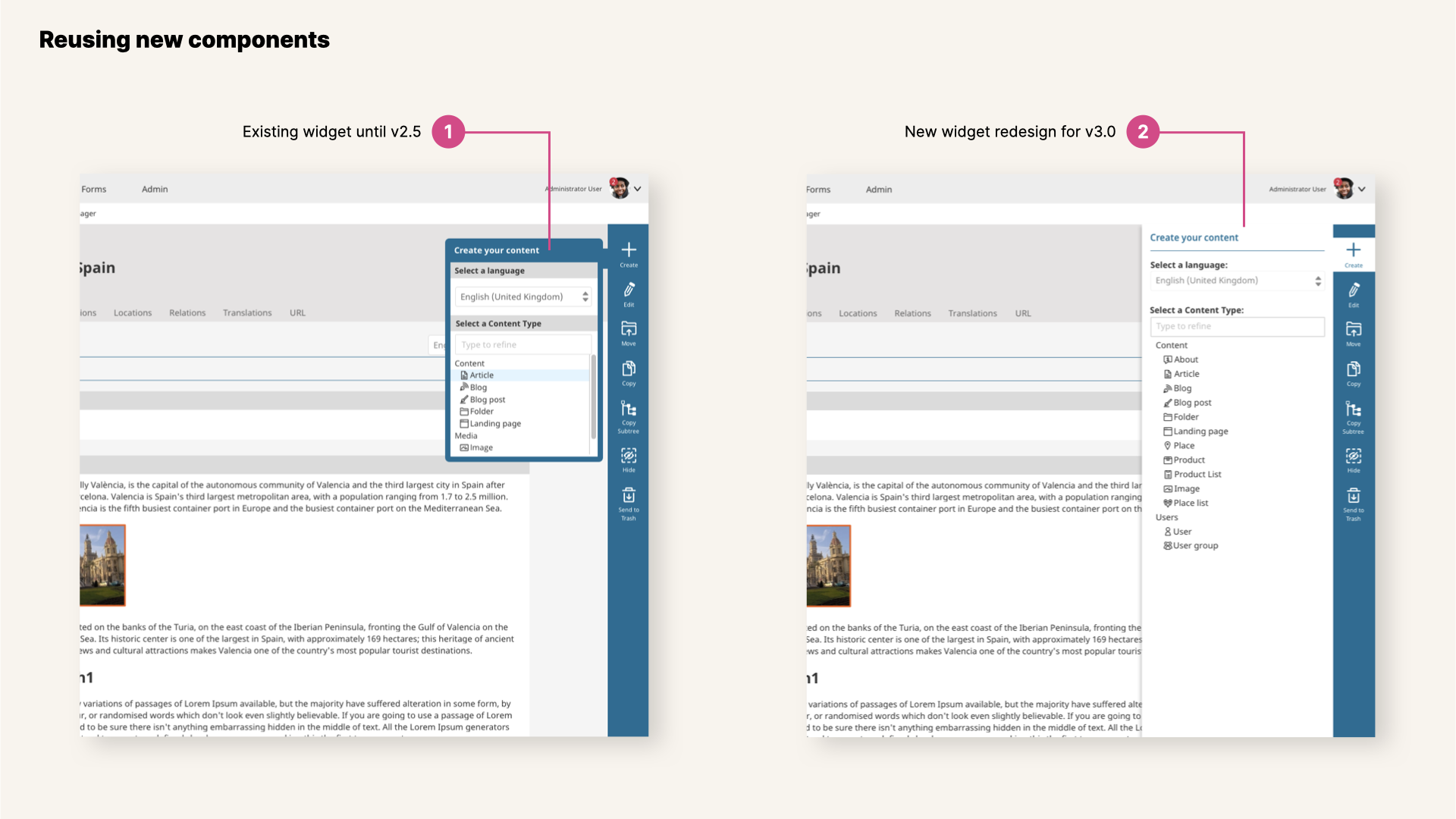
View of New components redesigned, view of create widget.
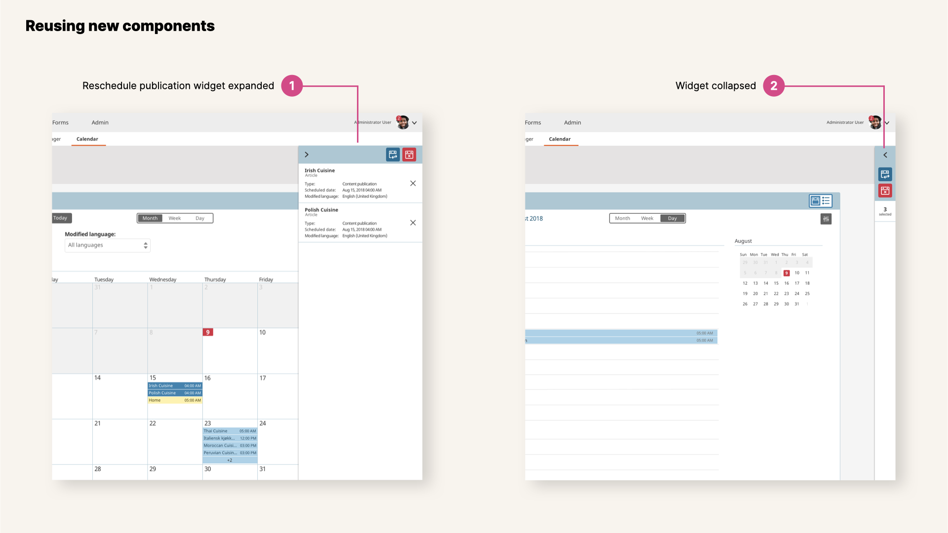
View of New components redesigned, view of multiple selection widget in Calendar view.
So we jumped onto the second iteration with a new and refreshed approach.
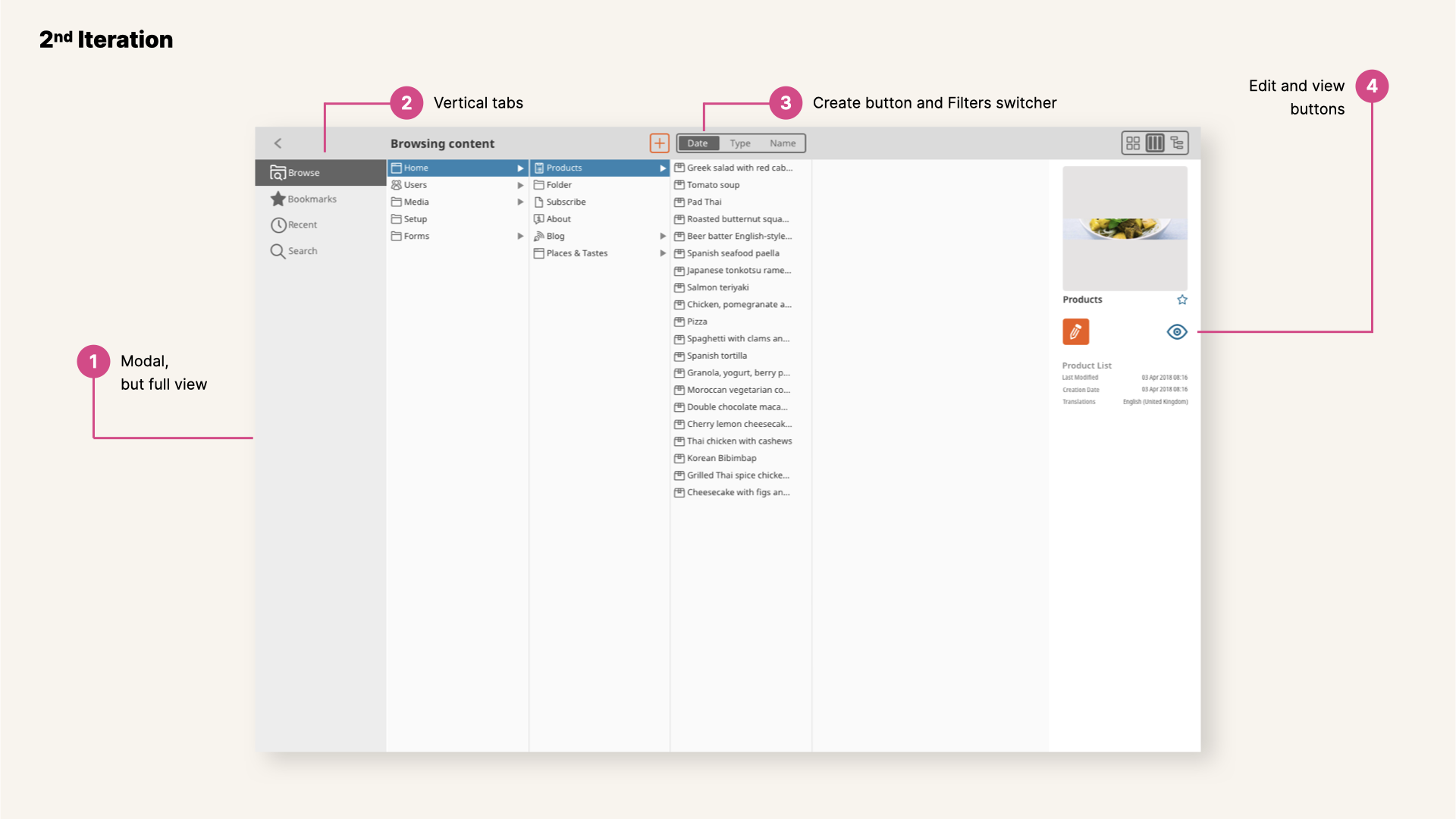
View of UDW second iteration, browse view.
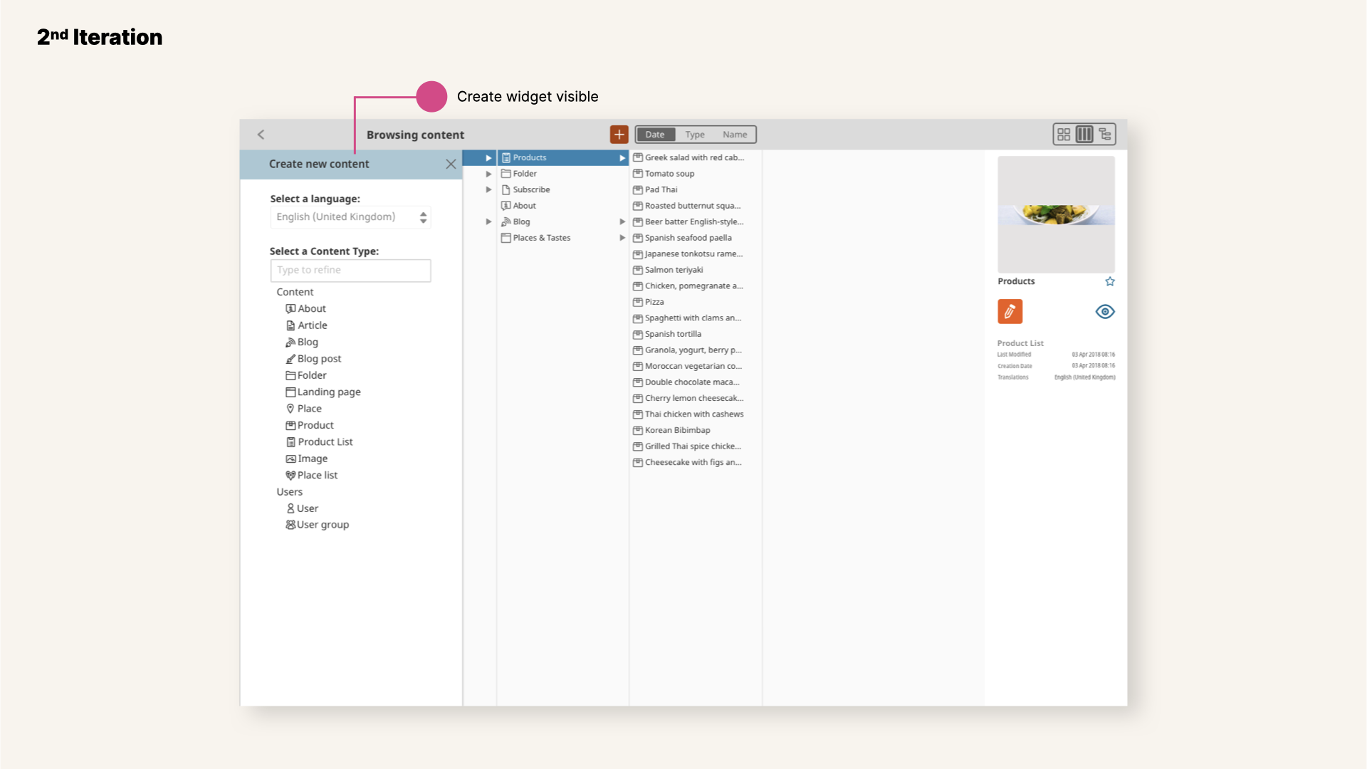
View of UDW second iteration, create view.
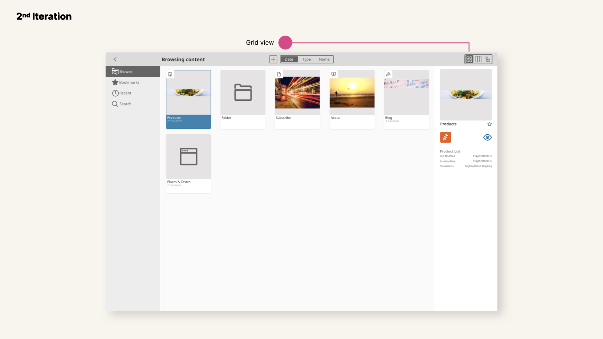
View of UDW second iteration, grid view.
Testing & Sketching
The time for the final round of iterations was close. We knew we needed more insights. So we listened to these users, conducted interviews and explored different options with one main objective in mind: how can we make eZ Platform faster to navigate? It led us to the final re-design of this browsing feature.
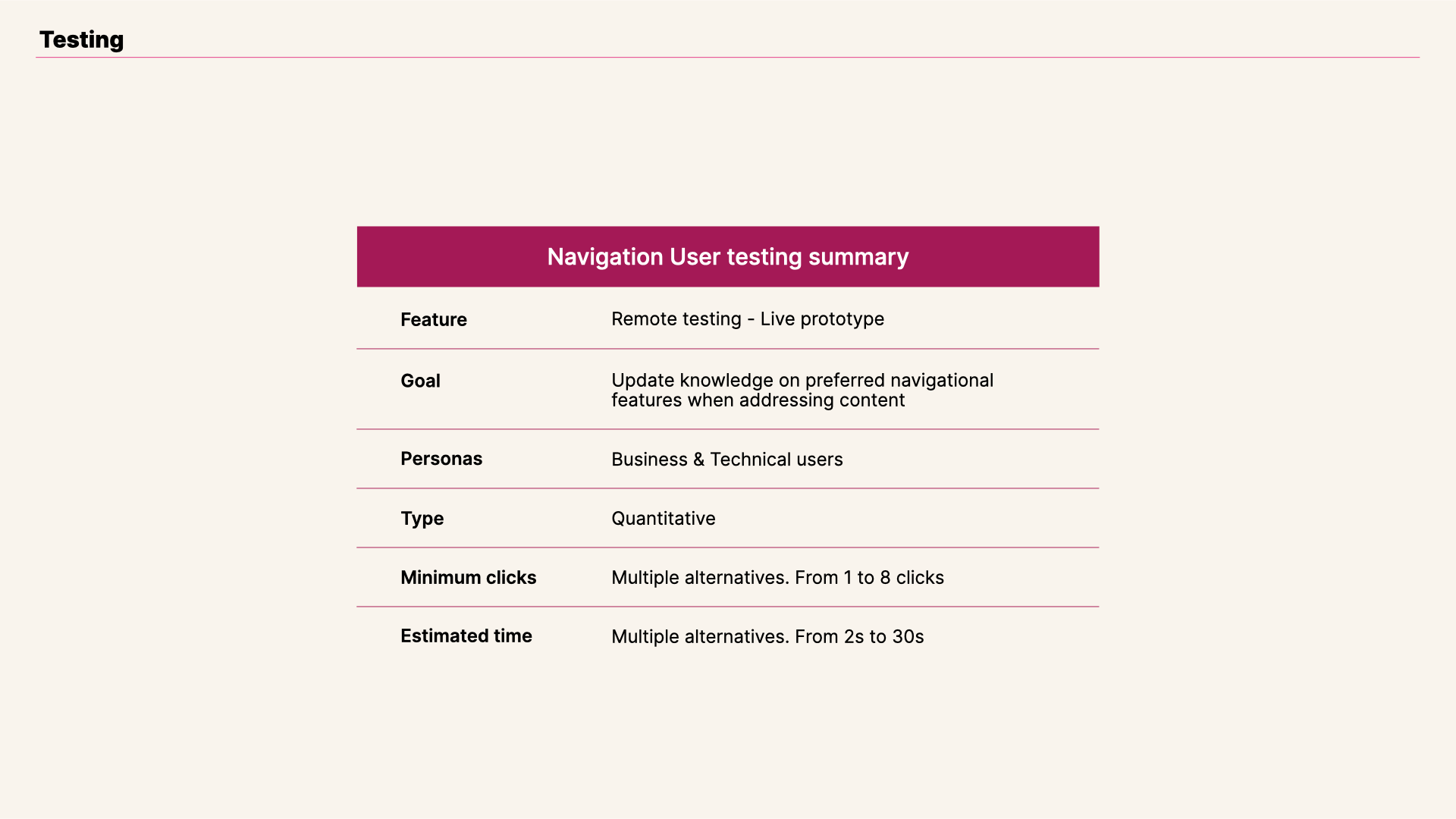
View of Universal Discovery Widget testing summary.
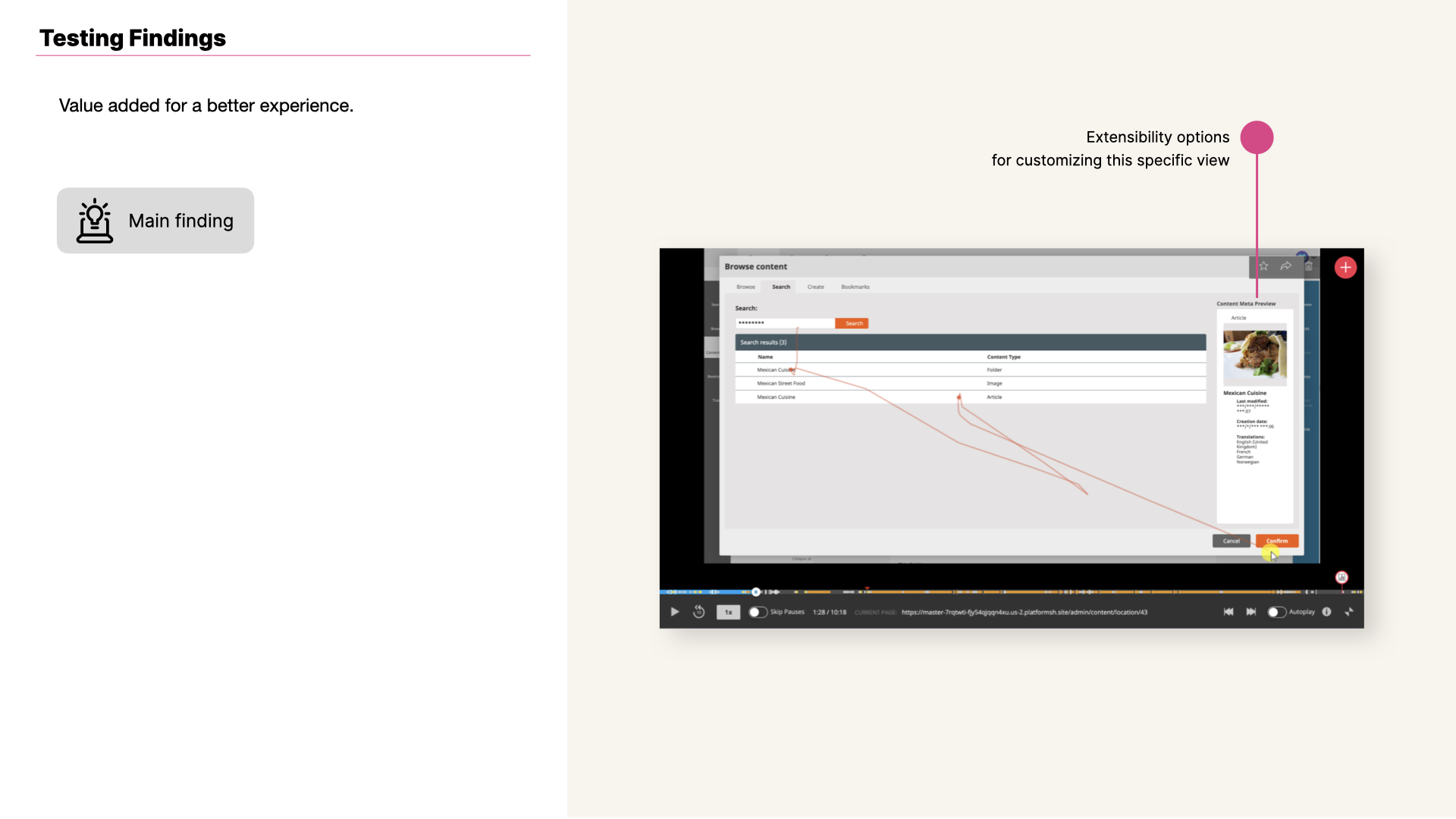
View of Universal Discovery Widget testing insight.
Universal Discovery Widget's search results view brings a lot of value to Ibexa's Platform users.
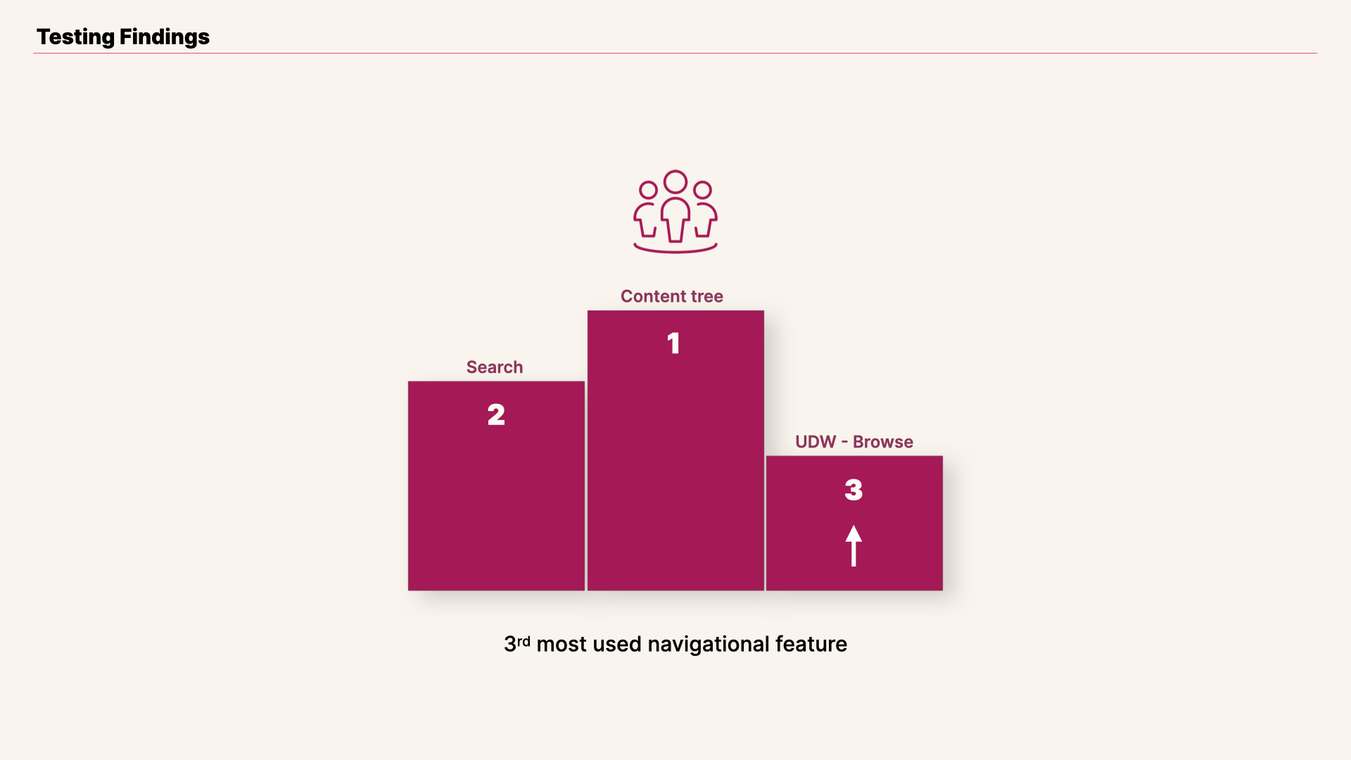
View of Universal Discovery Widget testing result.
Universal Discovery Widget is one of the most important navigational features in the application. With all the insights gathered we were ready for the final iteration.
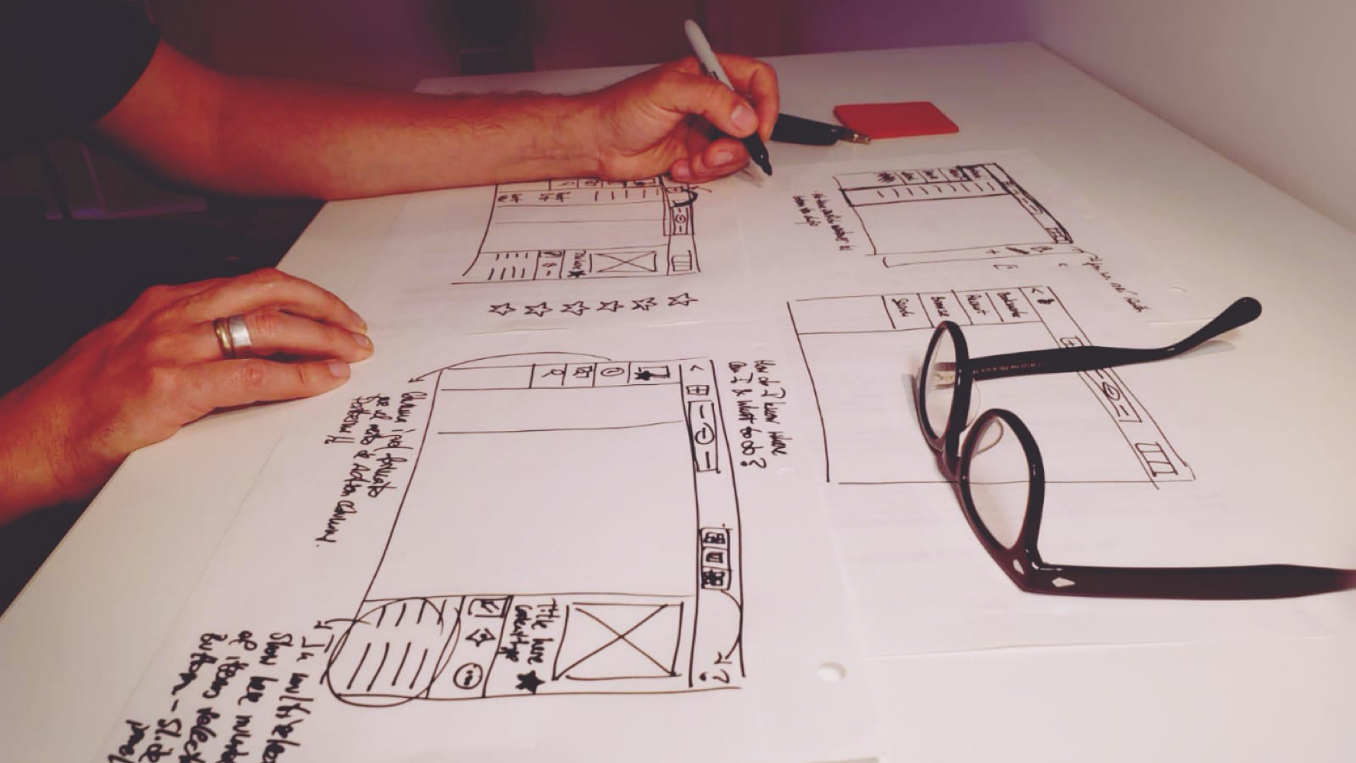
View of Universal Discovery Widget sketches.
Results
Improved experience when navigating and selecting content
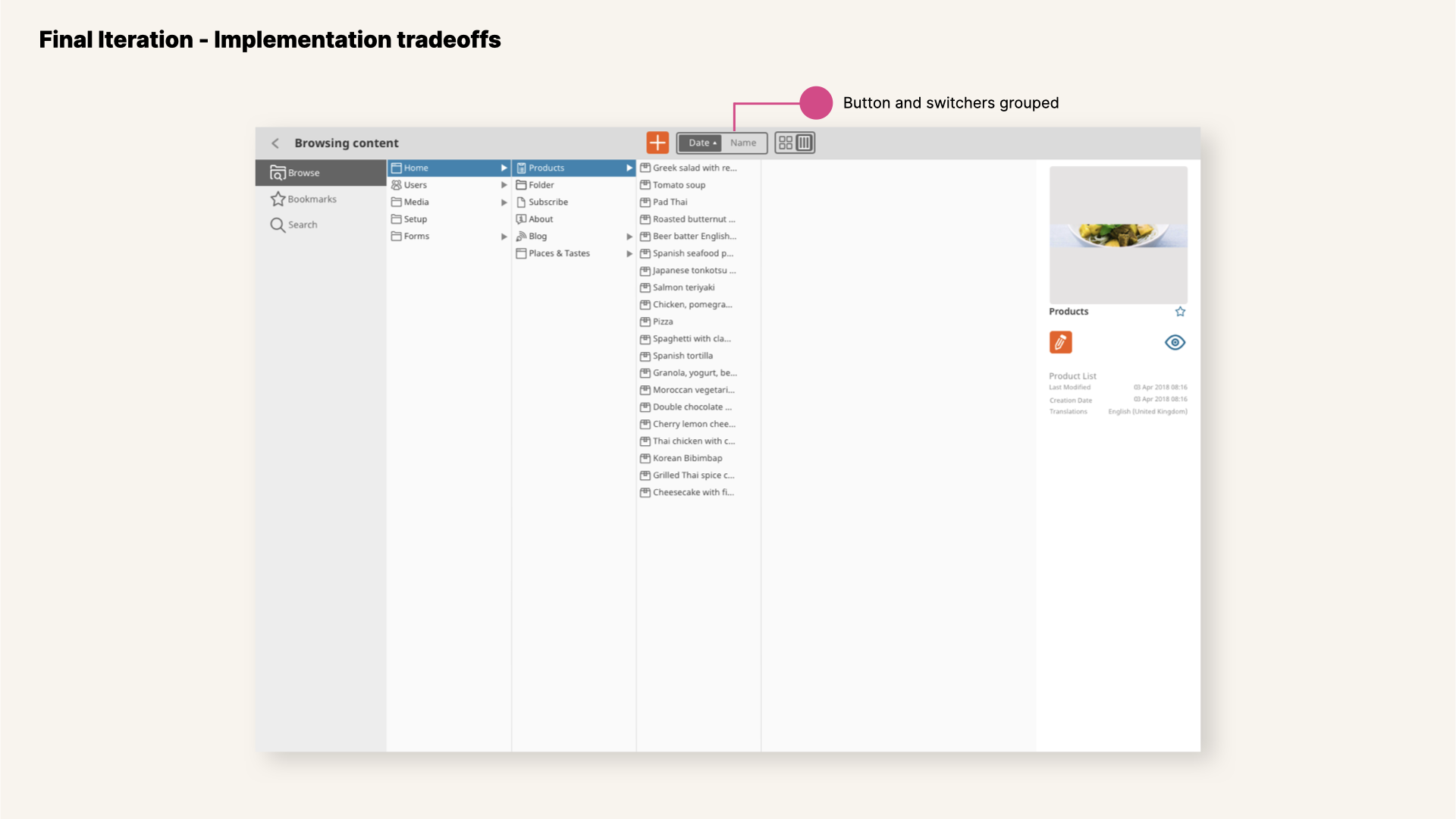
View of new UDW in v3 with buttons grouped.
With the launching of Universal Discovery Widget v3 I had the opportunity of seeing the outcomes of long journey. There were some interesting tradeoffs, that are usually part of the software development process. It is the case of the filters for content and the switcher for customizing the view.
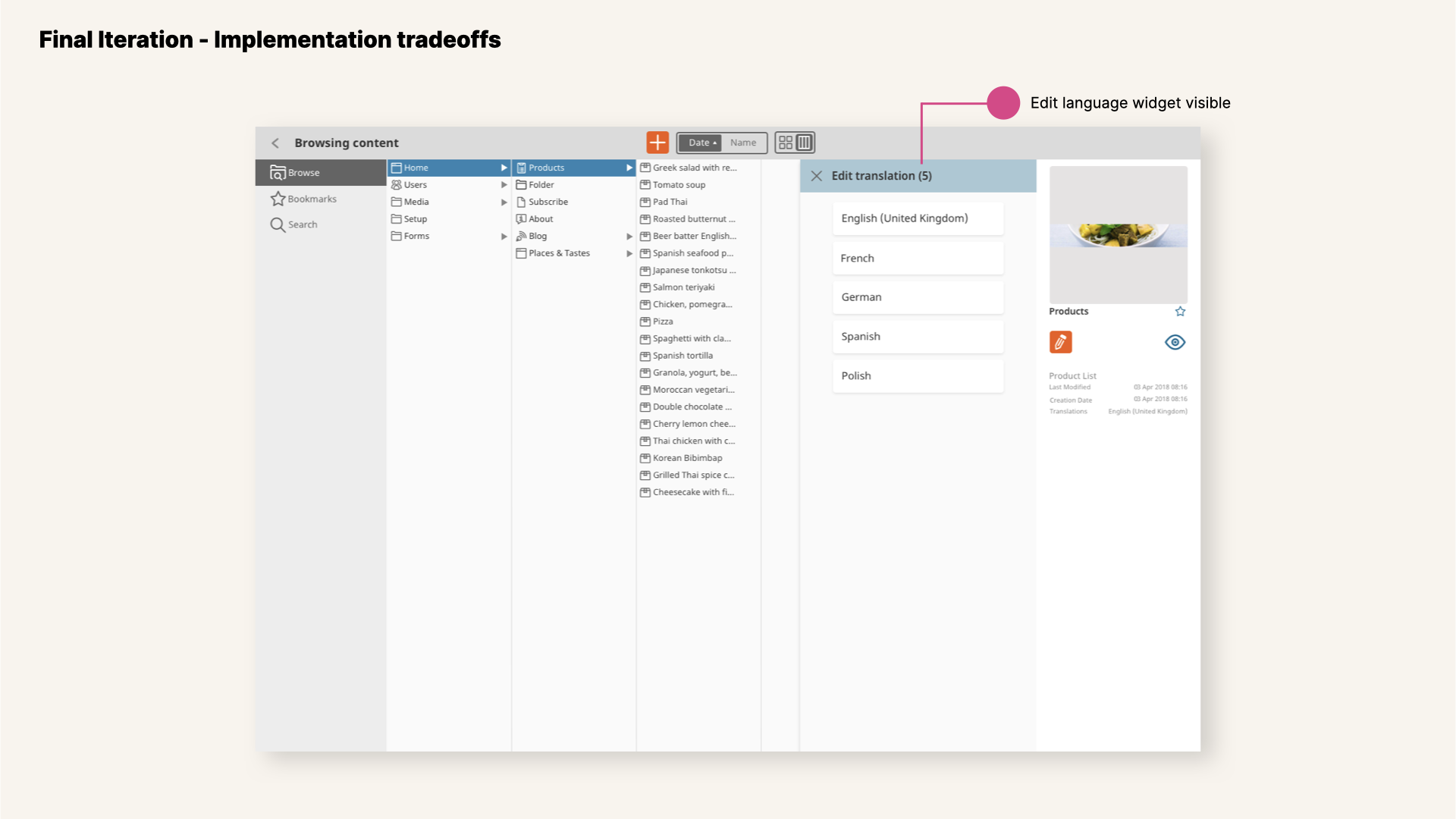
View of new UDW in v3 with edit widget visible.
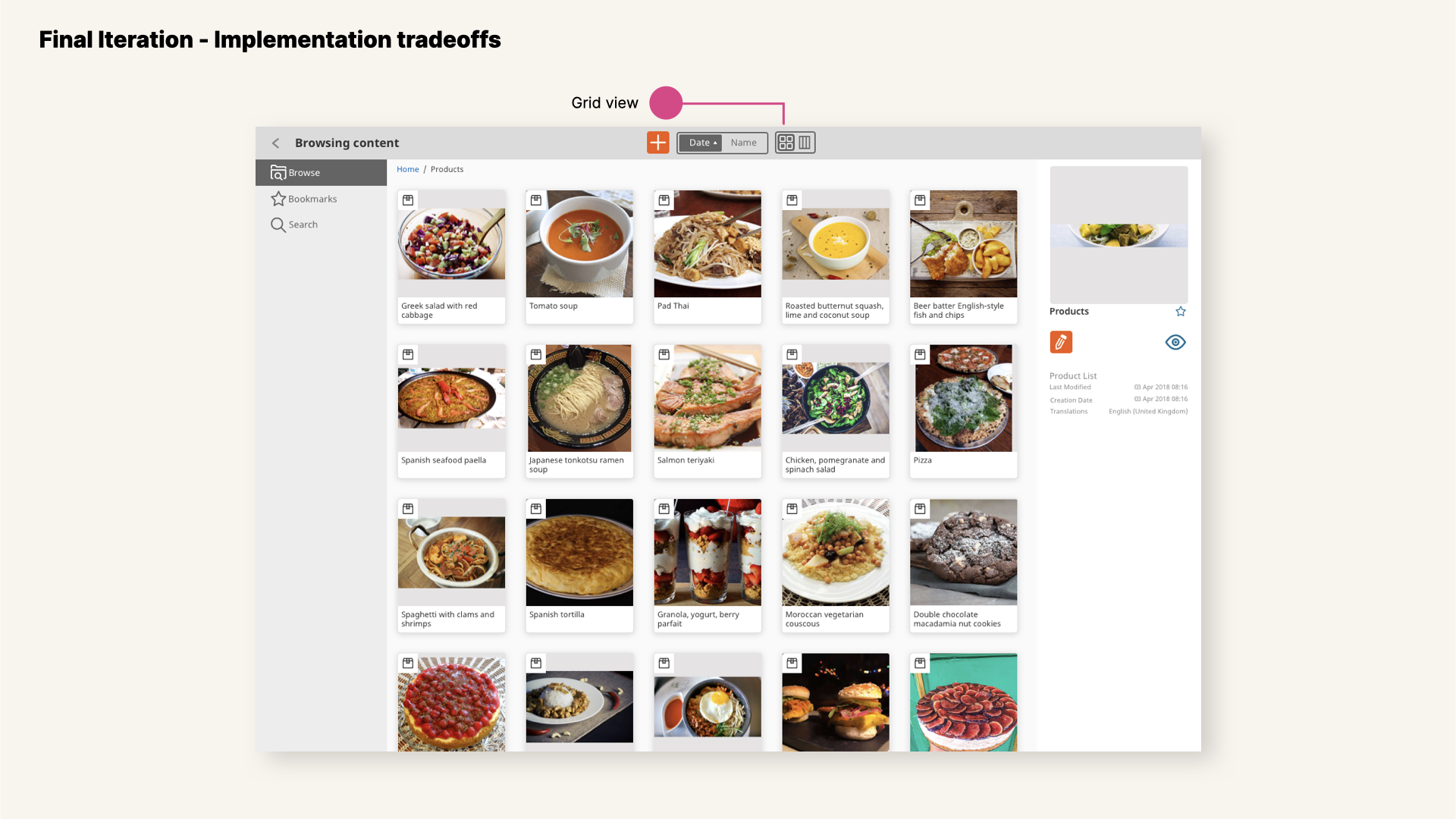
View of new UDW in v3 with grid view selected.
This version is the first one that also includes new components designed that we created and continues with a decided commitment on Accessibility standards.
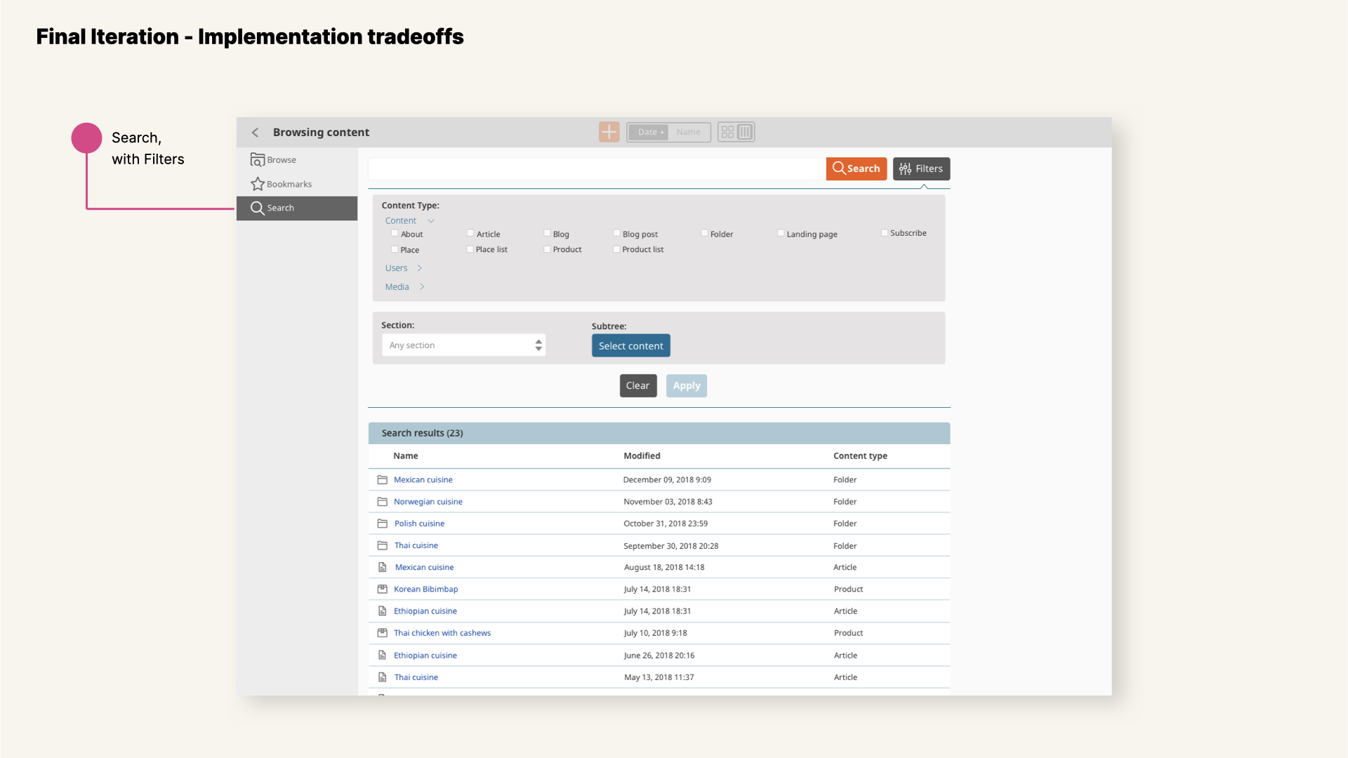
View of new UDW in v3 with search results displayed.
One of the main focus was design consistency across screens and interfaces in order to build usage patterns that will simplify users' life and build-up familiarity with the tool, adoption of best-practices for usability, simplification of the interfaces with less clutter... and many more.
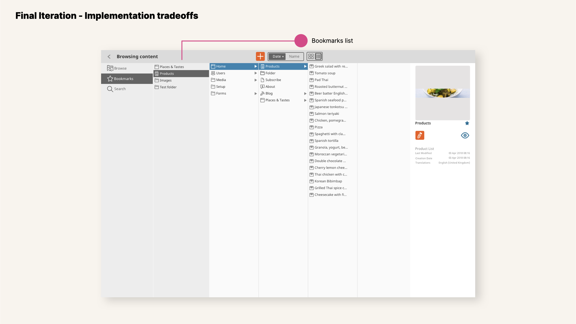
View of new UDW in v3 with bookmarks path showed.
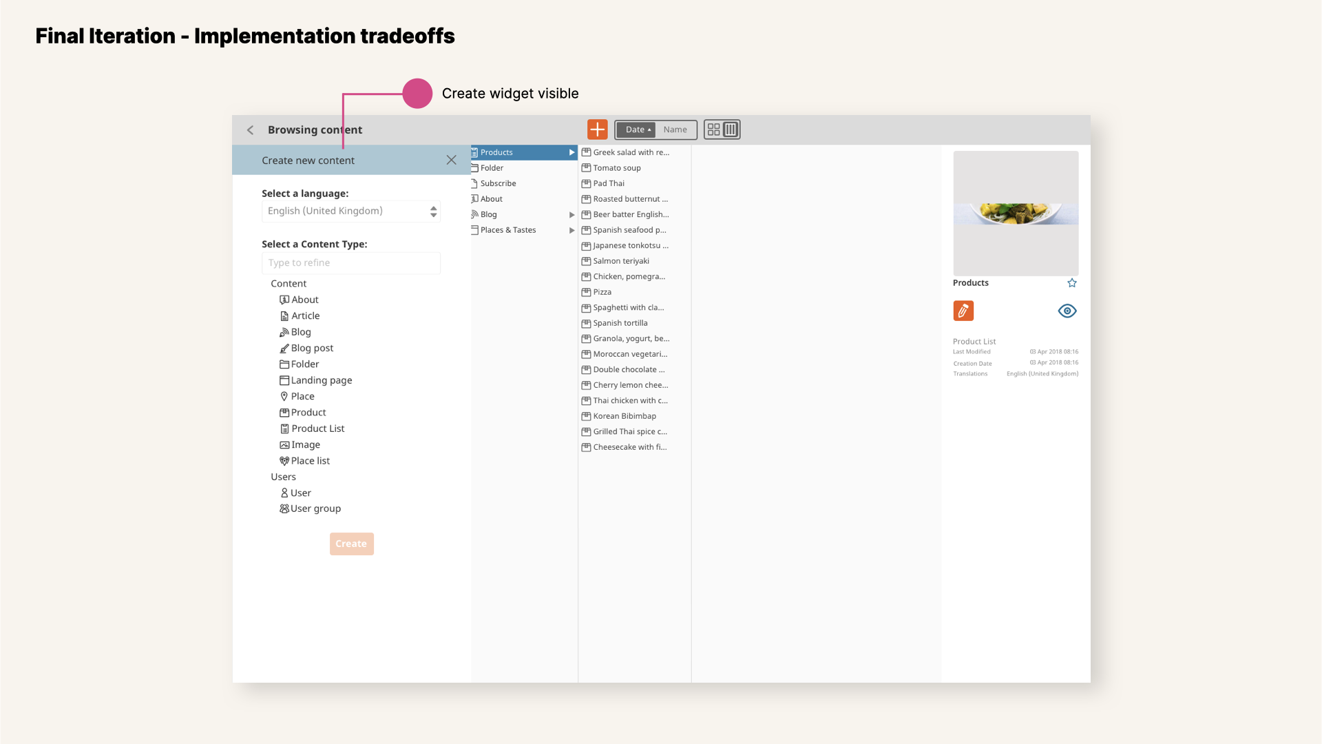
View of new UDW in v3 with create widget expanded.
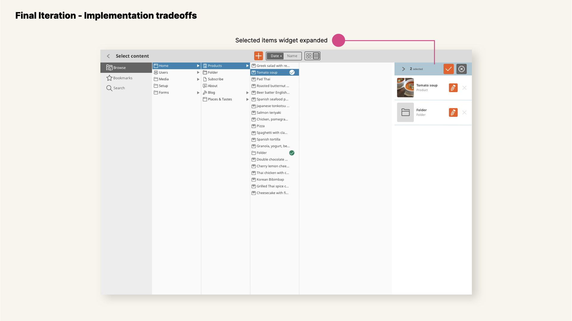
View of new UDW in v3 with multiple content items selected.
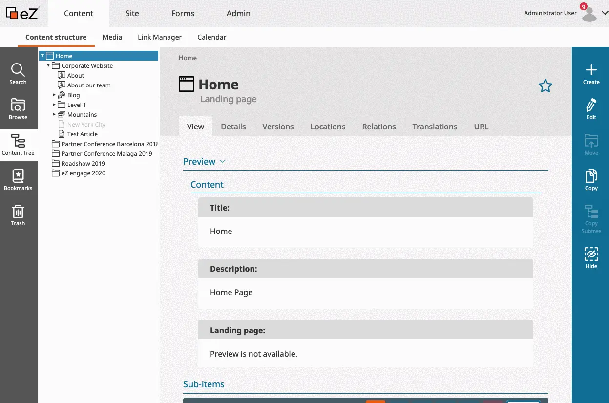
Interaction flow with the new Universal Discovery Widget revamped.
More information about the revamp of this feature on
Ibexa's blog posts Winter Release: eZ Platform v3 Beta 4 and Discover eZ Platform v3.0
Related content
