UX solution for a fashion startup
A User Experience solution for a New York City fashion startup that follows crowdfunding standards
Company: Crowdemand
Year: 2014
Background
CROWDEMAND was looking to significantly increase its social presence & increase its sales.
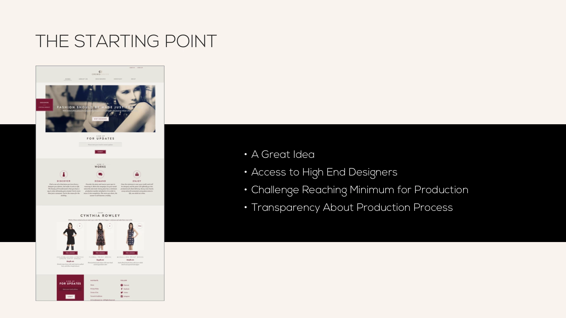
View of Crowdemand's starting point.
Challenge
Understanding how people buy high-end fashion design through the internet.
Our challenge was to create a solution that gave a feeling of reinforcing the runway experience, while clearly communicating the concept to differentiate from common e-commerce experiences.
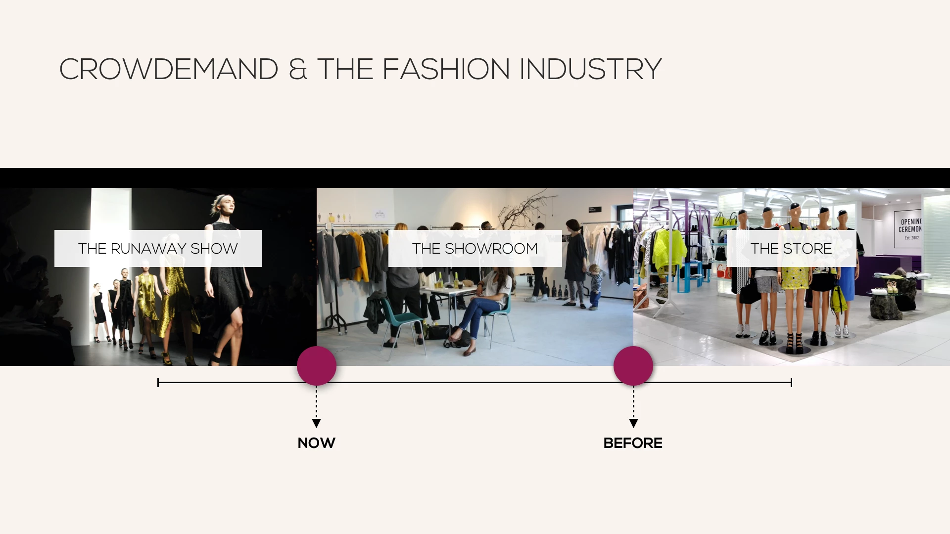
View of Understanding crowdfunding business model was crucial.
Research and user interviews were crucial due to the specific users (high end fashion users) Crowdemand has. A seamless navigation that provides a unique experience since the beginning to a narrow audience was a constraint, but also a challenge we really enjoyed to work with.
My Role

- Conduct research, competitive and comparative analysis.
- Influencers survey, User interviews.
- Co-define the vision, design Checkout process.
- Wireframing Tablet prototype and assemble the deliverable.
Research & Analysis
We discovered Crowdemand customers through research and user interviews. Nonetheless we realized that it was not enough, we needed more details. So we decided to go for real high-end fashion consumers or people working on fashion industry on one-on-one interviews. We could gather a very precise list of pain points the current site had and prioritize the opportunities that those bottlenecks meant when facing the sketch and design stage.
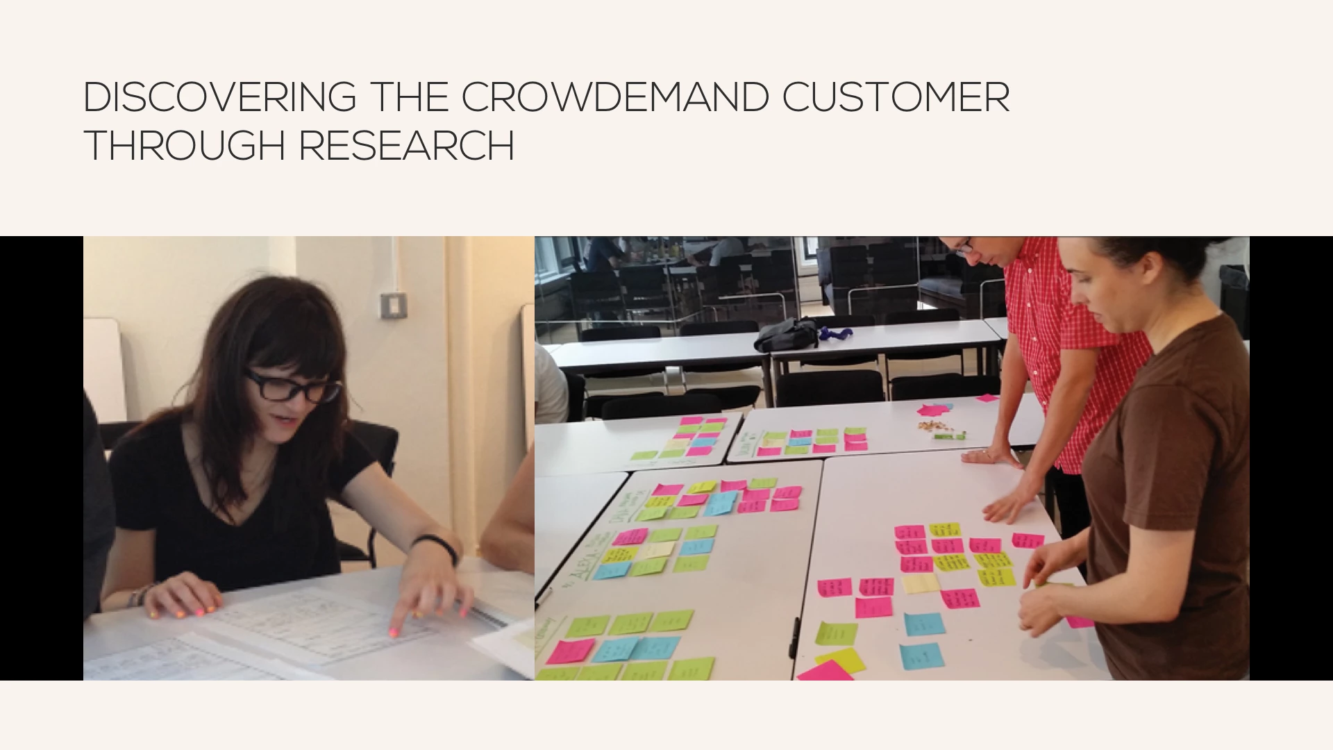
View of Universal Discovery Widget Personas.
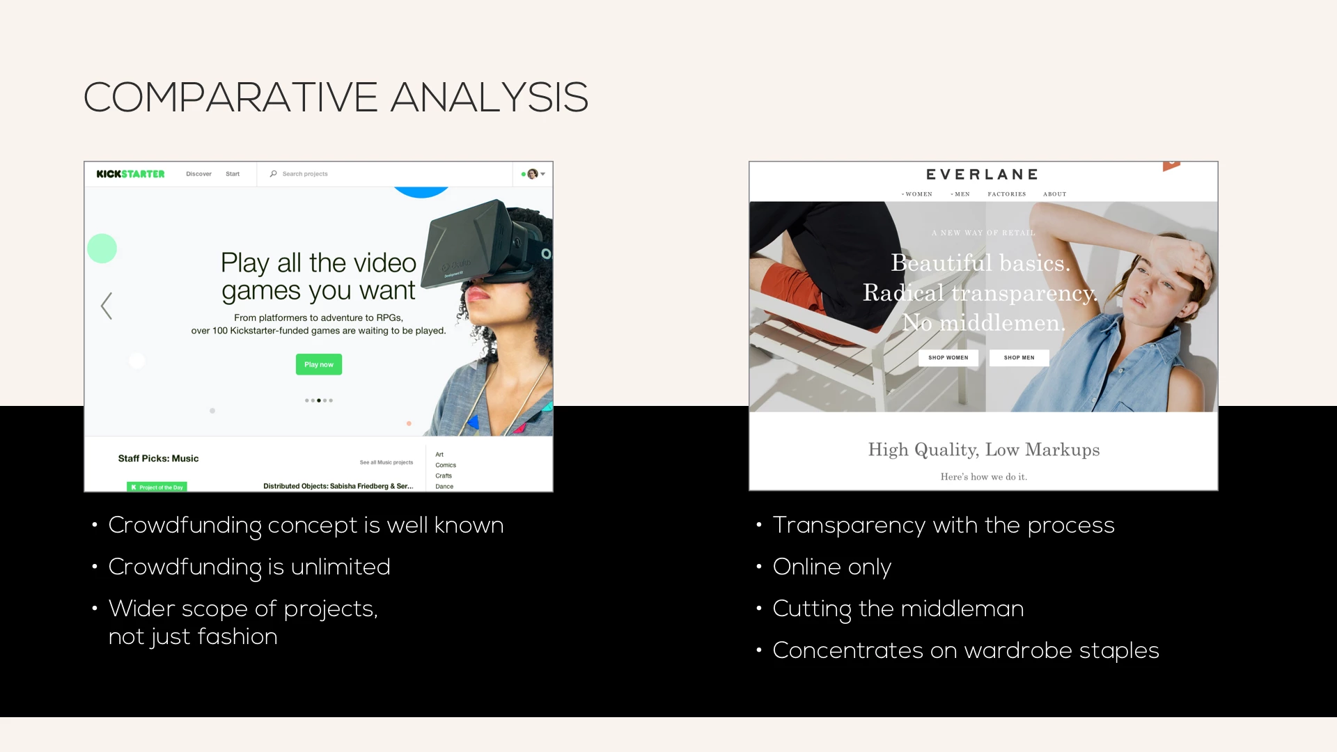
View of Crowdemand's Comparative analysis.
Crowdemand is a great Idea. It offers access to high end designers (nobody else does this currently within its industry.) Because it follows crowdfunding standards it has the challenge of reaching a minimum pre-orders in order to send garments for production.
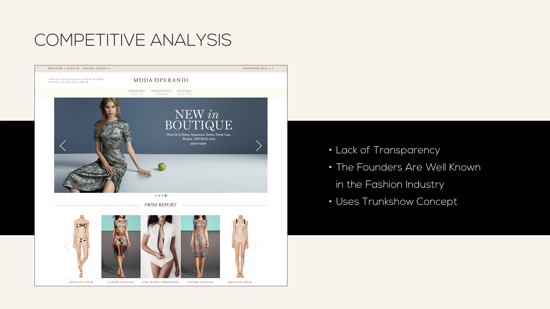
View of Crowdemand's Competitive analysis.
Besides it is transparent about the fashion industry production process. But how to transform specific user needs into something unique that keeps them and brings in new customers...?
Constraints & Personas
Based on data obtained from our surveys and qualitative data collected from user interviews, we defined five different profiles. All of them have a direct relationship with the high end fashion industry. From personas working in fashion businesses, to influencers or personas with key connections to specific high end designers.
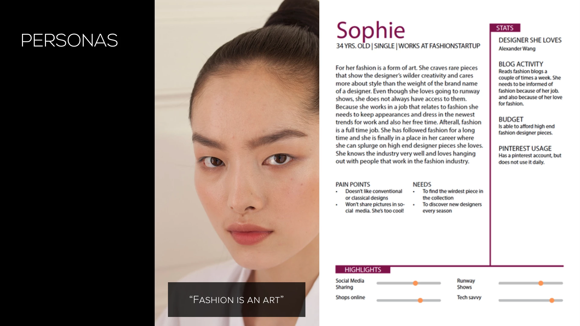
View of new persona profile designed for Crowdemand.
Our client acknowledged that this exercise would help them refining their business model, because they did not had defined who their users were.
Design process
User Flows
Despite we fundamentally worked with our first primary persona, and because Crowdemand's site is responsive, we designed three different flows. Each of them is represented with a different flow on the final prototypes.
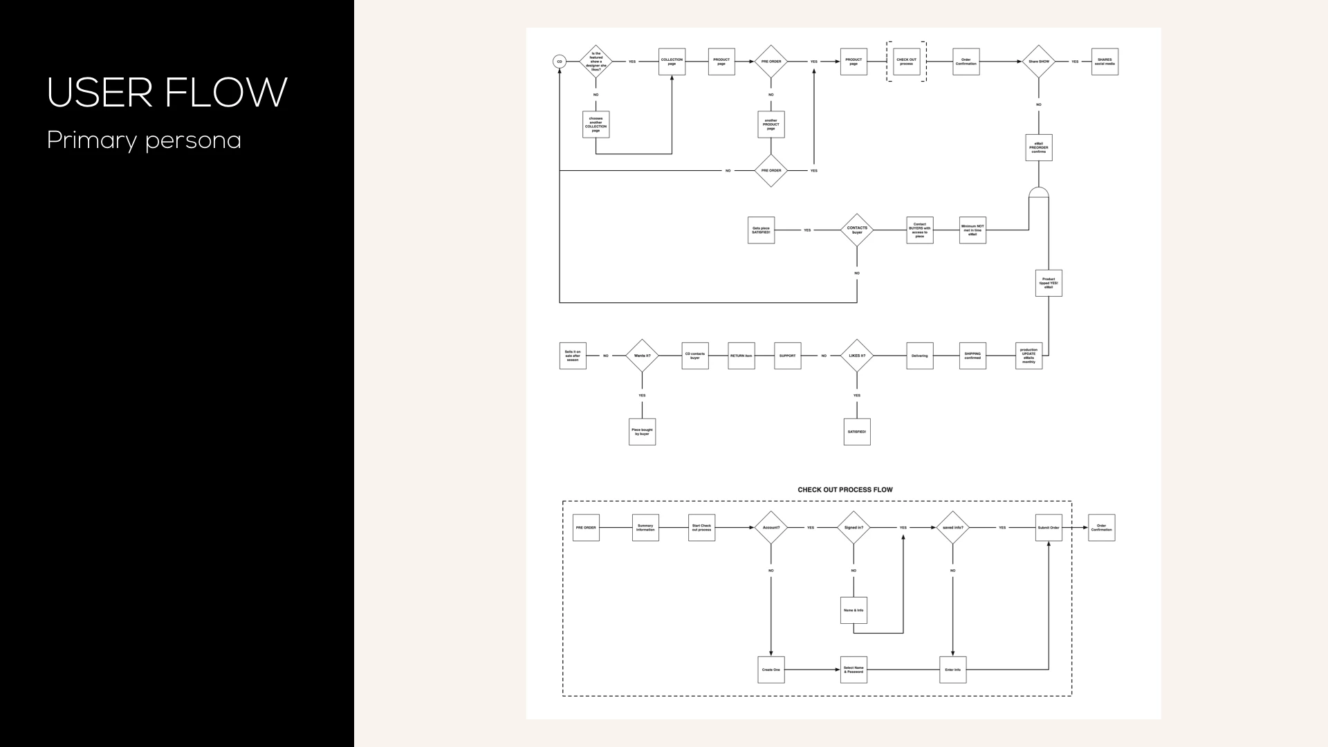
View of User flow for Crowdemand's primary persona.
Site Map
Something interesting about this project it is the fact that it was really easy to draw out the site. The challenge was hidden in each of the pages (see prototype). The structure answered to both the user's and business' needs.
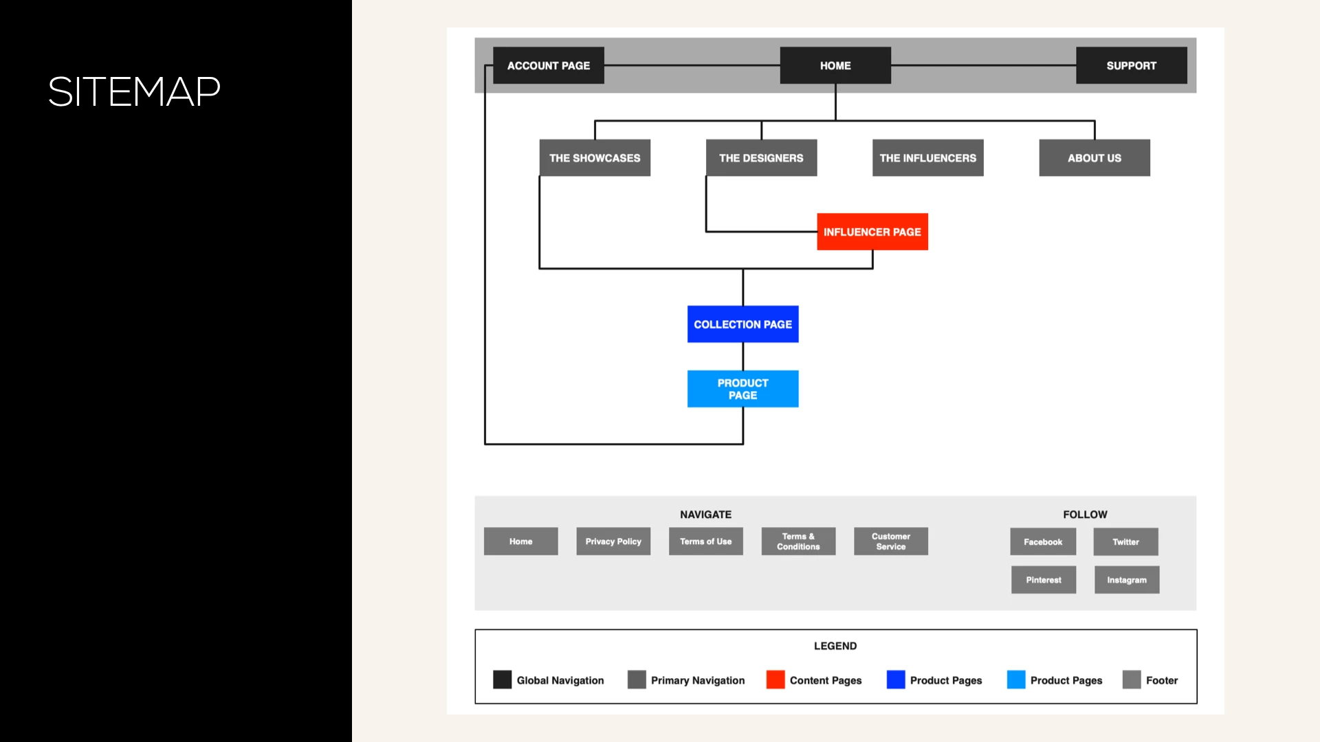
View of Site Map for Crowdemand's primary persona.
Ideating & Testing
When user testing our first rough sketches our testers confirmed the assumptions we had drawn based on our previous research. We identified clear opportunities for the site, as long as the interaction with specific users allowed us to discover unapplied online high-end fashion standards on Crowdemand's site.
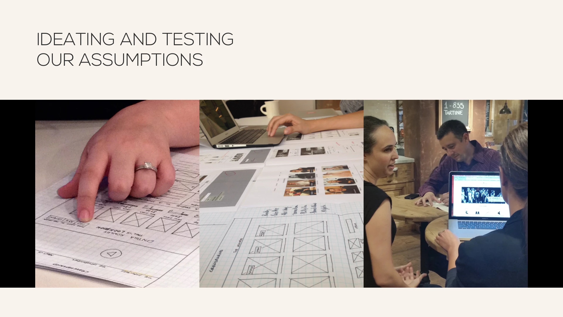
View of ideating and testing our new assumptions.
Constraints
Getting the information and photos from designers for the site it is not an easy process; every designer works with different methods.
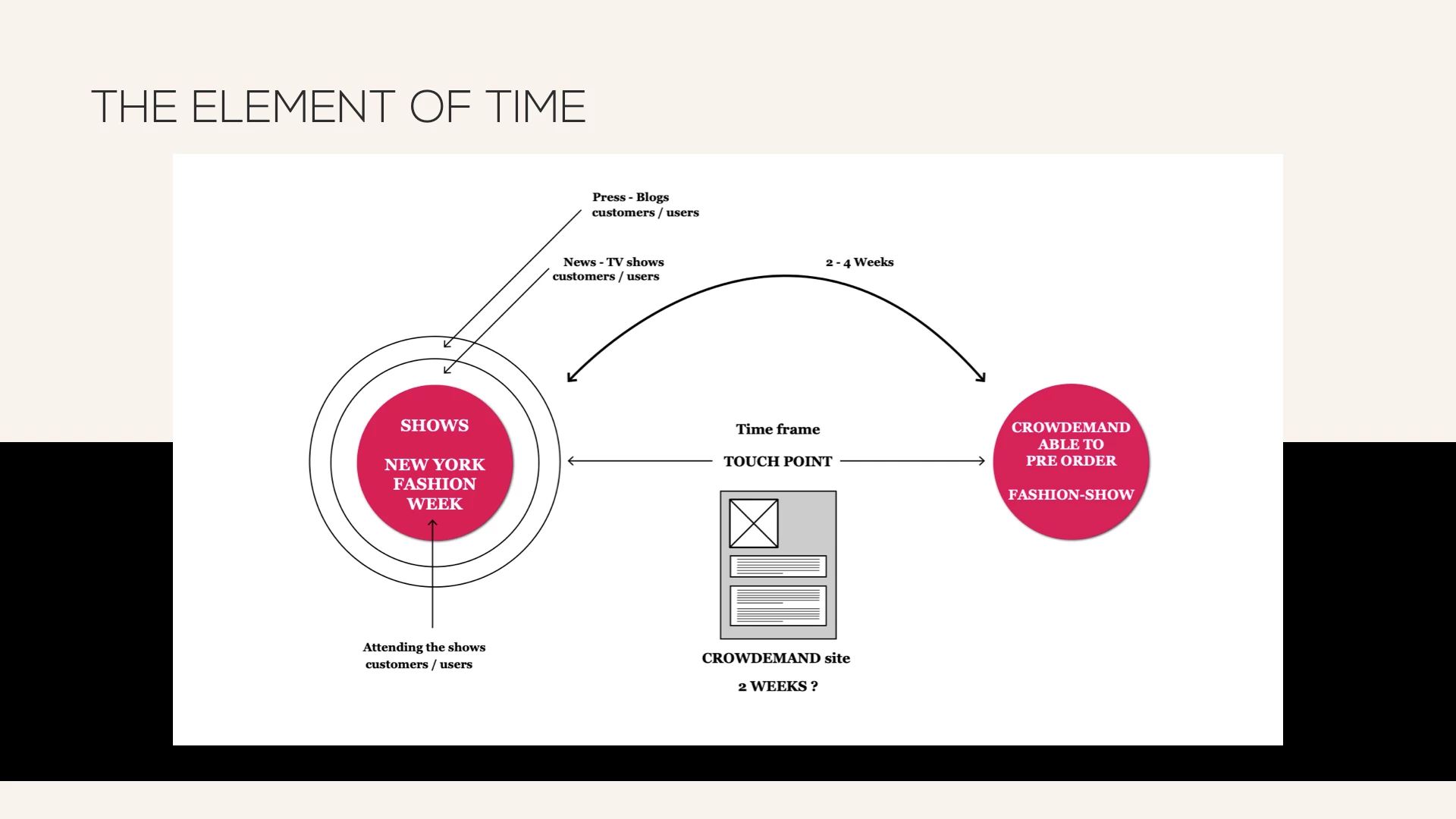
View of time constraints in Crowdemand's flow.
When designing the new features for the site we took into account real constraints that Crowdemand owners are facing and have to deal with. How do they get all the information related to the garments and designs? How much time has to last since they can offer in their site a brand new collection and they upload the garments' photos? We make these constraints ours and adapted our design not only to the user's needs, but also to the current business constraints.
Result
We developed throughly two main aspects:
Runway experience. Fashion customers want to live unique experiences, where the runway show is the most important one. Home page as well as Collection page offer several options for this.
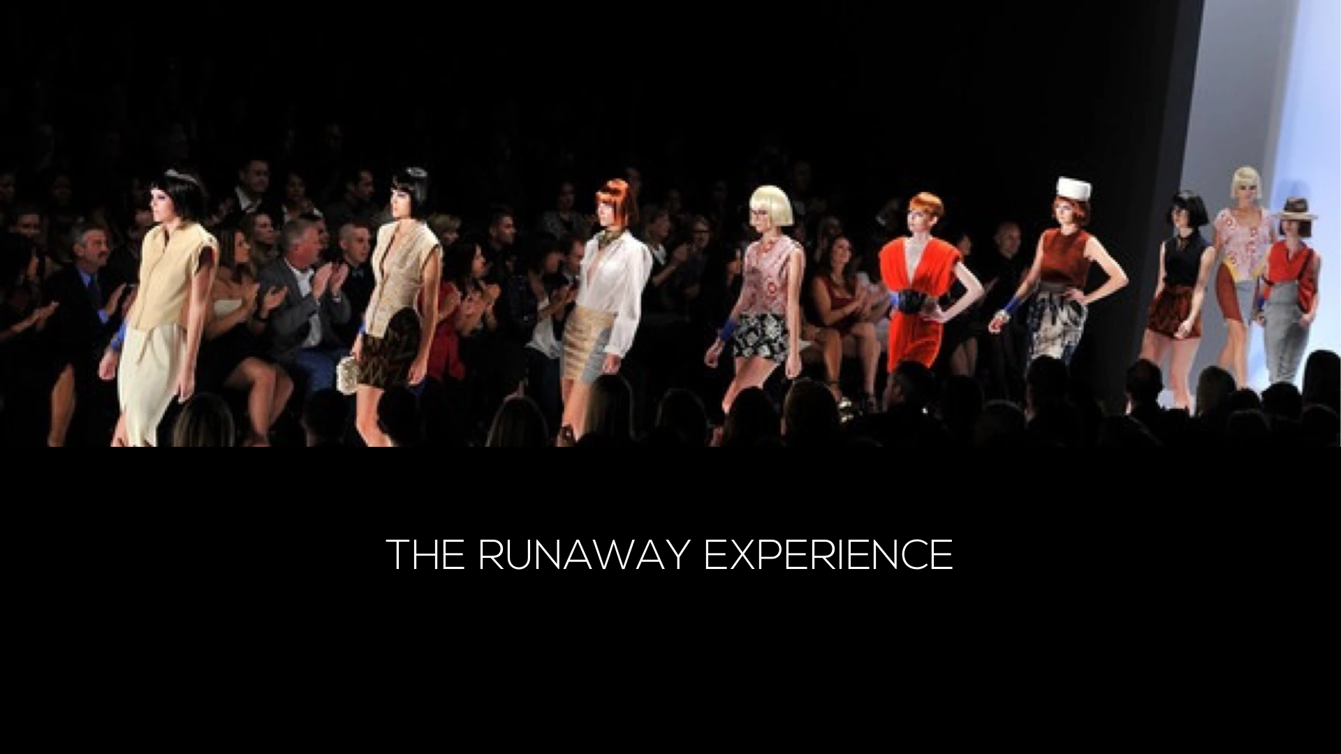
View of Crowdemand's runaway experience.
Shop by the Look Book. Detail page and Pre-Order page are the two affected for these new designs. The objective was to implement on Crowdemand's Detail page current standards applied on high end fashion sites, but also taking into account limitations crowdfunding business models offers. The Shop by the Look Book was a primary implementation. We also designed a new checkout process.
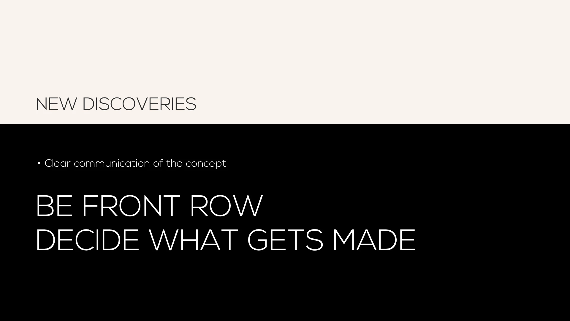
View of Crowdemand's new discoveries based on design.
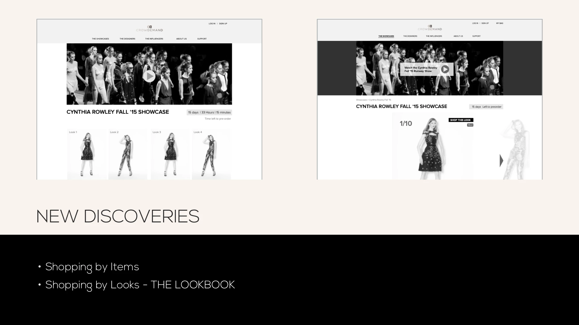
View of Crowdemand's new shop by the lookbook based on new wireframes.
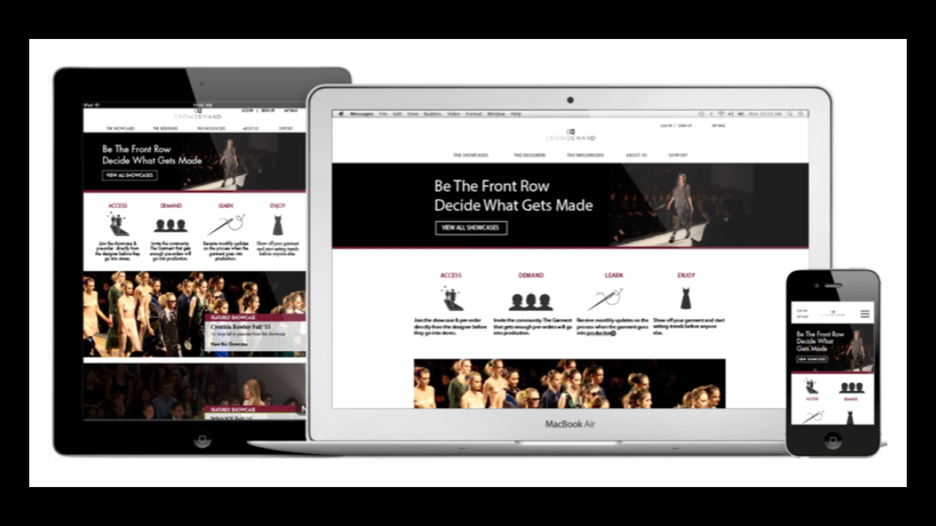
After several user tests we finally could get our prototypes for three different platforms.
The final result is available through this link 👇
Related content
