Adoption of UI Guidelines
User Interface Guidelines added to Ibexa's software development cycle
Company: Ibexa - eZ Systems
Year: 2015-2020
Challenge
One of the main tasks I had as UI Designer at Ibexa was to address inconsistencies across interfaces and put a strong focus on harmonization. At the same time, the adoption of the new stack for Ibexa's eZ Platform in v2 allowed to the Engineering Team being more agile and productive. This put more pressure on both the specification and designing processes in particular. At the same time it meant a real need for increasing the speed of design production, as well as the number of stories added to each sprint and release.
What is Ibexa's eZ Platform?
eZ Platform is a Digital Experience Platform (DXP) created by Ibexa that helps B2B companies to stay relevant and succeed by transforming traditional sales strategies into frictionless buying experiences. This DXP is ideal for large enterprises working on complex projects requiring several languages, with numerous sites, and multiple content types.
Ibexa's eZ Platform offers the ability to build interactive sites, pages and views and deliver multisite, multichannel and multilingual websites and apps. It gives organizations the control to create, and structure their content, reuse it and present it differently from a single location. It also provides a granular configurable system for user permissions, which allows organizations to set specific access rights for users and roles across all features.
My Role

- Researched on UI Guidelines standards and advocated for the adoption of it within the company's software development cycle.
- Designed and maintained a set of Design Libraries for Product Management Team.
- Led the creation and coordinated the live UI Guidelines, sub-section within doc.ezplatform.com site.
Results
Adoption of UI Guidelines within Ibexa's Software Development cycle
The need of faster development time on the design side, while keeping both code and design consistent throughout the application, was a very exciting goal to achieve. The creation of a set of UI Guidelines was the perfect match, besides of being one of the trending topics in the digital design world at that moment. Find the most appropriate way to implement it -“alla” eZ Systems- was the challenge for me.
More than the harmonization design tasks, like designing a new set of icons, the goal was to define a new way of working within the Product Management team when preparing new stories based on Ibexa’s roadmap priorities.
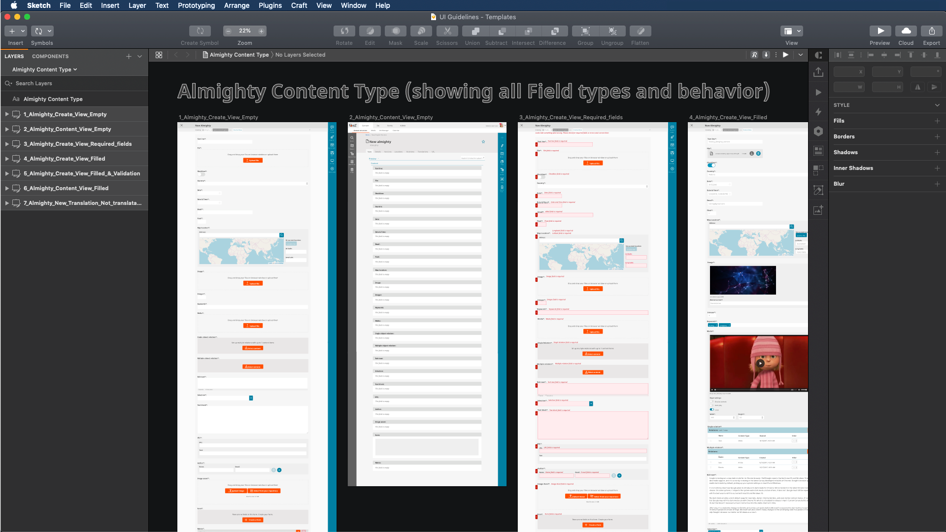
View of UI Design Template.
The experience while implementing them and making use of them in a daily basis within Ibexa’s software development cycle is the speed and simplicity. The adoption and use of the UI Guidelines helped to reduce design time by 50%. Project managers are more focused on the story they want to reflect, based on the requirements they previously defined in the specification document.
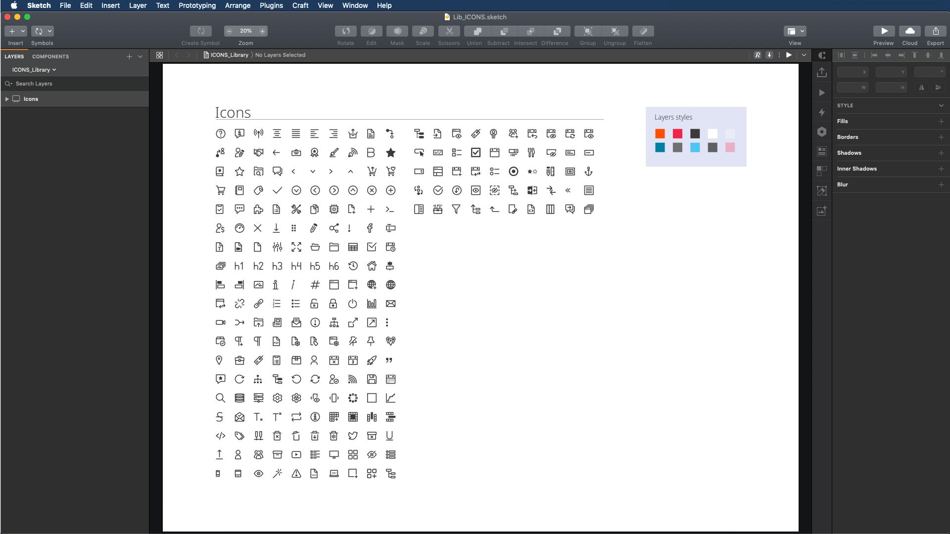
View of UI Design Guidelines Icons Library.
Built and maintained a set of Design Libraries for Product Management Team
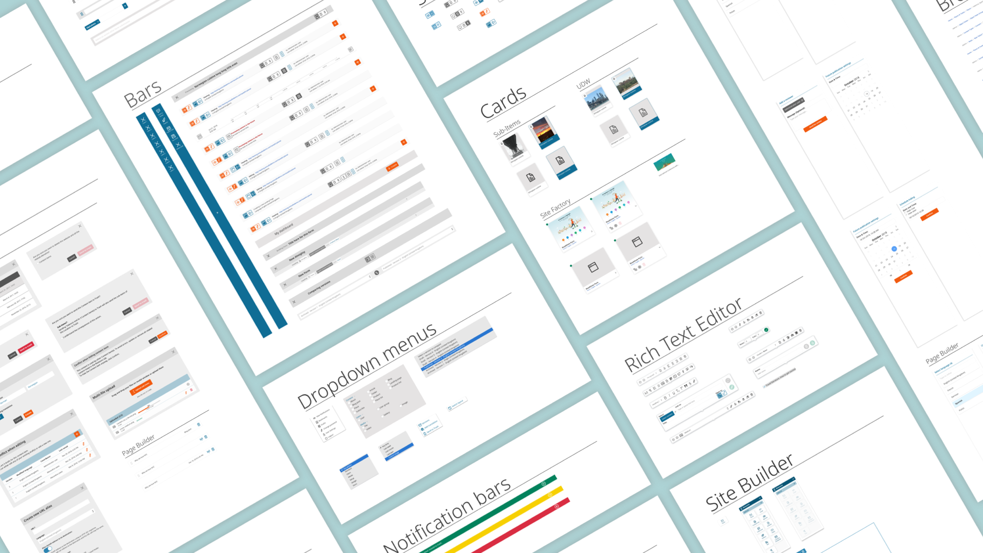
The Design Libraries take the most advantage from the design application (Sketch) with a combination of libraries, templates and plugins: libraries, provide samples of the most used components -icons, buttons, form components tables, and rest of resources- so that project managers adapt them to the feature development story they are currently working on; templates, contribute to speed up the process offering pre made templates. Finally, selected plugins help out with an extra boost during the designing tasks.
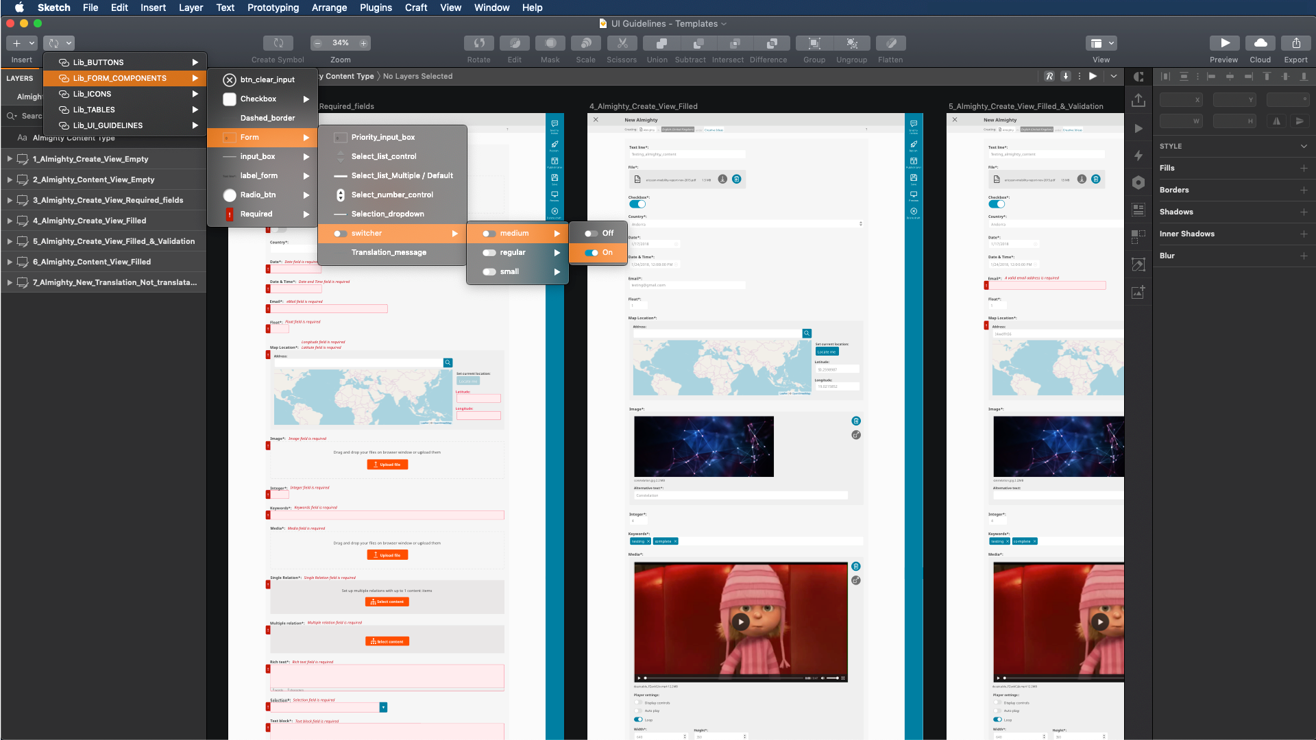
View of Design Guidelines with Form Components Library in use.
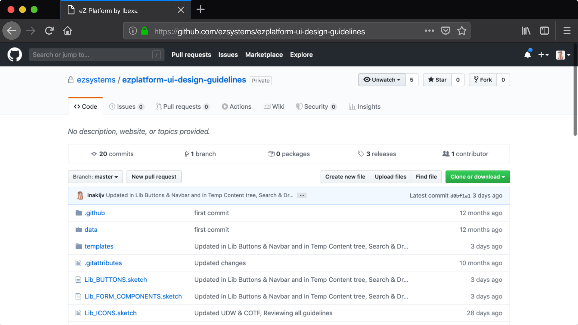
View of Design UI Guidelines repository with tagged versions in use.
Led the creation and coordinated the live UI Guidelines, sub-section within doc.ezplatform.com site
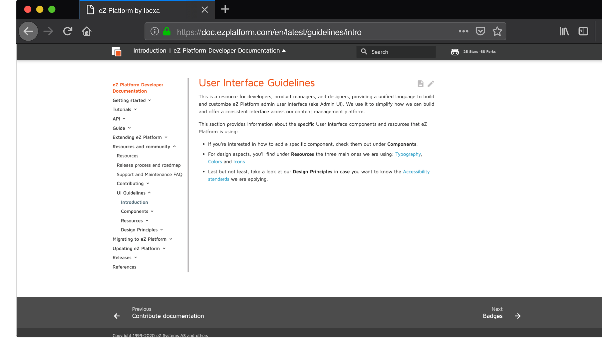
View of UI Guidelines section within Ibexa's eZ Platform Doc site.
The other side of the UI Guidelines, the live style guidelines, has been built to provide a resource for developers, product managers and designers as well, providing a unified language to build and customize Ibexa's eZ Platform admin user interface. The goal was to simplify how we can build and offer a consistent interface across the Content Management Platform. This is a coordinated effort that involves three internal teams: Product, Documentation and Engineering.
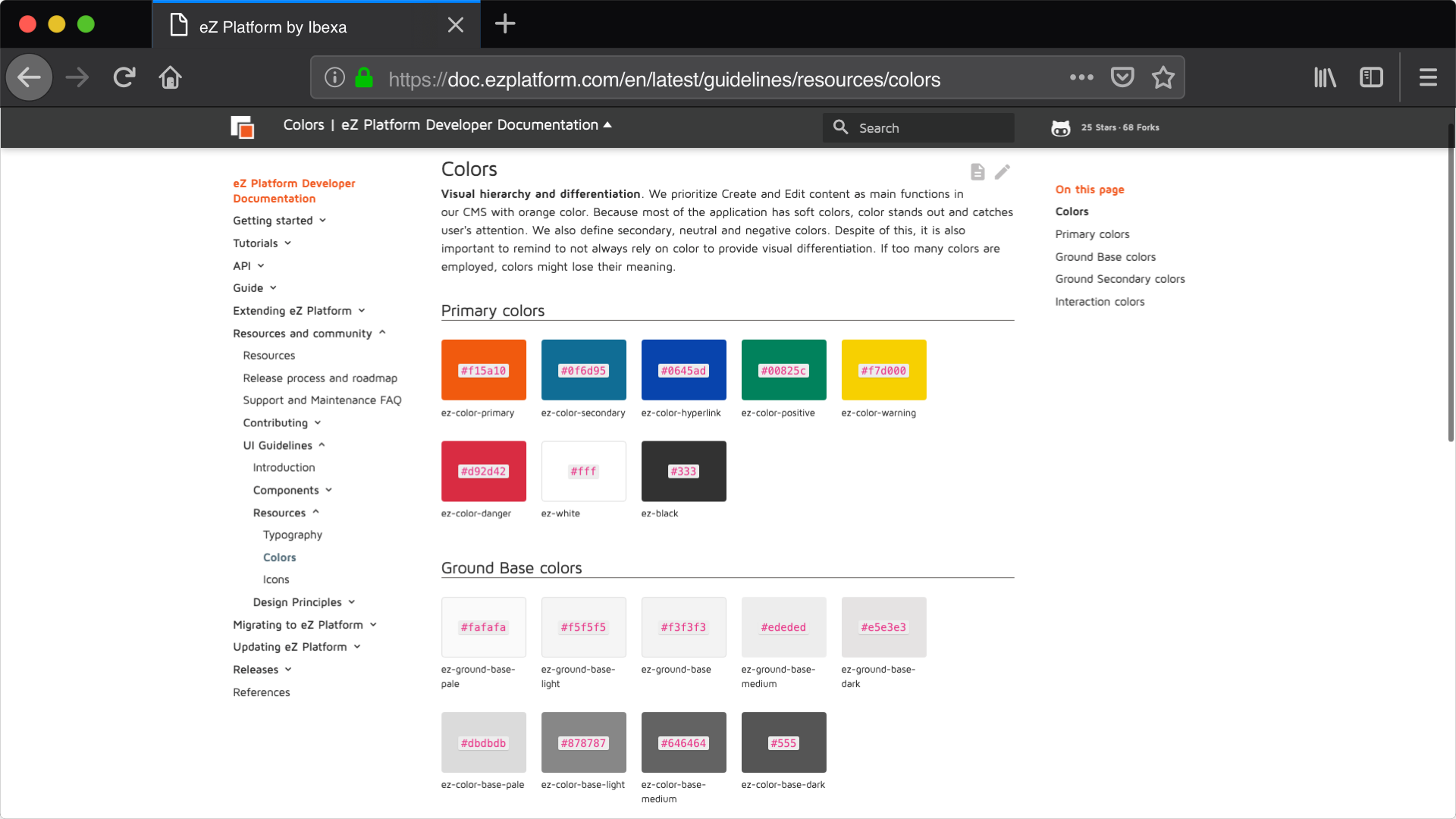
View of Live UI Guidelines Colors Resource.
This section of eZ Platform Developer Documentation site includes best practice examples to demonstrate the use of eZ Platform itself and illustrate appropriate semantic markup, including ways in which potential accessibility concerns can be addressed.
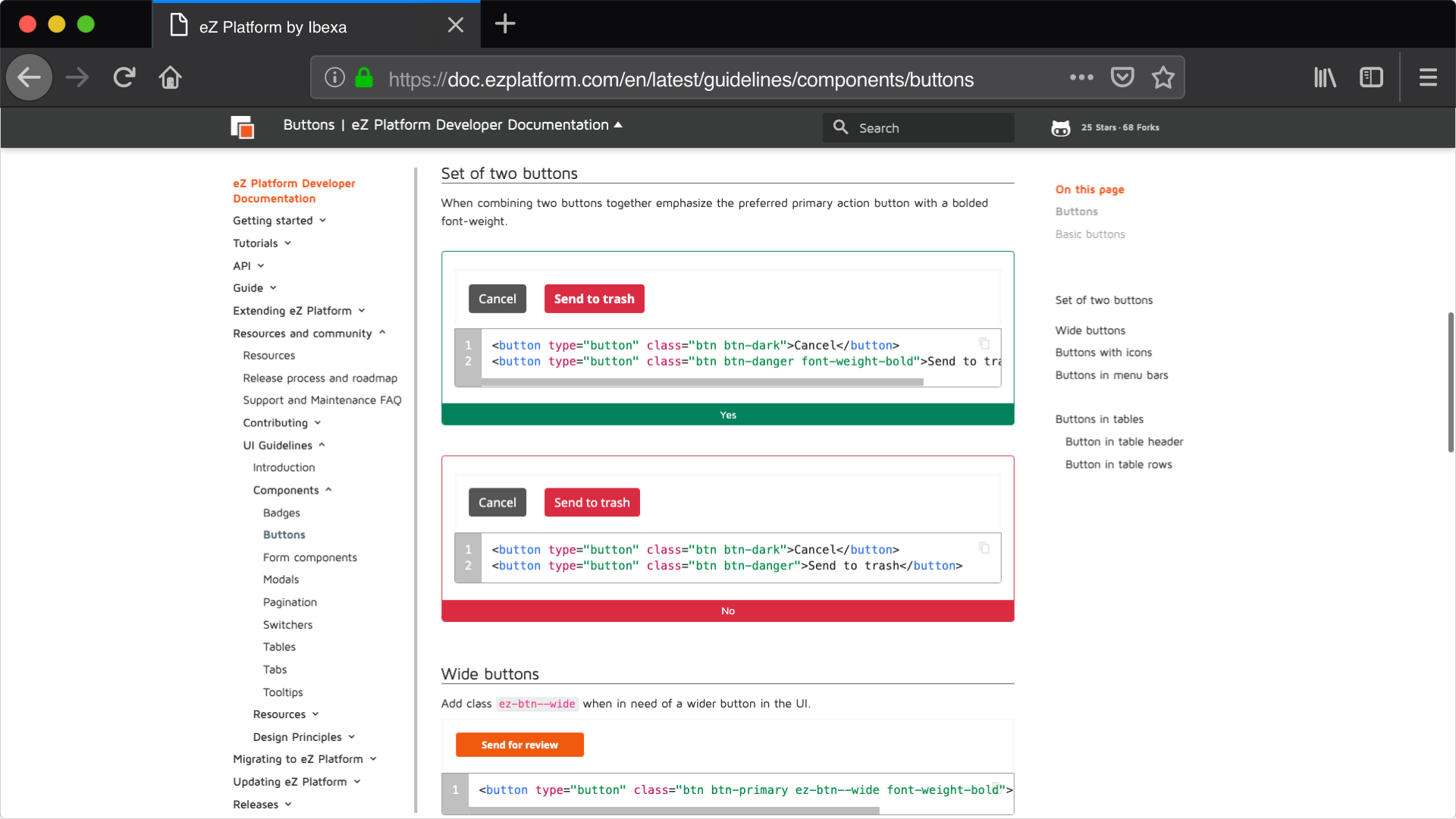
View of UI Guidelines buttons component.
In addition to this, and given the complexity of the product, the UI Guidelines reflect changes added to each of the components throughout Ibexa's eZ Platform releases. So that Doc users can extend and develop based on their specific needs.
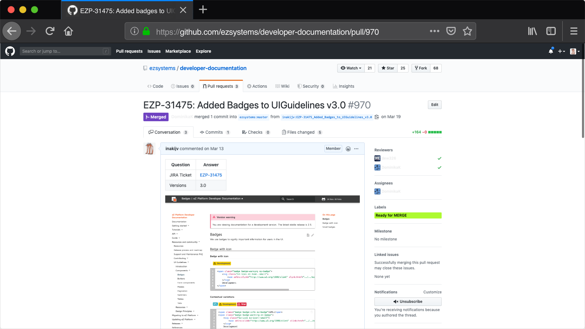
View of addition of new UI component Badges to documentation site.
Related content
