The New York Times Project
Testing out a feature applying User Experience & Front-End Web Development skills for an online newspaper
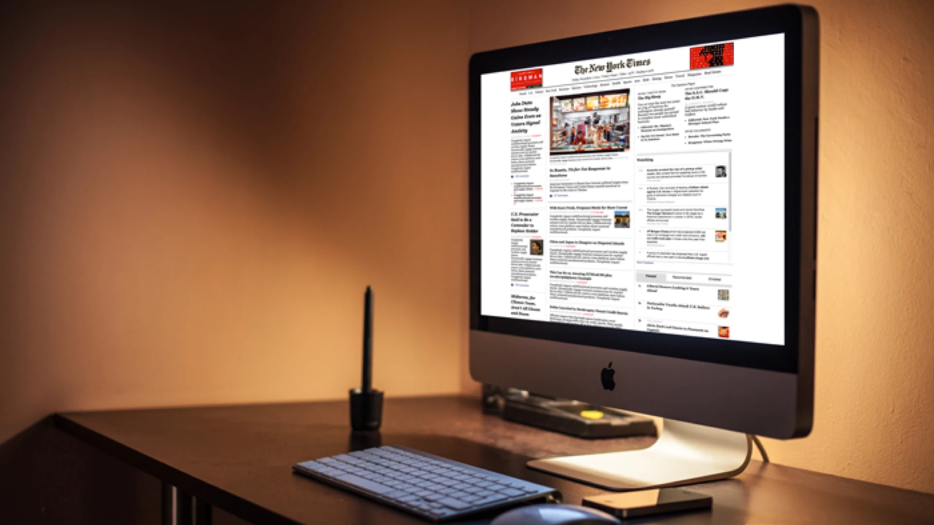
TL;DR
- This was my final project and it was part of my Front-End Web Development course at General Assembly (2014).
- My challenge was to design a responsive prototype for new first visitors, that complements current NYT apps, offering them a more signified navigation through the site;
- With the new proposal The New York Times online edition readers would be provided with both a responsive design, and a side navigation menu that shows up at tablet and mobile screen sizes.
Challenge
Despite of keeping a huge amount of online readers through their custom-screen size apps, The New York Times was concerned at that moment about its decreasing amount of online readers while offering them the best journalism.
My goal was to test out a new side navbar feature that looked for an improved user experience.
With this proposal NYT's online edition readers would be provided with both a responsive design, and a side navigation menu that shows up at tablet and mobile screen sizes.
My Role
Conduct Research, Competitive and Comparative analysis, User Interviews, Wireframing desktop prototype, and designed and coded the responsive prototype.
Tools
Adobe Illustrator, InDesign & Photoshop, Omnigraffle, Camera, Typeform surveys, HTLM&CSS, JavaScript&jQuery, Sticky notes, Whiteboard, Markers, Prints and Paper.
The Process
I must acknowledge that Margaret Gould Stewart's TED Talks on How giant websites design for you (and a billion others, too) inspired me for this project. Sometimes UX projects involve only a new feature instead of revamping a whole site. I strongly recommend you watch it.
For this project offering a high-fidelity prototype coded was the main task. In order to increase the User Experience perspective I added a survey stage and a usability testing process. With this project I was aiming to adding more value to the current online site. Because of this I did not include a userflow stage nor sitemaps.

Image of the User Experience design flow I followed.
User Research Results
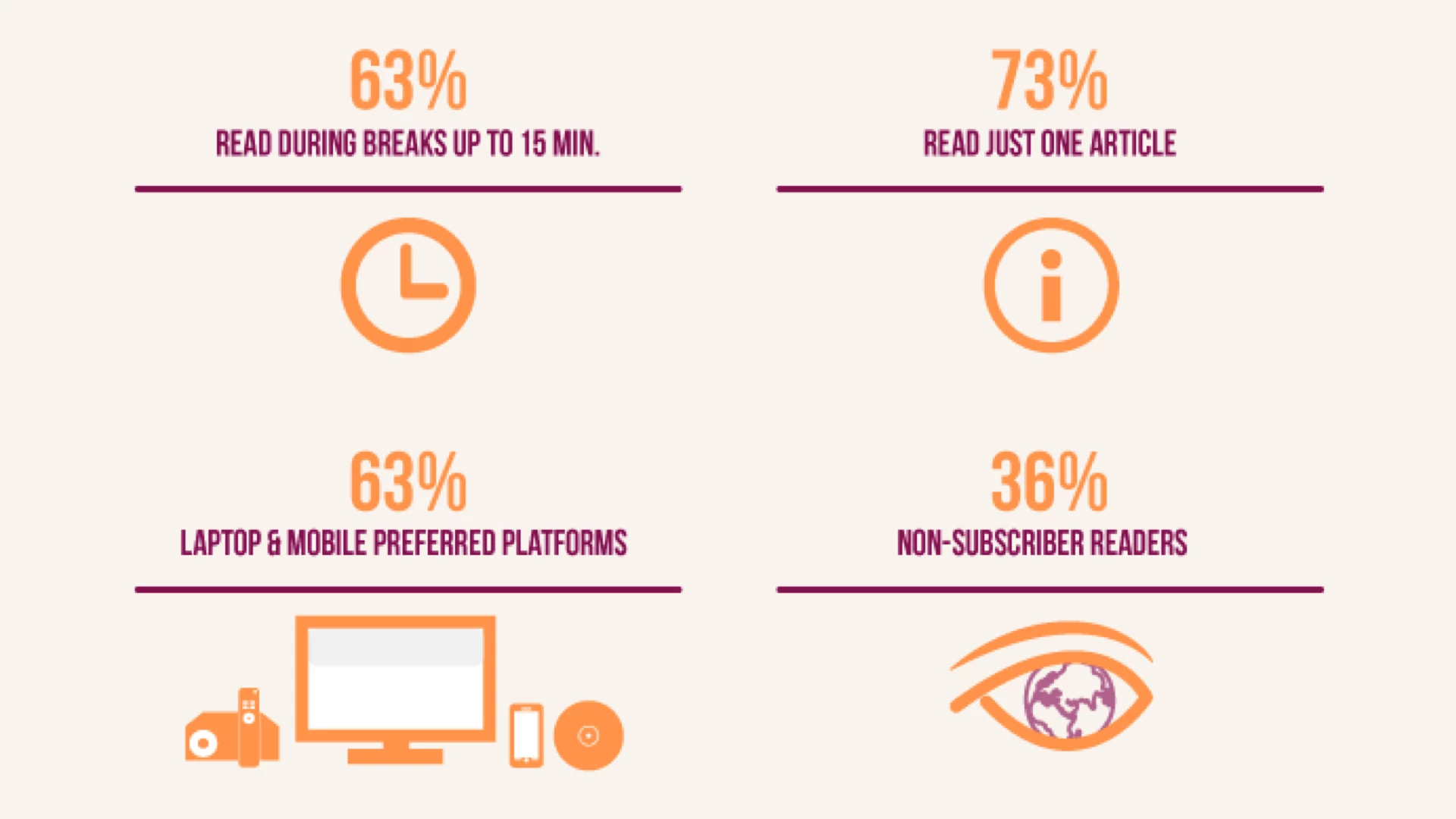
Image of the results from the survey group.
In terms of behaviour, I discovered through my research and surveys launched that NYT online edition readers use a multiplatform environment due to time constraints. There is not a clear preferred platform. NYT online edition readers are mostly NYT app-readers. It is important to highlight that this project is focused on precisely the non-app readers.
Personas

Image of the user personas for this project.
Based on data obtained from our surveys and qualitative data collected from user interviews, we defined five different profiles. All of them have a direct relationship with the news consumption. From personas working in global companies, to young professionals personas with key connections to specific political sectors.
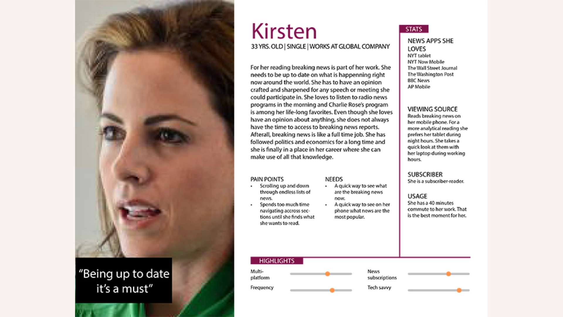
Image of the primary user persona for this project.
I also took a deep dive into NYT's online evolution and understood that increasing multiplatform usability was a great opportunity.
Wireframes
My objective was to replicate the Home page of The New York Times online edition. The challenge lied on how to transfer that fidelity in a responsive design, when precisely NYT had rejected that option because all of the constraints involved. Nonetheless it is crucial to highlight that important mastheads and magazines were evolving to responsive designs at that time (like Times Magazine, Los Angeles Times, The Guardian among others.)
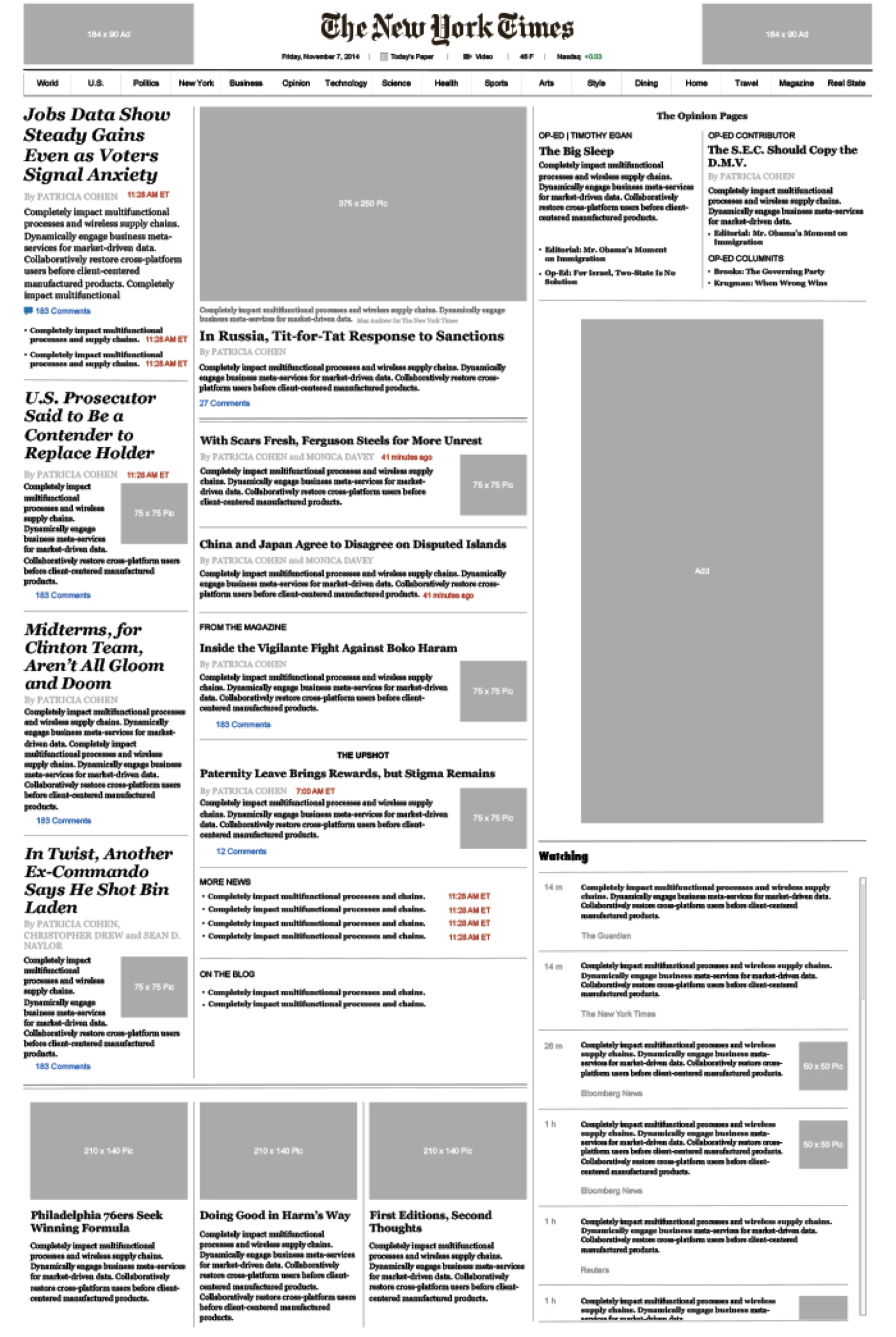
Image of the The New York Time home page wireframe.
To facilitate NYT's subscribers experience my challenge was to design a prototype as accurate as possible with the current NYT online edition design at that time. The objective was to test out the new features within the real context. I looked for ensuring brand identity and strengthen navigation through a more signified environment.
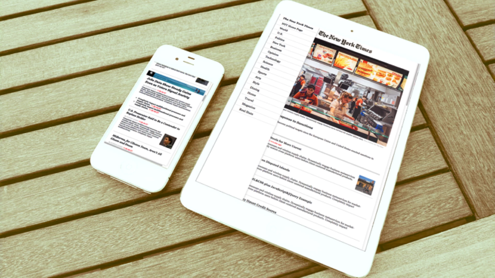
Image of two devices, tablet and phone, showing The New York Times edition.
The final prototype seeks to increase the usability from the user experience perspective. When the platform screen size is 1000px or higher (desktop and laptop) the navbar appears on top. This is a jQuery plugin with the Scroll Fix feature. However, when reducing screen width (tablet) the top navbar hides out for a side menu plugin. This last one is positioned on the center left side, fixed positioned, and always approachable with the thumb.
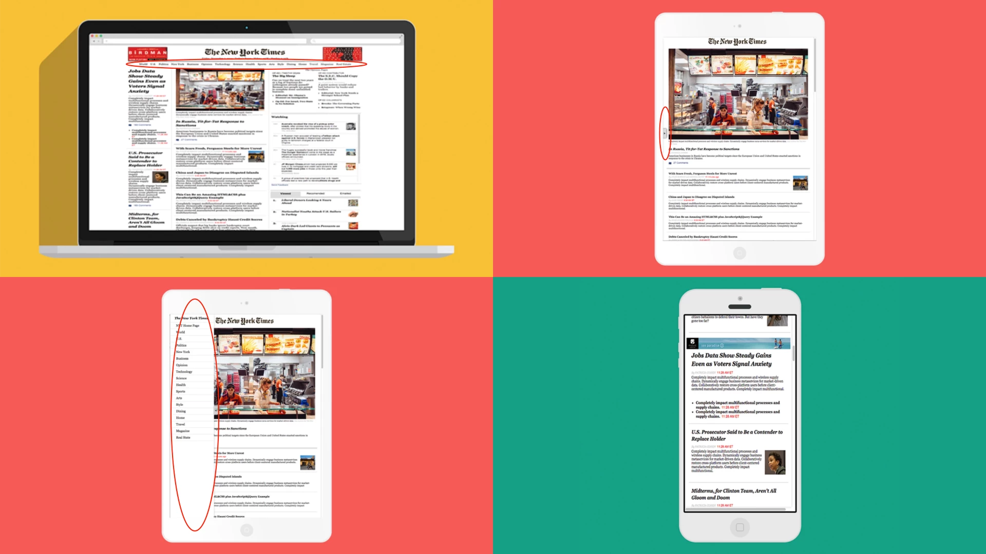
Image of four devices, one desktop,two tablets and one phone, showing the behavior of the prototype.
The Prototype
The final result is available through the link below. Check out the responsive design resizing the browser's window. Your feedback is appreciated!