Best practices on designing forms for a CMS
TL;DR
- As part of my role as UX/UI Designer at Ibexa, I designed Ibexa's eZ Platform v2 UI;
- Forms are part of DXP OR CMS' UI backbone (along with tables);
- DXP or CMS' forms have their own design constraints, due to they are part of a working tool where users can even make use of it several times within a day;
- This Blog Post, published on Ibexa's blog, it's one of my contributions in this area.
In this case I would like to talk about one of the main components in a User Interface: forms. We make use of them more often than we realize. We do it, for instance, every time we log in to an app or platform, when we send a text message to someone, or when we want to find some specific content, and even when we buy something online. Forms are surely one of the most ubiquitous types of interactions.
What is special about forms in CMS?
So, are there any big differences between a form designed for a regular website and one for a CMS? I would say no, there are not; in fact, what you will find are small changes. But, these small differences contribute to a greater user experience.
From my perspective, there are two crucial components to consider prior to sketching up anything: first, is to understand that your whole CMS relies on forms for any of the primary tasks your users will have to perform—from creating and editing content to reviewing it.
And secondly, your users—and I am including marketers, editors and other content creators—will interact with far more frequently than regular visitors to your website. In fact, they’ll probably use it on a daily basis. Thus, ubiquitousness and frequency of use are two main pillars when designing forms for CMS.
What are we currently working on at eZ?
At eZ Systems we are applying a third component: to simplify the way people interact with content. Because forms are a major part of the user experience in our software, we want to make this process as simple as possible. We aim to simplify the design of a form for a simpler, faster and more enhanced experience. We are working on applying this new perspective in our software design, and we hope you’ll notice these changes soon.
How to improve your form design in your CMS?
Let’s talk now about the main components of a form and how to improve their design for a CMS.
A. Title
Try to imagine this scenario: Right after your user scans the page and processes it, she sees there are text input fields on it, she probably sighs and asks herself: “Ok, a form. What is it about?” That’s the reason why part of the success of a form comes from its title. It states what the user can accomplish by fulfilling it, but also lets the user know where she is. The name should answer two basic questions: what and why.
B. Layout
Path to completion
From Nielsen Norman Group’s usability standards on how people read the web to Luke Wroblewski’s research findings on form design, the main conclusion is that you have to show the user a path to completion. Why? Because prior to reading the content on any screen, we scan it. Bear in mind, the moment a user detects a form field all her attention on the screen focuses on it. From the UX/UI perspective, there are multiple ways of highlighting this for your users, one of them is the layout of your form.
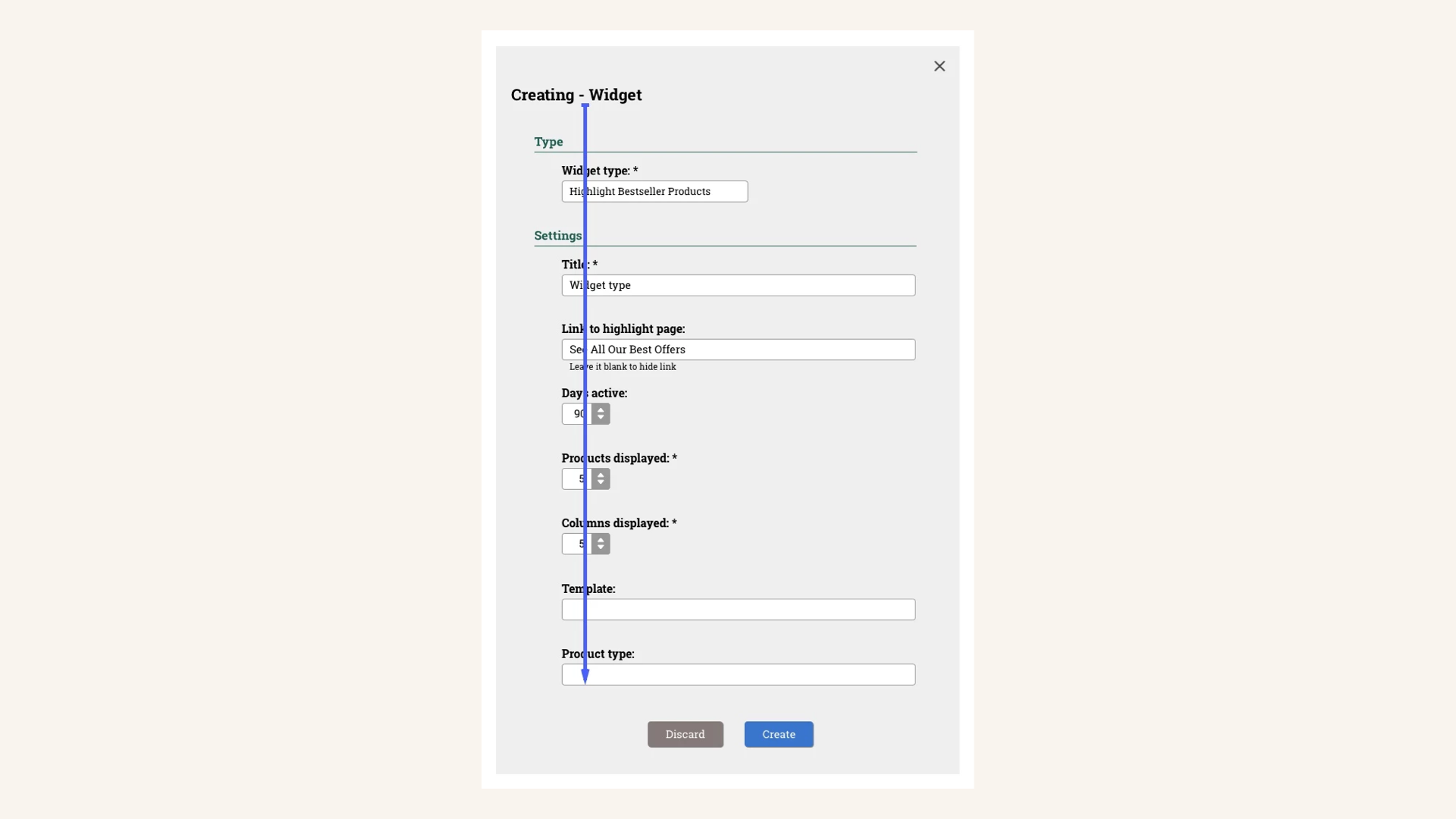
Show the user a clear path to completing the form. The user will understand from the beginning what we want from her and how long it will take for her to finish.
The design of your form has to show it has a path to its completion. When a user scans a form, and also scrolls it down and up, it is like a bird’s eye capture. By doing this the user gets a sense of what we are asking her to do and how long it is going to take her to finish. The more structured your form is, the faster this process will be, hence the better for the user.
One column? or two columns?
A classic question regarding the layout is if the form in a CMS can have more than one column. We recommend you to go for the one column layout as a general rule. Don’t be afraid of making your users scroll down a little bit more, because like Nir Eyal acknowledges the latter is a widely adopted design pattern
Besides, when adding more than one column to your form, you add a new design pattern (going traversal, from left to right) to the existing one, from top to bottom. This option would delay the completion process because it would demand extra attention to the user, and increase the chances she might get frustrated. Besides, from a psychological perspective, in the Internet era going straight down is the way that gives a sense of progress and achievement.
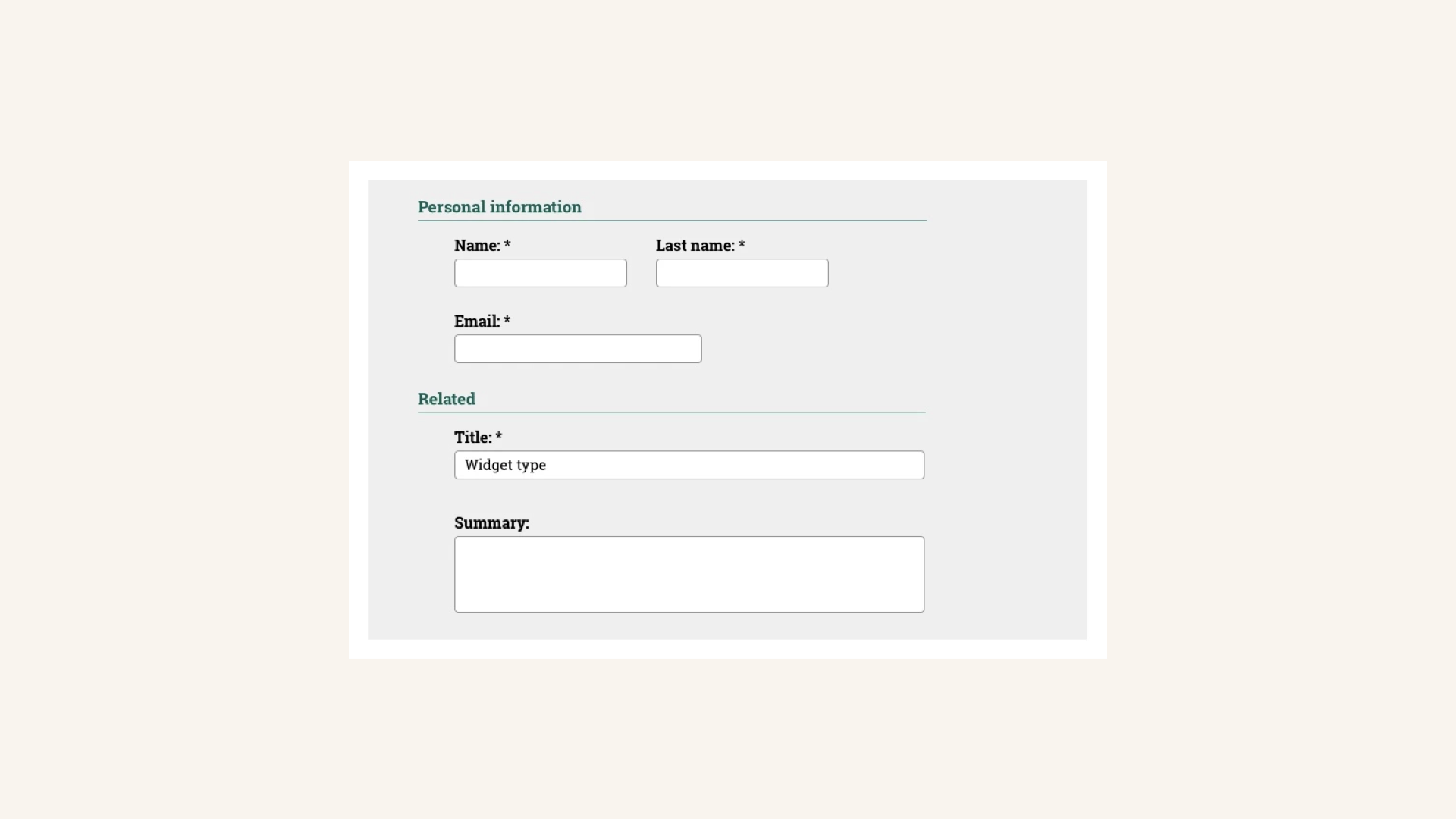
This is an example of when to add a two column layout to a form. Because both form fields, name and last name are directly linked, the user can easily associate them.
But if there is a general rule, there must be exceptions to it. First and last names are form fields that go together, for instance. The same applies to credit card numbers and expiration date. If you have to couple two form fields, highlight that to the user.
Structure your form and simplify it
When designing forms for a CMS take into account that the more structured your input forms and components are, the better the experience is for the user. Make use of space your ally. You will be making user’s work easier when you visually group your form in sections.
Caroline Jarrett, not only advocates this but also suggests a more simplified interface where the different form components guide the user’s work. Once you’ve designed your form, review it and ask yourself if there is something you can simplify or remove.
Add visual clues
Now it’s time to enhance the process of filling out the form you are designing. Consider adding some visual clues at specific form components, especially if there are numbers involved. Placeholder text can help you a lot if you are asking for a particular formatting for numbers, like with telephone numbers, for instance, or date display.
C. Form components
Labels
Labels play the main character in form design. They are the ones that will guide the user’s gaze. Hence, their length, shape, placement and style really matter. Jakob Nielsen’s research findings on labels are quite interesting.
Let's discuss these four traits:
[a] Length. Make your label as clear and short as possible. Test it with your users. Don’t use extra words to state something that is obvious, but do it if it is necessary to clarify something (for instance, “Your name” vs. “Name”, or “Name” and “Last name” vs. “Full name”);
[b] Shape. Make them bold. In a CMS labels should always be visible to your users. Take into account that your power users may access to your software several hours per day and may be performing multiple tasks at a time. A bold shape will guide their gaze easier on the screen.
[c] Placement. Place labels on top of the text input field, because it improves association. In a multi-language platform environment this is something you have to take into account, given the different lengths that foreign syntax may have for the same concept. In addition, placing labels on top makes the scanning task faster for the user. When you place labels on the left side it is because you want your users to take the form filling task carefully. This is not the case for a CMS where the user is filling out several form templates a week (or a day). Your users want to finish their task as soon as possible, because they can modify or review the content as much as they want to, and we have to encourage that pattern.
Maybe you have realized that there are new design patterns, like Google’s Material Design, where the user engages with the input text field and the floating inline labels are in regular text shape and move to float above the field.
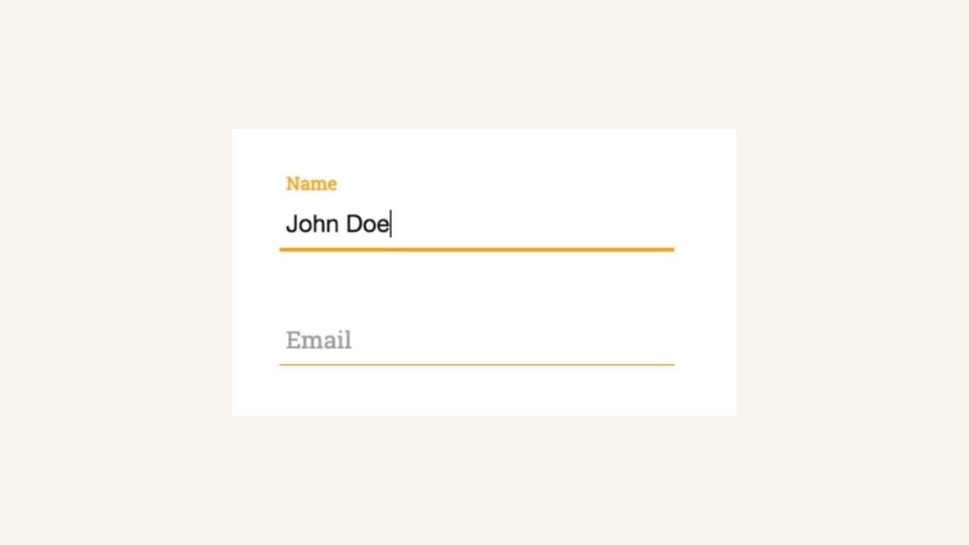
Google's Material Design form design example.
We don’t recommend this type of interaction for a CMS, because it forces the user to make an extra effort in locating labels that are not filled in and the ones that are smaller in size.
[d] Style. According to Nielsen’s research I mentioned above, the user’s gaze reads slightly faster a label written in sentence case than in title case. Maybe you are tempted to capitalize all words because you might consider a particular input field is really important in your form. Bear in mind that nobody wants to fill out forms and if they have to, they want to do it quickly. At this moment you already have 100% of the user’s attention, so try to avoid the creation of unnecessary obstacles.
Action buttons
In any given standard form on a website, action buttons such as “Submit” are placed at the bottom of the form. They put an end to the process of filling out the form and let know users they are ready to submit it to the database. In the case of a CMS, where content is at the core of design and experience, the objective is to allow users to create and/or edit content as many times as they need it. That is the reason why primary action buttons should always be available for the user in a CMS user interface. Place them above the fold, no matter how long is the form they have to complete.
Directly related to this area are the topics of buttons and accessibility. Both of them are really interesting and worth a short mention. We can dive into further detail in future posts.
Required fields, Help text and Validation
One of the big values of a CMS is to encourage the creative process of content creation by allowing multiple versions and/or modifications of a piece of content. Despite this fact, you should ensure your design not only provides a beneficial experience for the user, but also reaches the main goals your CMS strives to achieve.
Therefore, visually highlight to the user the required fields so they know what’s necessary for the form to be saved. Usability standards say required fields should be identified with an asterix “*”. In some specific cases you can make use of help text to guide the user, as shown below. We don’t recommend alternative design solutions, because the closer the required field message is to the label, the better to identify and understand for the user.
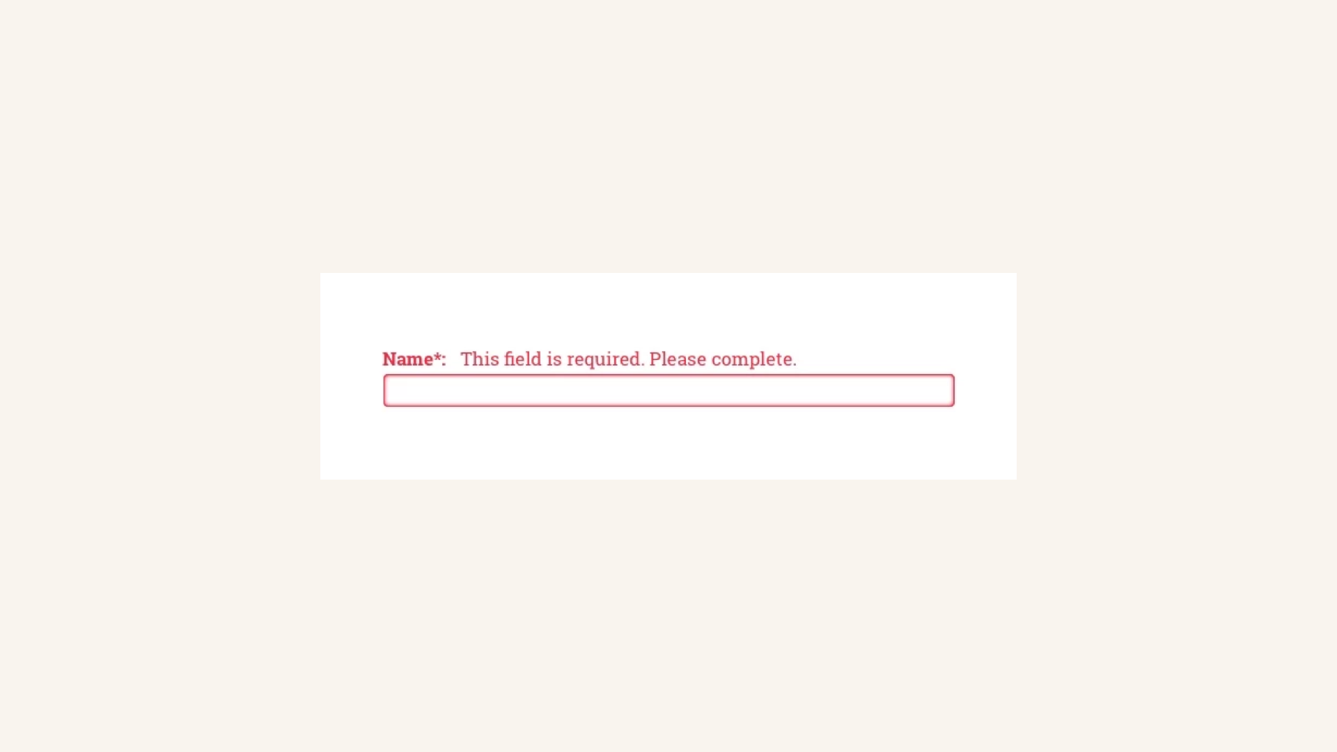
Example of required field with inline validation active. Label and input box are highlighted in red for a better location on the screen by the user.
You might also consider to include user-activated help text that shows up below input fields when the user hovers over that area. This is a recommended feature when you want to support the addition of a new group of users unfamiliar with your CMS. Finally, the addition of inline validation will give -as Luke Wroblewski states- real-time feedback helping users to stay within necessary form limits previously defined.
Given that some of the forms can be two or three folds long, it can be annoying for the user to figure out by herself which fields need review. So, you could guide the user through those fields, saving her time scrolling all the way down and up while scanning the screen, trying to discover where the errors are. Alternatively, you could let her know how many errors she has, what they are, and how to correct the issue.
Feedback and Notifications
Notifications Finally it’s worth considering including feedback messages to answer the user’s actions. For instance, you can provide a short “The document has been saved” message that shows up right after the user has clicked on “Save” button (or “Publish” button for instance). By replying immediately after the user’s input, we are creating a conversation between the user and the CMS.
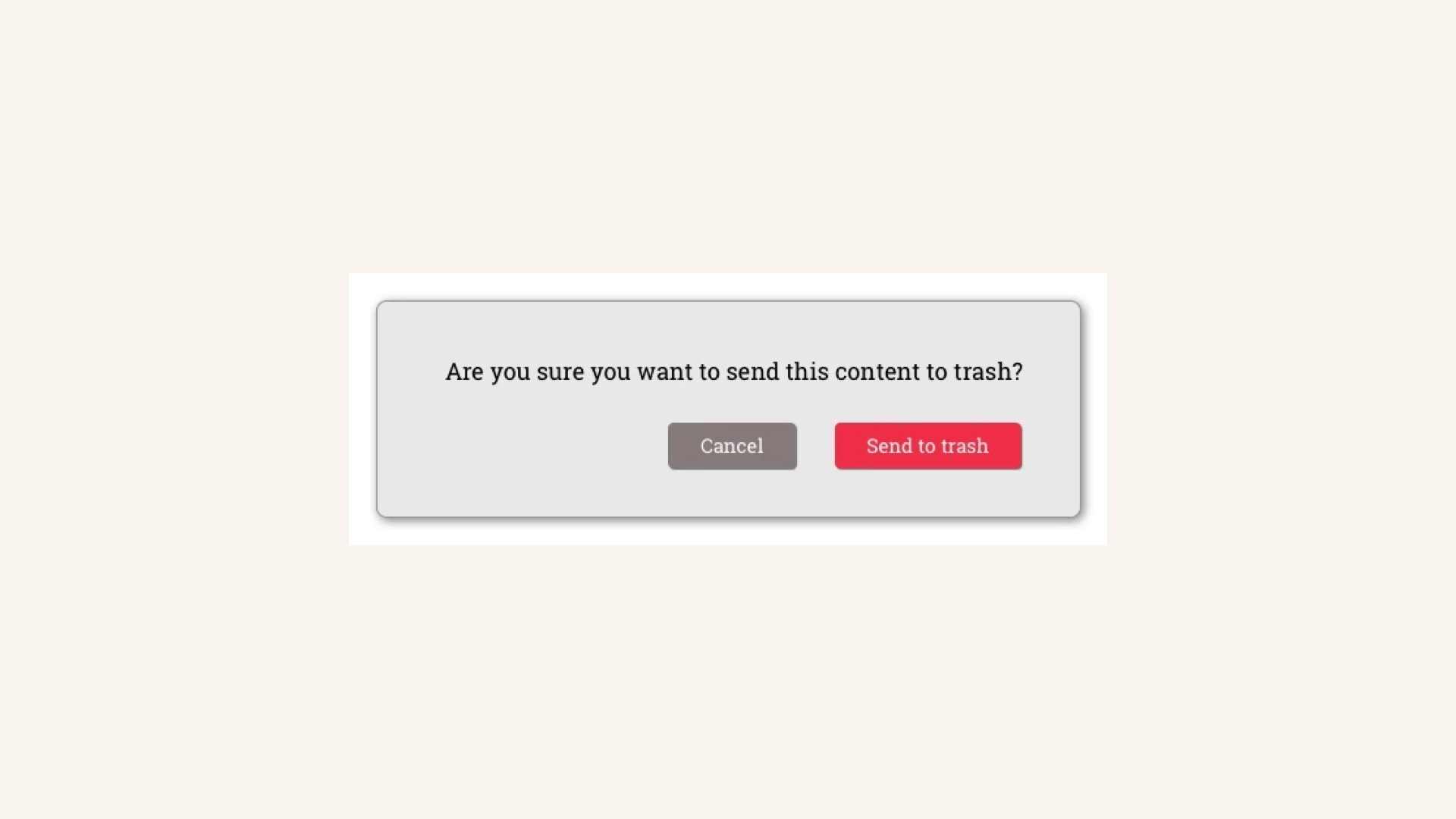
Noticing the user when she is about to make a decision that could not be reverted anymore or goes against CMS primary goals.
Conclusion
When designing forms for CMS take into account that your design is going to be used probably on a weekly basis and for a work environment. That means you and your team have to create an experience where your users can be productive and feel comfortable with it. You have to focus on increasing these areas. Minor changes can increase the experience in an environment where the important task is not to complete and submit content, but performing efficiently. That’s the main goal for forms in CMS. So, let’s start testing out and defining the appropriate choices for your CMS.