Logo loaders challenge

When loaders meet corporate interests
I have to admit that one of the things that I most love from Codepen newsletters is that moment when I can discover really creative loaders. It's creativity taken to the extreme, where you have to combine design simplicity, a message and a never ending animation. It can be tough to get to a polished final version, but it's rewarding and amazing.
But what happens when you have the option to add loaders that reflect corporate (or thematic) interests? Here is when additional constraints are added to the list and make design assignments even more fascinating.
Loaders are another way to communicate to users that it might take a little more time to process all data until it can generate the next view. So they are as important as notifications can be. In terms of my current field of work in UX/UI, CMS world, selecting a proper loader it is as important as designing a 404 page. We are talking about working tools where users will probably be in the same situation several times in a day. It's about making the time users spend using your tool shorter and nicer. Predictable and reliable.

View of Ibexa's old eZ Systems logo.
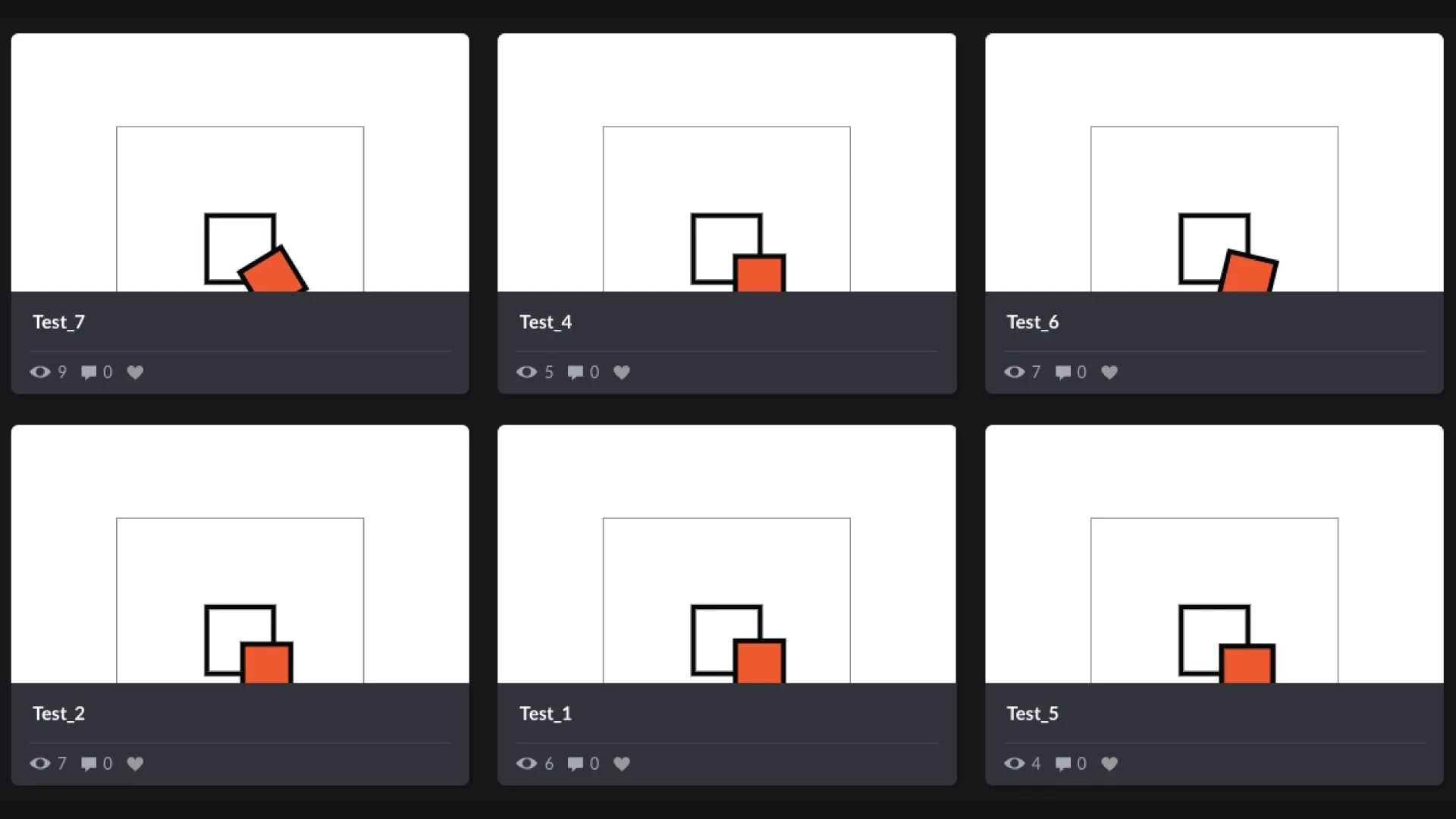
During the design time invested for Ibexa's eZ Platform v2, I also spent some time figuring out several alternatives for a loader, based on eZ System's corporate logo. Beyond neutral loaders, which are really useful by the way, applying some creativity around corporate constraints it can be fun too. Here you have some samples: